HTC U11 is dead on arrival
This article may contain personal views and opinion from the author.

HTC President of Smartphone and Connected Devices Chialin Chang delivering a troubled and cringe-worthy U11 announcement
This company, HTC, was once at the forefront of mobile tech innovation, and only one of three companies that managed to make any kind of profit on Android – an achievement in itself. Now, with those beautiful times long behind it, it's desperately trying not to drown in the vast ocean of the mobile industry. Gasping for breath, ineffectively swinging and hitting arms in the water, HTC likely put itself in this ridiculous position due to its lack of general vision to guide the company's operations through the last 5 years or so, as well as its inability to keep key talent in house.
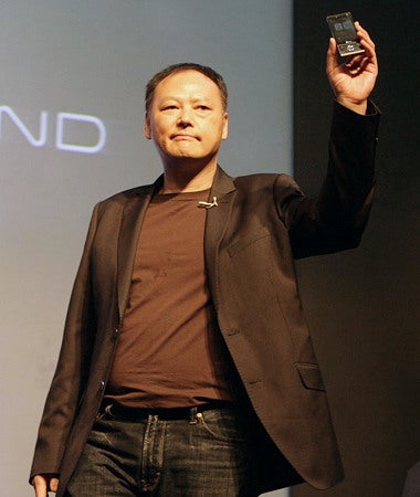
HTC's products lack a much needed spark after former CEO Peter Chou quit the company
Whether or not the beginning of the end for HTC started under Peter Chou is debatable. The firm's former CEO has been said to be difficult to work with, but if anything, he gave HTC the spark and character that defined much of its products from the past, brighter years. One thing is certain, though, everything started going downhill with a series of executive-level departures back in 2013 and 2014. We're talking chief product officers, design leads, global communications experts... This is an amazing example of just how valuable key talent is for a company.
HTC U11: a design catastrophe
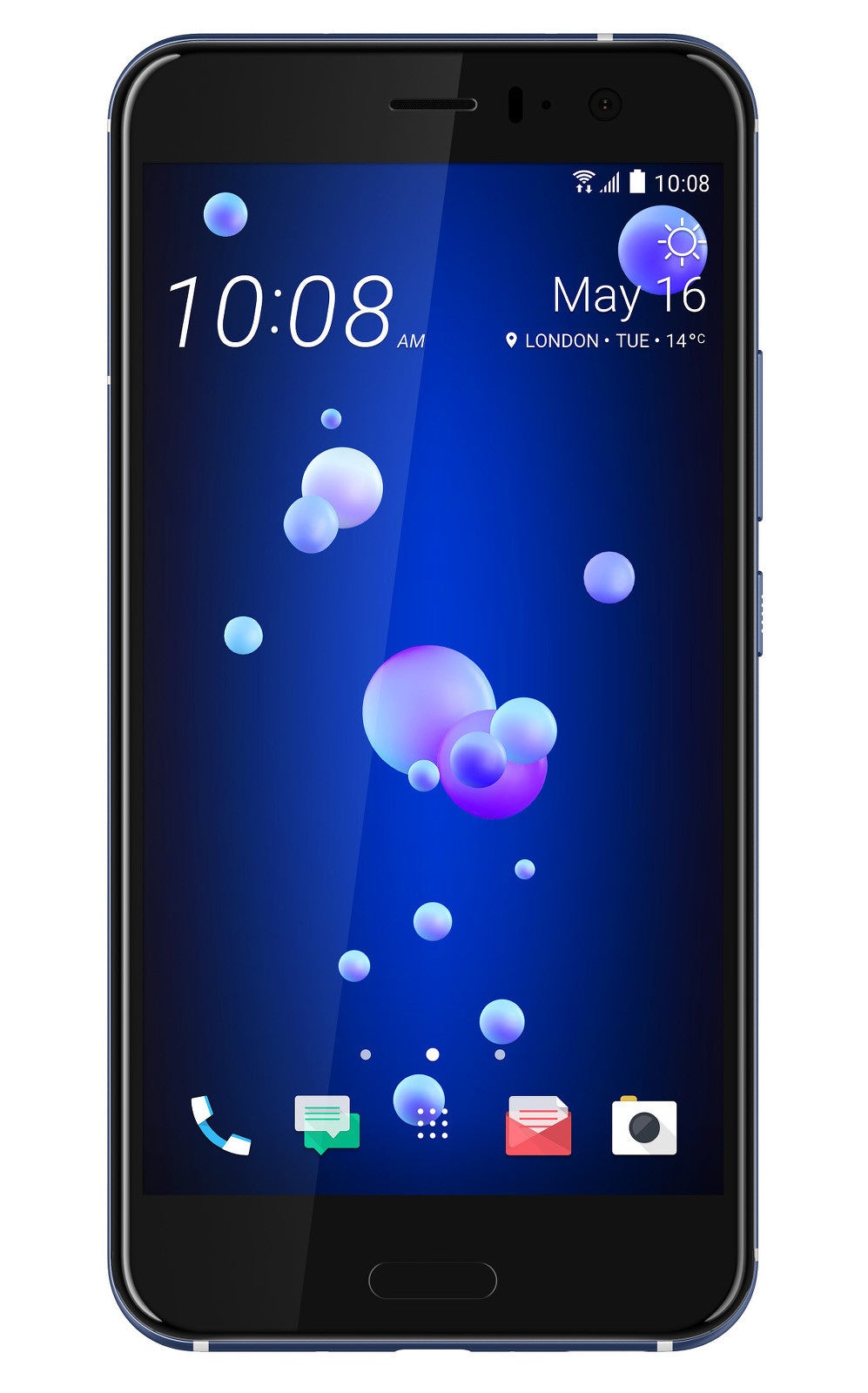
If you can't guess which phone this is, it's not your fault
The amazing thing is that you can see how HTC's smartphones get progressively generic and uglier after each of these departures. Little by little, you can see HTC's top devices devolve from the break-through design that was the HTC One M7, to the deal-breakingly dull U11. Yes, it has modern features like glass front and back, with aluminum frame and so on, but it has no style, it's generic, it has messed up front detail placement and proportions – a trend that started with the iPhone-esque One A9. A shiny back is not enough.
Just squeeze it? Um, no, thanks.
Some makers have always been struggling to think of meaningful innovative features, which is why they have historically tried to make up for that with specs. With varying degrees of success. These days, however, it seems it has been getting increasingly difficult for manufacturers to find new features to woo customers with. This is a legit concern, because most fundamental aspects of the smartphone experience (performance, camera, screen, memory, etc.) has already been perfected, or so we think. Some have decided to turn to voice assistants, others to AI and VR, still others have started to curve and extend their phone screens out of proportion... Some of these efforts have thus far delivered only partial results at best, mostly because they've been largely arbitrary, with no real answer to "OK, but why is it better this way?"

This video spot is the only good thing there is to Edge Sense
HTC though... these guys are redefining "lack of ideas" with this new squeeze thing. Or maybe the team behind this U11 is just so young and inexperienced that they still believe such things work. Spoiler: they don't. Squeezing your phone will be neither natural, nor intuitive. It's prone to accidental squeezes, it introduces the risk of having the phone slip out of your hand as you try to squeeze it, and most importantly: it doesn't do anything useful. It just launches apps, and may eventually be updated to perform some other actions, but it'll be a user-configurable thing, meaning users themselves will have to think of ways to use this so-called Edge Sense. HTC itself doesn't have any idea why and what you may want to squeeze your phone for, so it'll just set this action to open apps for now. Educated prediction: it won't get better with "a future software update". It's incredible how such a feature (and a product-defining one at that) may appear in a flagship phone by a company that takes pride in its 20-year experience in this industry.
Even more mind-boggling is how HTC presents this new feature: "We wanted to go beyond the touch screen so we created an entirely new and intuitive way to interact with the phone – Edge Sense. A simple squeeze unlocks a whole new world." Whoa! Translation: "a whole new world" now seems to mean "launch an app".
A few bright points that won't save this phone

HTC will bundle noise-cancellation earphones with the U11
Still, it's 2017 and you can no longer impress consumers with specs alone. You need a delightful experience, and a complete one at that, you need differentiation and clear positioning. The HTC U11 has none of this, or it has it but not in the right places. My point here isn't that the U11 won't be a "good smartphone". I'm sure it will, but that will by no means be enough. A $250 Moto G is now a "good enough smartphone", so why pay the premium price of $650 for the U11? In my Galaxy S8 review, I made the point that Samsung now has to prove to consumers that it's worth it to pay north of $650 for their phone, considering all the pressure from lower-cost alternatives. HTC will have to do the same, but the U11 just doesn't seems to make particularly strong argument.








Things that are NOT allowed: