HTC Sense UI 3.5: redesigned, streamlined

HTC’s NYC event kicked off with the HTC Rhyme, a phone aiming straight at the ladies. With no groundbreaking specs, but plenty of novelties with it including the latest iteration on HTC Sense, 3.5. The new UI comes with more personalization options and new streamlined look and feel with a homescreen allowing you to dock icons to the side, while the clock shows on the left. Well, at least in the default state - you can personalize that as well.
Nicole Coddington, senior UX Designer at HTC, went on stage and explained how the new design allows more space for wallpapers as people tend to often put their photos on the background. HTC is actually adding 12 new wallpaper images and the famous flip clock has also been updated.
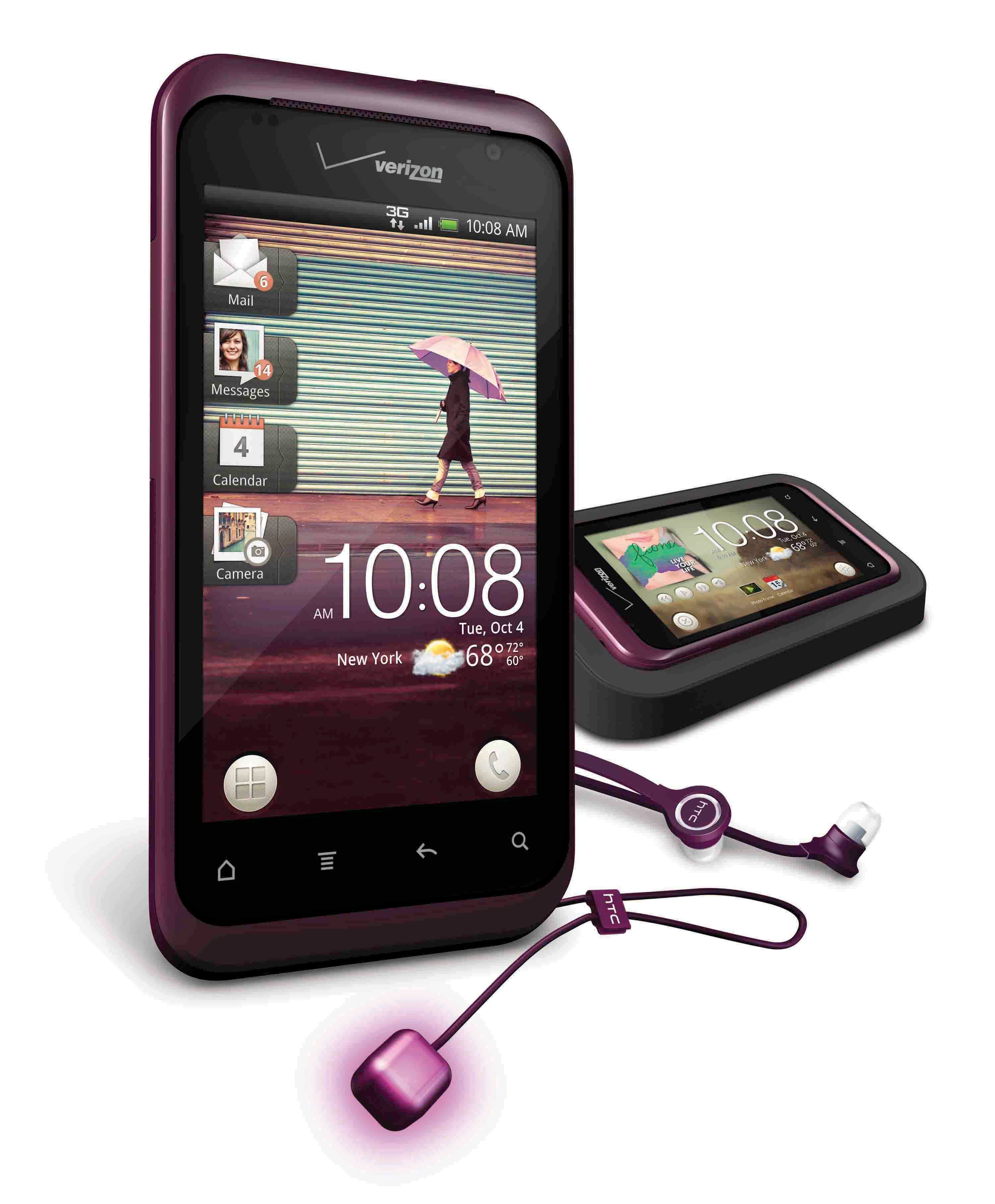
Plenty of minor additions arrive as well - including redefined customizable icons and preview tabs, so plenty of stuff to be excited about. Stay tuned for our hands-on preview of the HTC Rhyme, coming up shortly - that’s where you’ll get a first glimpse of the Sense 3.5.
source: HTC
Follow us on Google News





Things that are NOT allowed:
To help keep our community safe and free from spam, we apply temporary limits to newly created accounts: