HTC Sense 7 UI vs Sense 6 UI: a visual walk through the subtle changes (gallery)
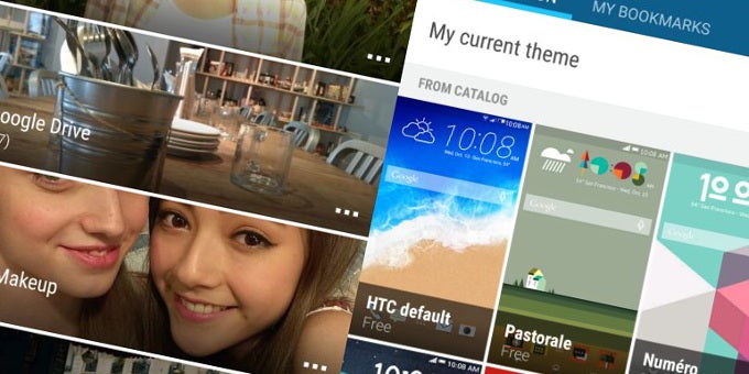
The seventh iteration of HTC's Sense UI is already here. Succeeding HTC Sense 6 UI, which was playfully dubbed "Sixth Sense", the new rendition of the Taiwan-based maker's Android user interface bears a slight materialistic overhaul over the older user interface.
We already made a comparison between Sense 6 on KitKat and on Lollipop. To be honest, we had to dig pretty deeper to find any changes in the interface. Not that we're complaining, but there were not as much novelties as we had hoped. Still, this is not a bad thing - Sense UI is among the more polished Android interfaces.
Is the case with Sense 7 UI the same, i.e. is it just an incremental polishment over the previous embodiment of HTC's user interface? Well, we grabbed some screenshots from the newcomer and put them next to the "Sixth Sense" for your viewing pleasure. Check them out right below.
Note: For your convenience, the screenshots from Sense 7 are on the left, while the older Sense 6 is pictured in the screenshots on the right.





Things that are NOT allowed: