HTC One vs Samsung Galaxy S III - first look
How about we make an improvised comparison between the old battle horse Samsung Galaxy S III and the young race stud HTC One, we thought the minute we got our hands on HTC's latest and greatest at the MWC expo today. Tasty, eh?
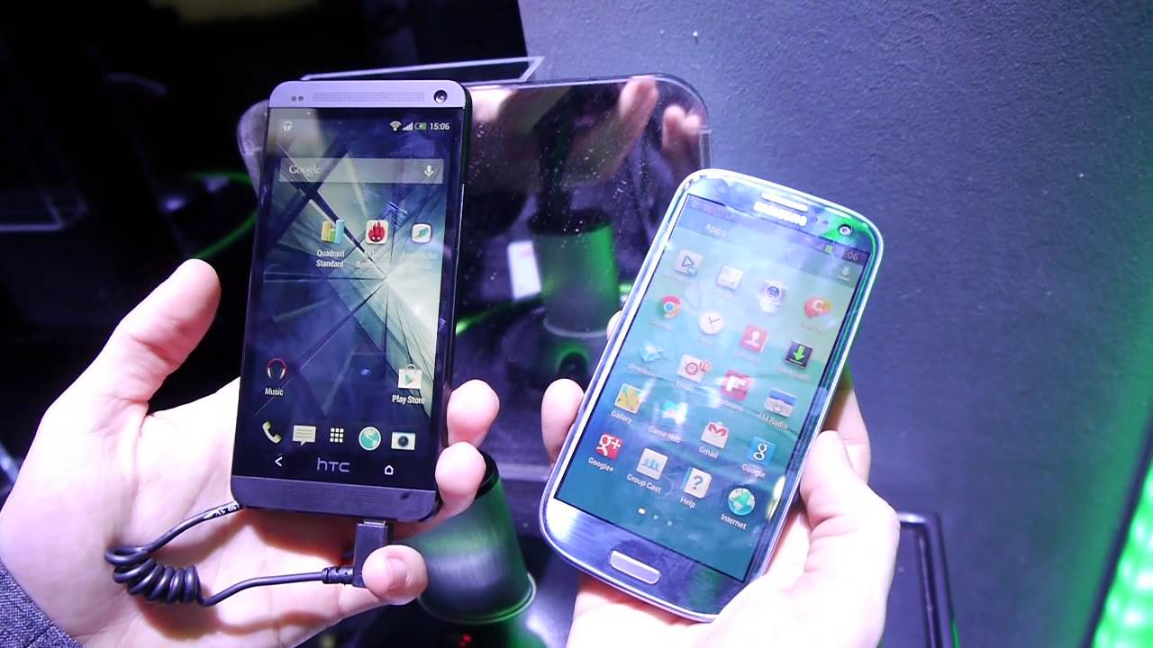
Without rehashing the specs, we'd just say that the HTC One is the more powerful of the two, since it houses the newest generation Qualcomm Snapdragon 600 inside, but with Jelly Bean these synthetic benchmark differences should be taken with a grain of salt, since the phones plough through everything Android can throw at them anyway. Where the silicon can make a difference is the ability to process things like HDR video, stitch 360 degree panoramas faster and so on, but we are dealing with a non-final HTC One unit here, so we thought we'd focus more on the general look and feel.
Here is where it got interesting, as the two handsets are pretty far apart in terms of the impression they leave in your hand. The lighthearted polycarbonate Galaxy S III is very ergonomic to hold, yet feels somewhat cheaper than the anodized aluminum HTC One, with diamond-cut edges.
HTC's handset is truly a thoughtful design, and a proof that a big-screen phone doesn't have to be all-plastic to be fairly light and comfortable to hold, but can come wrapped in premium materials with great success, too. Granted, the S III is slightly thinner, but that doesn't really feel as an advantage, rather the HTC One feels more solid in the hand because of the extra girth, and easier to grip. The One is also more narrow and elongated, which helps operate it with just one hand and your thumb better than the S III. The One is a unibody design, though, so tough luck expanding that 16/32 GB memory, or swapping the battery - things you can do with ease on Samsung's handset.
Now off to the interface races - Samsung's TouchWiz, or Nature UX now, has always felt a little cartoonish and ragtag compared to HTC Sense, which is much more integrated in terms of graphics and functionality with Android, to the extent that you only see the Sense UI wherever you may roam on the handset. It is more uniform, to the extent that some call it bloated with all the animations, themes and 3D effects that make it stand out, but Sense 5.0 is a whole different ballgame. It is minimalistic now, with two-dimensional, non-cluttered, more schematic graphics, and the visual oomph is left for features like the BlinkFeed aggregator, or the Zoe Camera automatic media collage function. Yet, it is all flatter than Sense UI of yesteryear, much simpler, and still looking way more sophisticated than the ragtag Nature UX. despite Samsung's array of useful features in it.
Moving along, we take a look at the cameras - the Galaxy S III sports an 8 MP shooter, which takes one of the best looking photos and videos coming from a smartphone, while the One has something called the UltraPixel camera. HTC here is trying to put an end to the megapixel war, moving ahead with things that matter, like pixel size - the One has 2 micron vs 1.4 micron pixels on the Galaxy S III, thus in theory should be better in low-light scenarios.
Another great selling point of the HTC One's camera is the two-axis optical image stabilization, shrunk enough to fit in the 9mm body, and aiding to avoid any shake during video footage, as well as allow much longer exposure times, soaking more light without blur. We'll try and snap some samples with both later on to check out both cameras against each other. The frontal cam on the One also has an advantage with its wide-angle lens, fitting up to four people in your video chat sessions.
As far as the screens go, despite being almost the same size, they look quite different, and we are not talking pixel density here, because, let's be honest, the difference between Full HD and HD mobile screen from a normal viewing distance is negligible, PenTile matrix or not. What we mean is that HTC has the habit of calibrating its displays almost perfectly lately, which was proved with the excellent display on the HTC Butterfly, and with the One and only here things seem to be the same. It sports very true colors, compared to the oversaturated, yet quite cold ones on the S III, the brightness seems much higher, and to top it all off, the One sports very low screen reflection coefficient, which helps immensely under a direct light source, and you can take a feel of in the video below.
It is, of course, not really fair to make a comparison between an almost year-old handset to one that hasn't even hit shelves yet, and the true test would be against the Galaxy S IV, but from what we gathered, the One will be a direct contender for anyone's throne in the first half of the year.






Things that are NOT allowed: