HTC One max hands-on
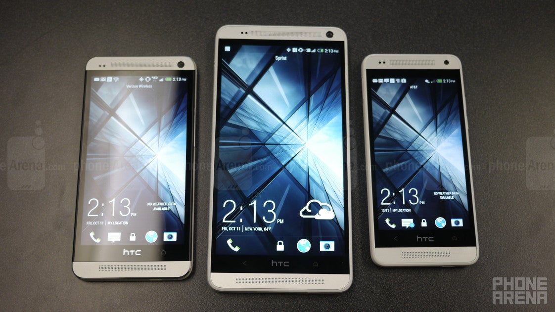
We have the “normal” sized flagships, and then we have their mini counterparts. Still, those two particular options are never enough for consumers, especially in this day and age when variety in size is increasingly becoming competitive. It’s crazy to believe it, but the HTC One has been around the block longer than most of the other flagship phones out there for 2013, but it’s just now that we’re seeing a larger sized sibling. Enter the aptly named HTC One max, which just like the HTC One mini before it, is giving HTC’s flagship smartphone some added variety by completing that trifecta of sizing options.
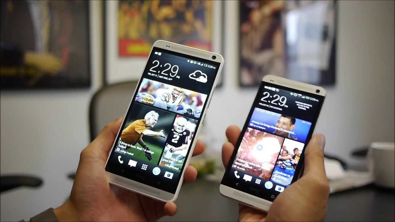
Okay folks, the design of the HTC One max isn’t surprising at all – and why should it be, right? Much like the mini before it, the max is simply a larger sized version of HTC’s flagship smartphone, and an even larger version of the One mini. And boy is it a beastly thing to hold or place in our pockets! Sure, we can grasp it with a single hand, but when it’s grazing close to the tablet form factor, it’s something that requires two handed operation more than anything else.
Looking at the thing, all of the exquisite qualities from the HTC One are present here – so that consists of its premium choice materials and solid construction. Relying on a mostly brushed aluminum casing, it’s no doubt wonderful to know that the max is a premium feeling thing. However, it’s not as skinny as or lighter than the Sony Xperia Z Ultra. Indeed, we would’ve have liked to see the max one-up the competition by minimizing its footprint further, but then again, it’s still a pretty good looking thing – though, it’s not something we’d consider as fresh at this point.
Interestingly enough, HTC decided to change up some things with the max. For starters, its power button is now placed on its right edge, next to its volume control. With this particular placement, we’re thrilled that it’s better accessible than what we had on the original HTC One – plus, it’s more distinct and has a better response too. However, they’ve left the IR blaster in the same location as before.
Another surprising revelation with the HTC One max is its decision of employing a removable rear casing, which gives us a sneak peek into it internals. Unfortunately, its battery is still something that’s not user replaceable – so it means that it’ll require service to replace it. Are we bummed? Absolutely. However, we’re ecstatic to find that the handset now boasts a microSD card slot, which allows it to supplement its internal capacity of 32GB.
Finally, the HTC One max features something entirely new that we haven’t seen before with HTC’s portfolio. Placed a little bit below the camera, there’s square shaped finger print scanner that HTC refers to as the Fingerprint scan. Now, its implementation is a bit different from Apple’s Touch ID fingerprint sensor, seeing that it requires us to slowly swipe our finger down for it to read.
In fact, this particular implementation is more in common to the fingerprint scanner technology of the past. Still, HTC mixes thing up by allowing it to store up to three fingerprints, which can be mapped to launch different things – like getting us to the homescreen or opening an app. Beyond the usual security unlocking, the finger print scanner has no other purpose, but hopefully we’ll see more features down the road with it.
Display
Frankly, everything about the screen from the HTC One is present here on the One max – so that includes 1080p resolution and S-LCD 3 technology. Being the max and all, the screen size now increases to 5.9-inches, which really pushes it into the tablet category, but it’s not as dramatic when compared to other phablets in the space right now – namely the Sony Xperia Z Ultra or Samsung Galaxy Mega 6.3. Regardless of that, we’ll say it’s still one super sharp display that looks amazing!
Processor
Knowing what’s considered as cutting edge in the smartphone space right now, we’re a bit perturbed to find out that the HTC One max is powered by the quad-core 1.7GHz Qualcomm Snapdragon 600 SoC coupled with 2GB of RAM and the Adreno 320 GPU. Needless to say, it’s rather underwhelming to say the least, especially when other newer smartphones out there already rely on the snazzier Snapdragon 800 SoC. From what we’re told, the decision to stick with this particular processor is due to pricing and battery life. Despite that, we’re at least thankful to find its performance to be extremely responsive with this pre-production unit – albeit, it doesn’t seem as snappy as something like the LG G2.
Interface and Functionality
The HTC Sense 5 UI made the HTC One is different amongst all other Android smartphones out there, but with this latest endeavor, it sees some added new features to enhance the experience ever so slightly. Specially, it's running version 5.5 of the Sense interface on top of Android 4.3 Jelly Bean. Just like before, the minimalist UI is present here on the HTC One max. With HTC BlinkFeed, we now have another accessible panel all the way to the left that allows us to customize what it aggregates on the homescreen, but best of all, there’s now an option for Google+ – in addition to the other popular social networking services.
Price, Release Date and Expectations
For right now, exact pricing hasn’t been divulged. From what we’re told, however, it’ll be price competitively to other comparable smartphones – so you can probably expect it to land somewhere around the $300 mark with a 2-year contract. As for availability, we’re told that it’ll launch globally sometime around mid-October, with an eventual roll out in the US market via Sprint and Verizon in time for the holiday season.
So there we have it folks! It looks as though that the HTC One max is going to be the only new phone from the Taiwanese based company to compete this holiday season. On one hand, it’s awesome that it complements HTC’s existing portfolio of One-branded smartphones, but as a whole, it’s not something we’d consider as ground breaking or innovative in the space. Knowing that the Samsung Galaxy Note 3 is highly praised and acclaimed by many, the HTC One max will seriously need to show that it can tangle on the same level. The added new goodies with the smartphone are appreciated no doubt, but in the end, it won’t mean anything unless it can perform in a stellar way in all categories.







Things that are NOT allowed: