HTC One hands-on

Isn’t she lovely? Isn’t she wonderful? Isn’t she precious!? Well, we know that’s what Stevie Wonder would say after taking a meticulous look at the just announced HTC One – the Taiwanese based company’s flagship Android smartphone for 2013. Seriously folks, we haven’t seen something like this since the original Google Nexus One, which also sported one heck of an iconic design of its own. Quite frankly, it’s not every day we come across a handset that evokes second glances mainly due to its stunning design, but yeah, this one is one of the precious few out there that's able to do just that. Skillfully, the HTC One brings back the metal like no other, which of course, translates to one masterful industrial design worth praise.
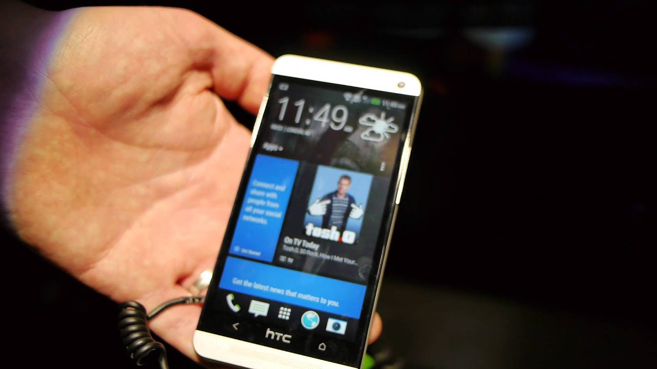
Let’s get the obvious out of the way people! The HTC One is one damn fine looking device, especially when it’s utilizing a sturdy metallic casing. Going with a metal unibody design, which HTC details specifically as a zero-gap aluminum body, our hands can’t stop falling in love with the sturdy feel. In comparison to other recent things, the only thing close to this design that we can remember, was the HTC One S from last year – though, the sheer magnitude of the HTC One blows it away. Even more impressive is the fact that HTC is able to keep this one equally skinny amongst the masses with its uniform profile of 9.3mm thin (0.36 inches), while being uber lightweight at the same time. Combining those things with its impeccable construction, the HTC One is simply one gorgeous thing that’s a head turner any way we look at it.
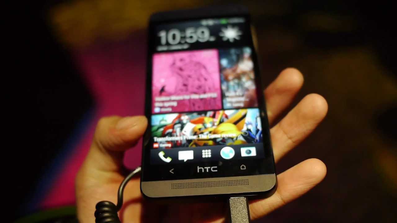
After allowing its hot design to subside, our eyes naturally become affixed to the display. However, for those HTC DROID DNA wielding owners out there, the HTC One’s display might not impress them much – albeit, it’s still one sharp looking beauty. In fact, it’s been blessed with a 4.7-inch 1080p Super LCD 3 display with Gorilla Glass 2, which is indeed lovely looking with its sharp visuals and stunning color, but not quite as immense, mainly due to size, to what we’ve seen already with the DROID DNA. Regardless of that, seeing that it delivers a pixel density of 468 ppi, our eyes have no issues whatsoever when it comes to distinguishing any fine details. Moreover, the lush color tones of the display, combined with its predictable great viewing angles, splashes on that practical amount of vibrancy to wow us from afar.
By now, we’re familiar with the intense hardware of the HTC One – such as its quad-core 1.7GHz Qualcomm Snapdragon 600 CPU, 2GB DDR RAM, and 4G LTE connectivity. However, if there’s one detail worth mentioning, it’s that the handset is lacking a microSD card slot, which doesn’t come as a surprise in this day and age, but still, it would’ve been helpful to see it tacked on. Nevertheless, the handset will be available in 32GB and 64GB capacities to appease those who have a hunger for storage. With its new and speedy Snapdragon chipset, the HTC One flies with its performance, as every little action is accompanied with a sense of snappiness. In our brief hands-on time, we didn’t see any form of sluggishness or choppiness.
So with that, it leads us to the new HTC Sense 5 experience, which so happens to be an overhaul. In general, we’ve always been fond of the Sense UI, especially when it’s polished from head-to-toe with its countless and snazzy looking widgets. This time around, however, HTC, has improved the experience by providing us with a cleaner, yet still seamless experience. As the name goes, this version of Sense continues to sense our experience with the new HTC BlinkFeed – an all-in-one solution that aggregates all the relevant content, mainly social networking stuff, directly on the homescreen. In the past, we saw HTC’s FriendStream widget, which accomplished the same thing, but HTC BlinkFeed takes it up a notch by updating us with news, photos, and immersive news that pertains to our needs and wants. Come to think of it, HTC BlinkFeed replaces the typical Sense homescreen we’re used to seeing with a very live tiled one instead. So yes, it does reminds us of Windows Phone a lot. Elsewhere, it’s comforting to know that HTC has refined some other aspects of the Sense experience as well as bring some new things – like HTC BoomSound, UltraPixel, and Zoe.
With the latter two, they’re associated with the new experience surrounding the camera, which of course, is none other than an average 4-megapixel UltraPixel auto-focus camera that features a wide angle f2.0 25mm lens, backside illuminated sensor, LED flash, and 1080p video recording. Taking a few snapshots, its seems adequate enough to handle low lighting, but then again, we’re only able to view the photos on the handset – not a computer to gauge its quality. On the flip side, there’s also a pleasant 88-degree wide-angle front-facing camera that can stuff all of your friends into the shot, without having to stretch your hand out. Again, it’s not something particularly new, as we’ve seen it already on other devices.
So far this year, we haven’t heard or seen too many flagships as of yet, but with the HTC One, it’s undoubtedly a dreamy thing to find in a space filled with plastic Android smartphones. Quality-wise, the handset delivers the goods with its unibody aluminum construction, which interestingly enough, is still rarely seen in many of today’s top-tiered devices. Beyond the beefy hardware, it’s absolutely wonderful to see Sense getting its long awaited overhaul. We’ve been pleased in the past, but they’re really pushing forward with the unified experience on the homescreen. Crazy to say, this is simply dubbed as the “HTC One “ – with no other letter attached to it. Needless to say, it makes us wonder, but the more we ponder about it, everything makes perfect sense. This is the one! The one that’s sure to be a big player throughout the first portion of this year.
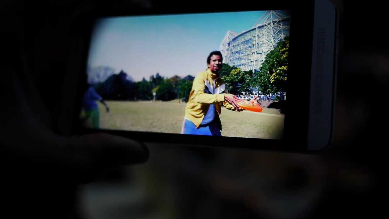
With the latter two, they’re associated with the new experience surrounding the camera, which of course, is none other than an average 4-megapixel UltraPixel auto-focus camera that features a wide angle f2.0 25mm lens, backside illuminated sensor, LED flash, and 1080p video recording. Taking a few snapshots, its seems adequate enough to handle low lighting, but then again, we’re only able to view the photos on the handset – not a computer to gauge its quality. On the flip side, there’s also a pleasant 88-degree wide-angle front-facing camera that can stuff all of your friends into the shot, without having to stretch your hand out. Again, it’s not something particularly new, as we’ve seen it already on other devices.


Follow us on Google News




Things that are NOT allowed:
To help keep our community safe and free from spam, we apply temporary limits to newly created accounts: