HTC One M9 hands-on
Full speed ahead! That’s the direction everyone is seeming to follow now that MWC 2015 is upon us, where we get to see the crop of new flagships that are vying for supremacy for the first half of the year. For HTC, it’s a never ending battle in overcoming adversity and achieving total domination in the space with its flagship. Last year, however, the HTC One M8 marveled folks with its evolutionary industrial design – one that was proclaimed by many as being the most beautifully crafted smartphone of 2014. Despite the pleasantries in regards to its design, there were still some aspects of the phone that proved to be way too underwhelming. In particular, HTC’s decision to stick with the “UltraPixel” rear camera didn’t make it a formidable competitor in the camera space.
Design
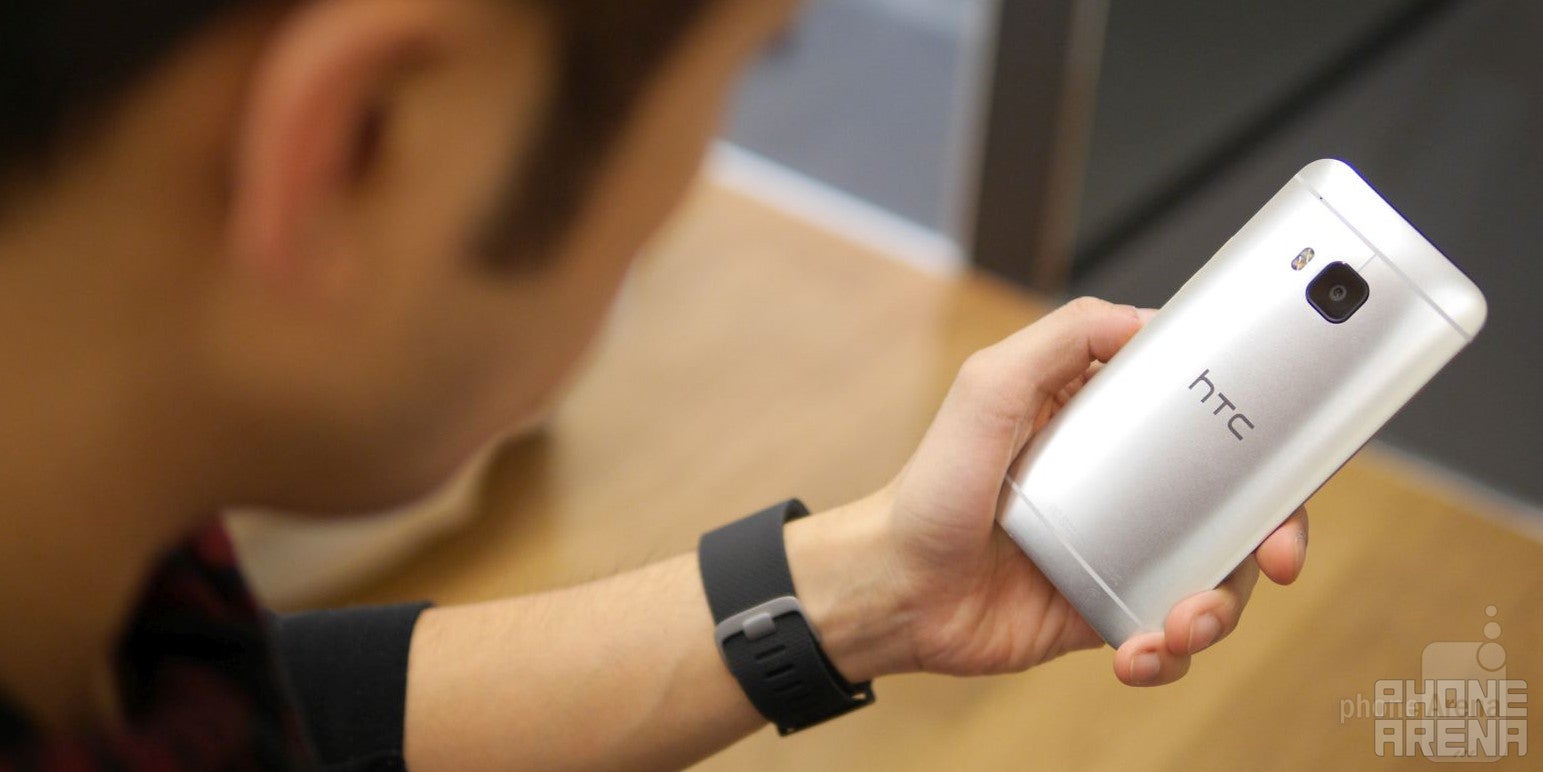
Evolutionary or revolutionary, it’s tough for us to validate what HTC is going for with the M9. To the company, they claim it to be even more luxurious than before, which we agree to an extent, but for the most part, there are some minor design changes that make it subtly different from the M8 before it. The footprint, for the most part, remains unchanged, which is a good thing in this age of super big smartphones. For a flagship smartphone, it’s undeniably one of the more compact models out there – allowing us to comfortably grasp it in our hand without the need to excruciatingly stretch our hand.
Remarked by HTC as the first in the industry to offer a “dual finish” design, one that’s consists of the same premium feeling metal cladded body with a new anodized finished trim accent, the One M9 retains the same lovable design that radiates premium from head-to-toe. Technically, it sheds the unibody design of its predecessor in favor of this new dual finish one. However, the phone loses its clean and uniform finish due to that second choice of material. For starters, the new metal trim adds a lip to the sides of the phone – where it leaves this sharp feel.
Display
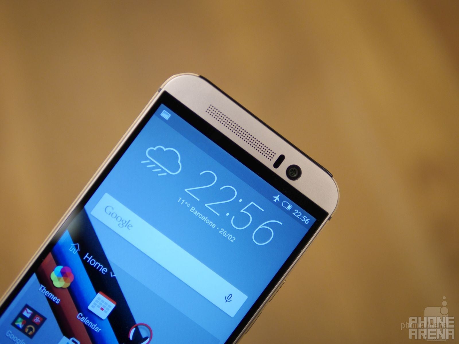
What keeps on coming back is the decision to stick with 1080p resolution, more so when all of its main competitors are leaping ahead into quad-HD realm. Like we said, there isn’t a whole lot to complain about 1080p resolution, since looking at stuff on a 5-inch screen is more than detailed enough. Regardless, it still would’ve been nice on a higher level to also make the jump to quad-HD – giving it that true modern flagship quality.
Interface
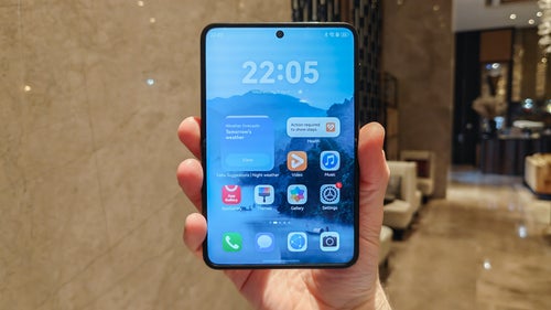
A new flagship phone from HTC means an updated new Sense experience, that’s the expected evolution. In this case, we’re now up to HTC Sense 7.0, which carries the software legacy that HTC is known for, but it’s been evolved to give users more control in how the interface is presented. Honestly speaking, the visual changes on the surface are subtle – like how the weather-clock widget from HTC now sports a clean, italicized font. For the most part, the same modern design language we’ve seen in previous incarnations are present here. In typical Sense fashion, usual staples like HTC BlinkFeed, Zoe, and various Motion Launch gestures are all present once again.
The absolute best part about Sense 7 is the unprecedented level of personalization that’s available. Don’t get us wrong, Sense is already one stylish and elegant looking thing, making it one of the more likable customized Android experiences out there, but HTC has gone deeper to give users control in how it looks. Specifically, we can select various themes to spiffy the standard look of Sense, which by itself is already one slick looking thing. However, with this new feature, we’re able to even modify the color scheme of the UI, the way the icons look, and even rearrange the standard set of Android menu buttons.
Processor and Memory
HTC’s flagships have never been slow with their performances, so it’s no surprise that the same fact is present here with its most latest and prized model. Ticking underneath the hood of this one is the latest and greatest from Qualcomm, a blazingly fast 64-bit based octa-core Snapdragon SoC with 3GB of RAM – where four of its cores are clocked in at 2GHz, while the other four are at 1.5GHz. Just moving around the interface and doing some basic stuff, there’s that constant presence of swiftness and tight response with its operation. Don’t worry, it also helps that there are also all of those software optimizations with Android 5.0 Lollipop that help to propel this one on a consistent level.
From the sound of it, HTC will only be selling the One M9 with 32GB of internal storage out of the gates. It might change, but for the near term, that’s the tally you can expect to find. Luckily, as always, there’s a microSD card slot that there and ready to supplement its capacity. Therefore, there’s no need for panic if you’re one of those multimedia heavy junkies.
Camera
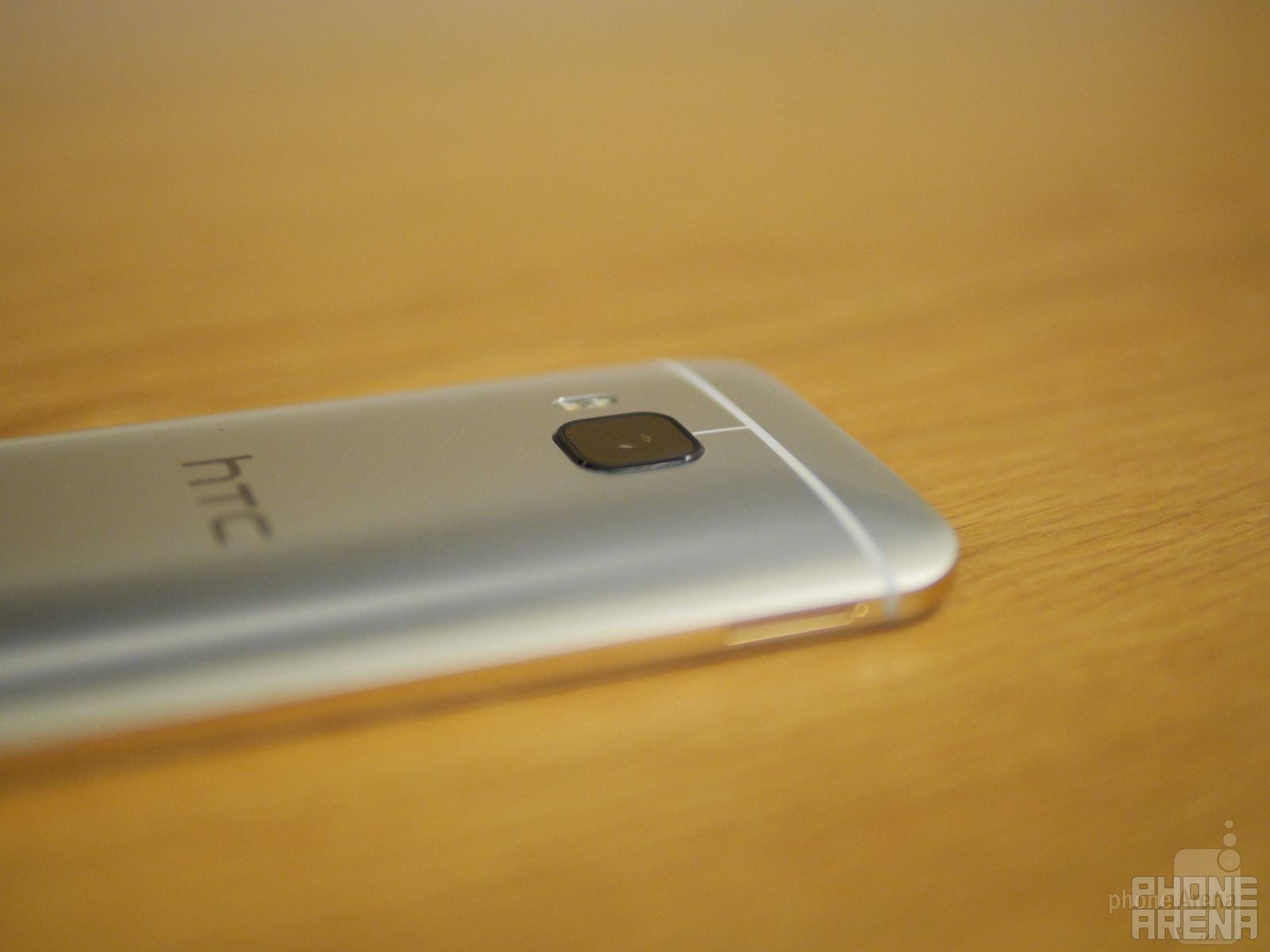
Interestingly enough, the “UltraPixel” camera isn’t totally removed from this phone, since the front-facing camera is an “UltraPixel” one. The main benefits here include its wide angle lens and attention to low lighting situations – so it’s the kind of thing that’s perfect if you want to include several people in your shots.
On the software and experience side, there’s just an obnoxious level of editing tools that are available. Some are really fun, where they add some nifty and artsy effects to photos, but HTC continues to go beyond by delivering customized themes that are taken directly from photos snapped by the smartphone’s camera. Frankly, the results are pretty interesting, as the software intelligently analyzes a snapshot, and then proceeds to procure color themes from it.
Expectations
Looking at the big picture, it’s tough to say what’s on the horizon for HTC now that its latest flagship model has been announced. In the space, we have several noteworthy flagship smartphones that push the boundaries – such as the case with these phones with quad-HD screens, impressively long battery lives, and cameras that take outstanding photos in all sorts of situations. Personally, we feel as though there was more of a significant evolution from the M7 to the M8 – while here with the M8 to the M9, it’s more of a subtle, incremental step.
Some folks might be disappointed about its close resemblance to its predecessor, but we have to remember that it’s quite common for companies to recycle designs (look at Apple for example). Visually speaking, though, HTC executes on what it does well – and that’s designing a smartphone. Sure, there are some good and bad things with the new design, but we can’t escape the fact that it’s still one premium looking thing. That alone shows dedication and attention to detail, which is tough for some other companies to deliver on.
In addition, HTC has addressed the main concern of the M8’s “UltraPixel” camera by blessing the M9 is a beefier sized 20-megapixl sensor. However, the results from what we can see are still a bit disappointing, but that can obviously change between now and when the smartphone is official released. On the software side, though, we have to applaud HTC for enhancing the Sense experience to a higher level. It’s still one of the best looking out there, but the new software features in tow, like the various photo effects tool and customizable themes, help to offer enough pleasantries in the experience – and they’re not really distracting or redundant.




Things that are NOT allowed: