Google starts testing less obtrusive Assistant UI on Pixel 3 units
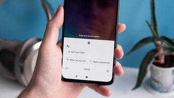
Google made some big changes to Google Assistant on the Pixel 4. With Google's latest handsets, the virtual digital helper is on-device instead of relying on a server. As a result, the Assistant responds faster to questions and commands. Also, Google Assistant now takes up much less screen real estate on the Pixel 4 and Pixel 4 XL. Instead of filling up the entire screen with a result, certain simple responses will cover about one-third of the screen while streaming music takes up half of the display and the latest weather forecast fills up two-thirds of the screen.
According to several Reddit users (via 9to5Google), the new-look Google Assistant is now showing up on some Pixel 3 and Pixel 3 XL models. Those with Google's 2018 flagship phones have to install the latest Google app beta to receive it. After activating Google Assistant by saying the wake word ("Hey Google" or "Ok Google"), the new UI on the Pixel 3 and Pixel 3 XL shows a shorter panel, but it is not transparent as it is on the Pixel 4 series. The Assistant icon is on the left with the user's profile avatar on the right. In the middle, Google Assistant asks, "Hi, how can I help?" And tapping on the Google Assistant text field to type in a request or question also results in a shorter panel.
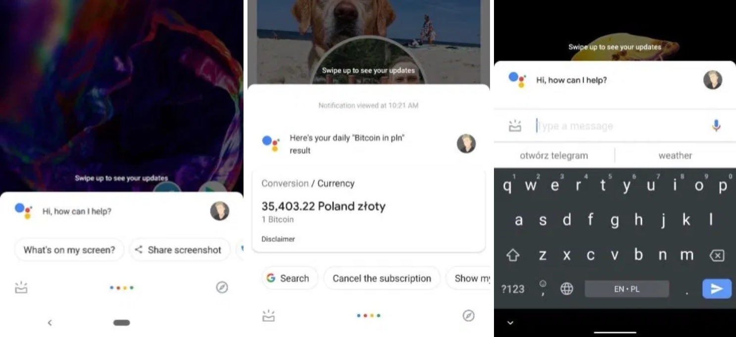
New Google Assistant UI on the Pixel 3
It isn't clear whether Google plans on offering the new Assistant UI to Pixel 2 users, but for now if you own a Pixel 3 or Pixel 3 XL and have the latest Google app beta installed, be on the lookout for the less obtrusive version of Google Assistant on your device.
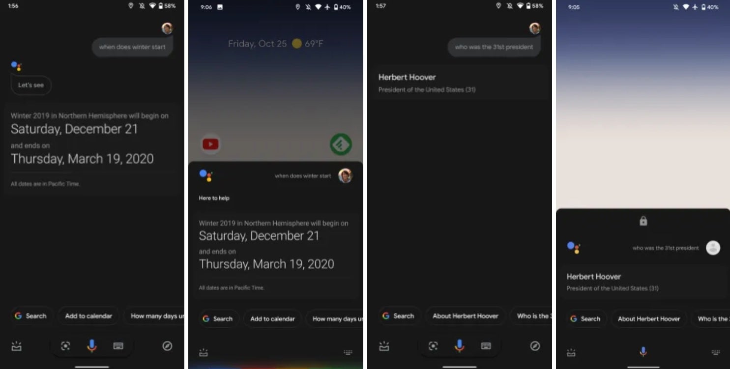
Comparing the older full-screen responses with the newer, shorter ones





Things that are NOT allowed: