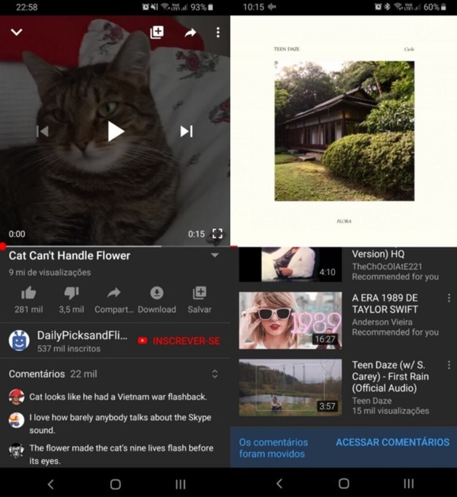
Google tests a new UI for the Android version of YouTube

YouTube is one of those apps, like Maps, Assistant and Duo, that Google is always trying to improve. Even the smallest of UI changes is considered for testing and this time the YouTube comments section is part of an A/B test according to Google. What Google is testing is the moving up of the comment section to a spot right below the video description. The idea is to make it easier for those watching a video to read and post comments on the video even while in the middle of viewing it.
Currently, to see the comments section, you have to scroll past the videos that are "Up next." The UI being tested will show you three featured comments right under the description of the video. Tapping on any of these three (even when the video is running) will bring up the complete comments section along with a prompt allowing users to join in the discussion. Scrolling past the "Up next" section, where the comments are located now, will show a note reminding those participating in the test that the comments section has moved to the top.
"We want to make it easier for people watching videos to find comments in the YouTube app without having to scroll through “Up Next” videos, so we’re testing out a new comment section that appears directly below the video. The new section will show up to 3 comments, with an option to view all comments while you continue to watch the video – just like you can today."-Google
The three comments that appear are based on how recent a comment is, or if the comment was pinned by the creator of a video (with some exceptions). Pinned comments with a link, consisting of more than 140 words or are self-promotional will not show up as one of the three featured comments with the new UI. When the user taps any of the three featured comments to show all comments, those that have been pinned will appear be on top when the section is expanded.
Google says that the new comments UI is being tested by a small percentage of users while it looks at the feedback it is receiving from those taking part in the test. A Reddit poster who is part of the test shared some screenshots showing the placement of the comment section on YouTube that Google is testing.

Google is testing a new UI for YouTube that moves the comment section right under the video description. Scrolling past the Up next section, where comments are now found, reveals a reminder that the comments section has moved to the top


Things that are NOT allowed: