Google names four apps as its 2018 Material Design Award winners
Google's Material Design language used on its apps helps to promote the Google brand by keeping the UI consistent across different platforms. Use of white spaces (so searing sometimes that a "Dark Theme" needs to be added to an app to keep users' retinas from melting), the four Google colors (Blue, Red, Yellow and Green) and Google Sans font are identifying traits of the current design being used by Google on its own apps like Gmail, Keep Notes, Calendar, Google Calendar, Assistant (see image at the top of this article) and more.
Every year Google hands out its Material Design Awards to those apps that make Google's design language "uniquely their own." Google has announced this year's award winning apps. The winners were picked from among hundreds of openly nominated apps, although just one winner has been announced from among four different categories: expression, innovation, experience, and adaptation. These apps will be honored tomorrow, November 1st, at Google's annual SPAN design conference.
The winning app in the category of expression is KptnCook, an app that offers healthy recipes. The design features a transparent top app bar and tapping on the Favorites icon takes users to an "image list" of saved recipes.
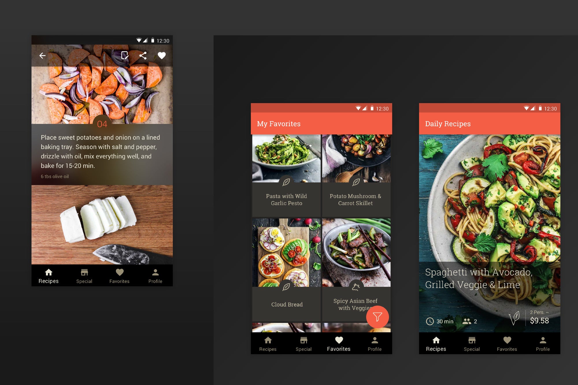
KptnCook, 2018 Material Design Award winner for expression
The innovation category was won by ride hailing app Lyft. The judges were impressed with the updated app's use of a Floating Action Button and Bottom Sheets (which show additional content attached to the bottom of the screen. The use of these Material components help the Lyft app optimize screen space.
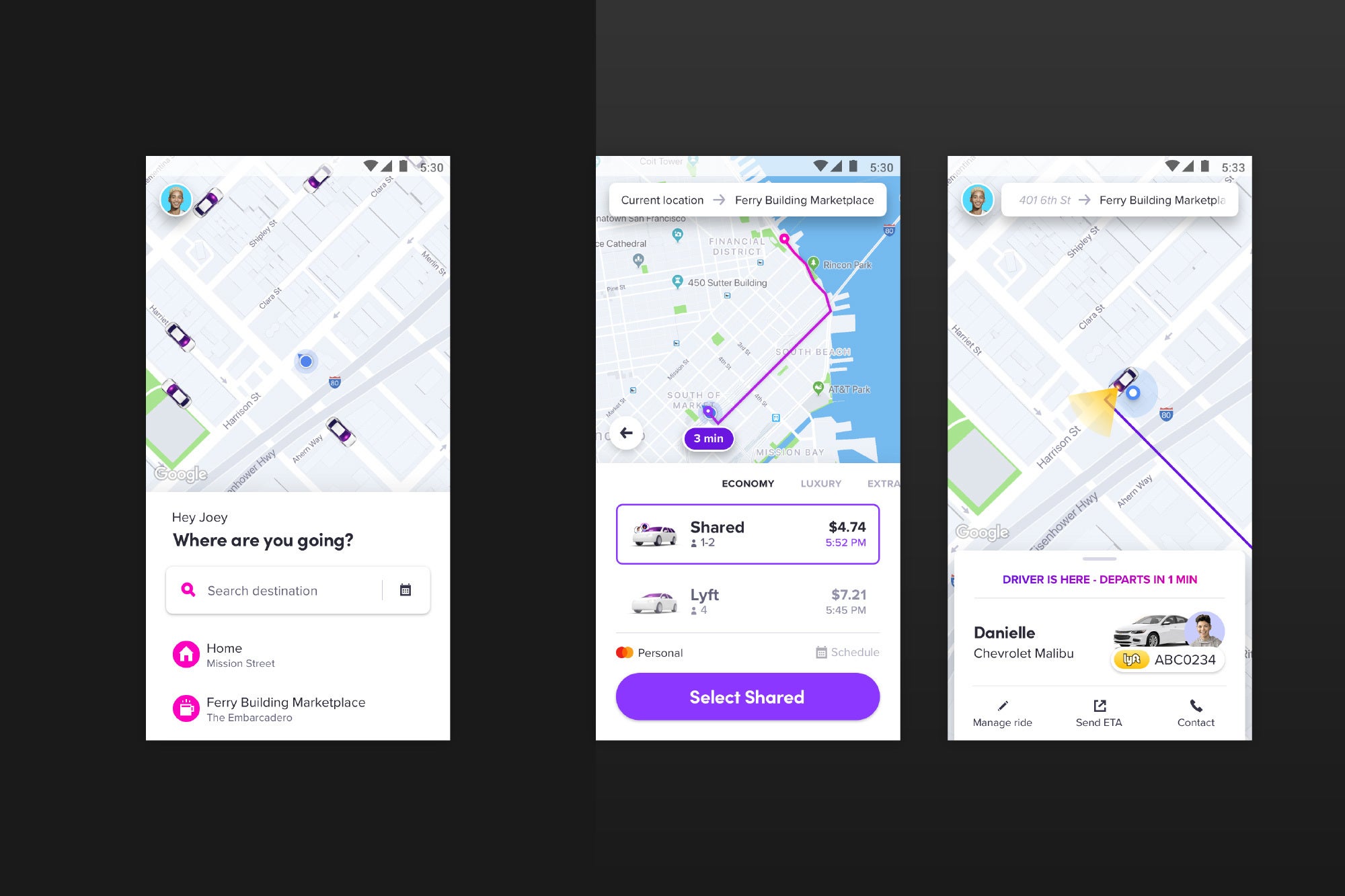
Lyft, 2018 Material Design Award winner for innovation
A Material Design Award is being given to the Simple Habit Meditation app for the experience category. The judges liked the color-coded image cards that help users navigate the app. They also noted the use of bottom navigation, branded typography and subtle motion cues. The app was also praised for how it employs a Dark Theme.
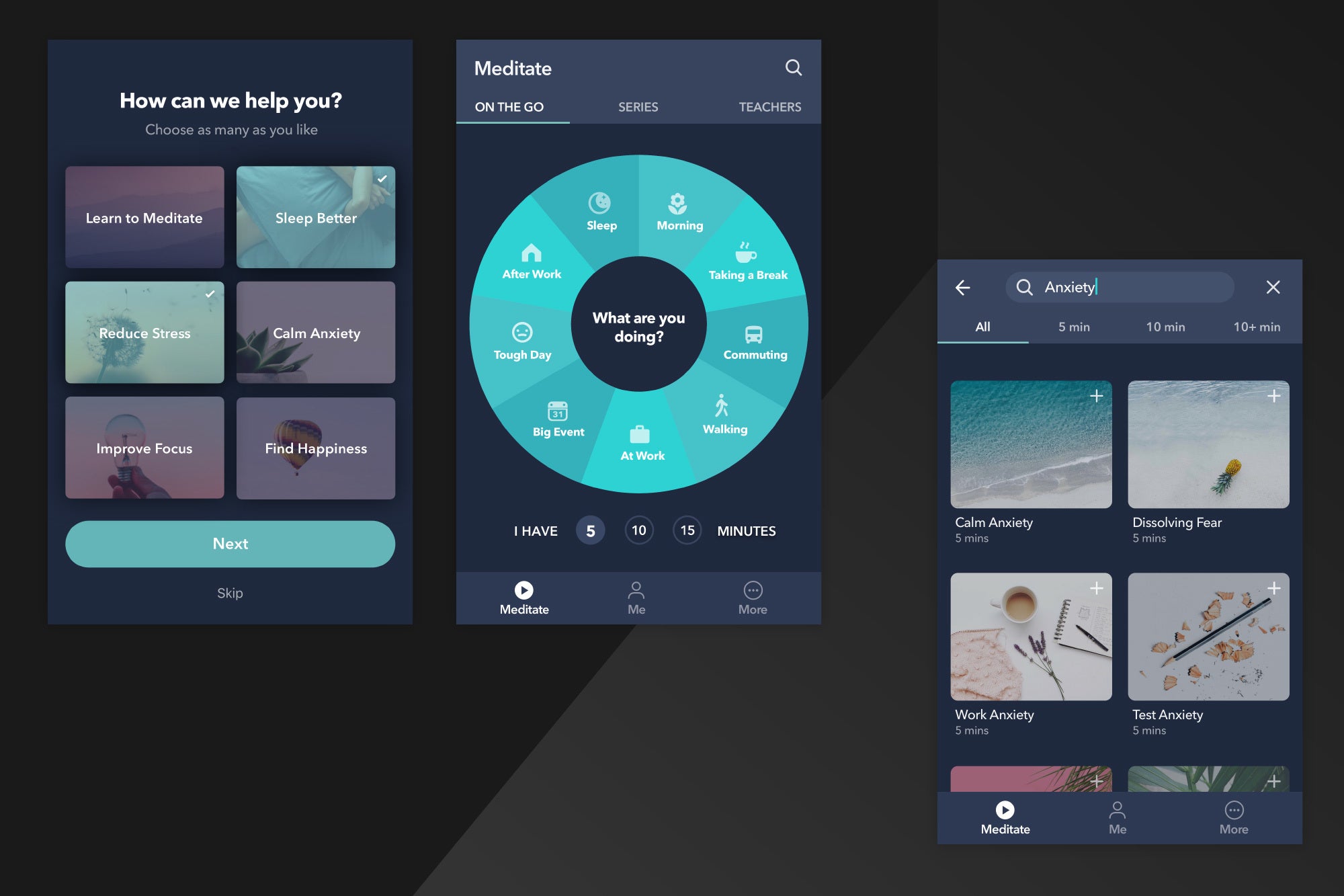
Simple Habit Meditation, 2018 Material Design Award winner for experience
The fourth and final category, for adaptation, was won by Anchor. This app helps users create their own podcasts and the judges noted the extended Floating Action Button on the bottom of the screen, and the use of animation. Choice chips, which allows users to make a single choice from a series of options, are used to help podcast producers align the text on their page.
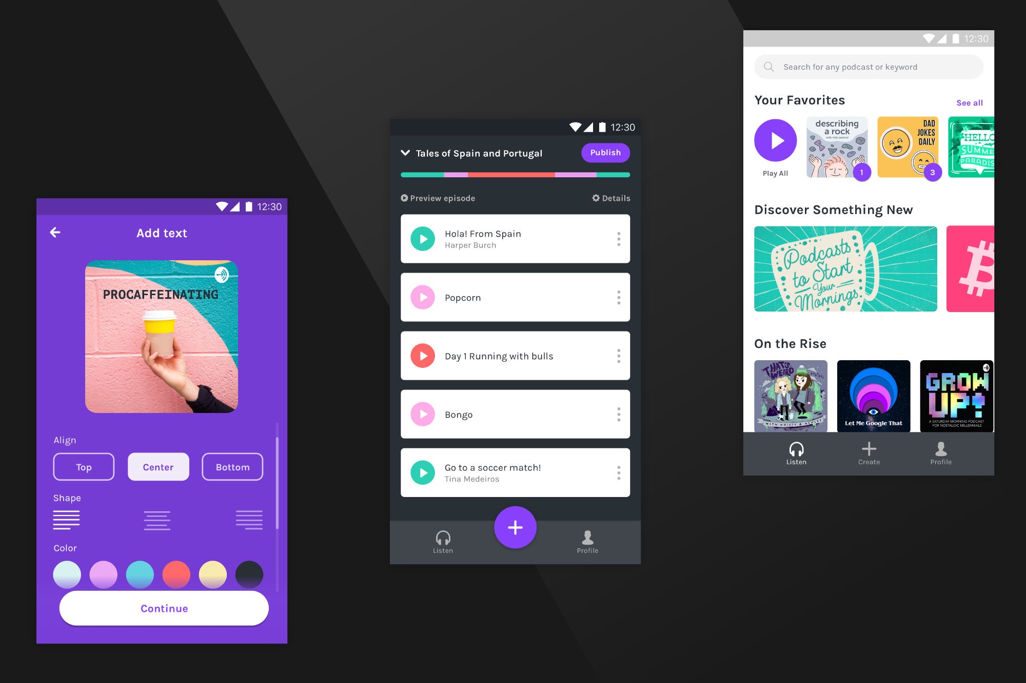
Anchor, 2018 Material Design Award winner for adaptation
The above quartet of apps are Google's Material Design Award winners for 2018. Congratulations to the developers and the designers of each app.




Things that are NOT allowed: