Google is testing UI changes for the Android powered YouTube app

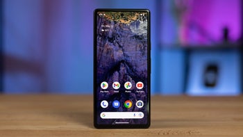
Google is apparently testing some changes to be implemented on the Android powered YouTube app. Instead of offering picture-in-a-picture, the new UI includes a "floating" bar on bottom that comes with options to play or pause. It also allows the user to close the app without having to swipe it away. This is the third UI change being tested this month for the Android version of the app; all three will apparently be added via a server-side update.
Besides the aforementioned change, another one shows snapshots from the video you're watching based on where you tap on the seek bar. This is a feature already on the web and iOS versions of YouTube. The other change is a new bottom navigation layout that offers links to Home, Trending, Subscriptions and Library. The button to upload videos has been moved to the left of the search bar, and the upper left now reads "YouTube" instead of the name of the tab you're using.
source: AndroidPolice
All of these changes are slowly turning the Android version of YouTube into the iOS model of the app. Whether you favor iOS or Android, it shouldn't matter because the ultimate goal is to have one app that looks and acts the same on all operating systems, with all of the features in the same place. This would make it easier to use YouTube no matter which platform is being employed at a particular moment.
source: AndroidPolice


Things that are NOT allowed: