Google explains how it created dark theme on three apps and Android Auto
A post put up today on the Google Design website shares how Google developed dark themes for three separate apps and Android Auto. The apps include Photos, Calendar, and News. Just in case you don't know what dark theme is, think of the typical smartphone display with black text on a white background. At night, or in a dark room, that white background can be murder on the eyes, especially with the Material Design used by Google on Android apps. The latter leaves large areas of white background that can be blinding or worse in the dark. With dark theme, the background and text are reversed to show white text on a back background.
Dark theme not only saves your eyes, but it can also save your battery life if you have a phone with an AMOLED screen. Unlike LCD panels, an AMOLED screen creates the color black by turning off pixels. Pixels that are turned off do not consume energy. Each of the three aforementioned apps required a different approach from Google for the implementation of a dark theme. For example, the Google Photos team had to take into consideration that the photos in the gallery represent the user's personal memories. So it used a "light touch" and took a "low-contrast approach" that respects an Android user's photographs. To allow the photos to stand out better, dark theme in the Photos app uses a dark gray background instead of a pure black. In the Photos app, Google says that dark theme creates a slideshow effect that is akin to turning off the lights to watch projection slides of a recent vacation.
Google had to implement dark theme differently for each of the four apps
Google had to adapt a wide range of colors to dark theme for the Google Calendar app. That's because the color scheme of Calendar can be customized with infinite color options. In addition, Google desaturated hues while still allowing a user to select from a wide range of colors. The result, as you can see, is a look with striking colors against a "charcoal gray" background. To enable dark theme on Calendar, tap the hamburger menu in the upper left corner of the screen. Tap on Settings > General and you'll see a section for "Theme." Tapping on that will give you three options: keep the light theme, turn on dark theme, or have the light theme on until the battery saver is enabled.
"Each of these products highlights key principles of Material’s dark theme—using smoky grays to reduce eye strain and pixel-bleed, desaturating colors while keeping their emotional resonance—but Material Design’s dark theme guidance goes even deeper. Explore recommendations on everything from creating shadowy elevation with multiple surfaces to adapting illustrations to feel more “nocturnal,” then get started designing and developing your own dark theme experience."-Google
Google News also features a dark theme. To turn it on, open the app and tap your avatar in the upper right side of the screen. Go to Settings > Dark Theme. You will then have the option of having Dark Theme always on, turned on automatically at night and when battery saver is on, turned on when battery saver is enabled, and always off. For this app, Google said that it had to concern itself with pixel bleed, which occurs when small white letters bleed into a dark background. As a result, the News app has the same deep gray background used on the Google Photos app. This allows headlines and images to stand out and makes it easier for users to read a complete story without any "vibrations."
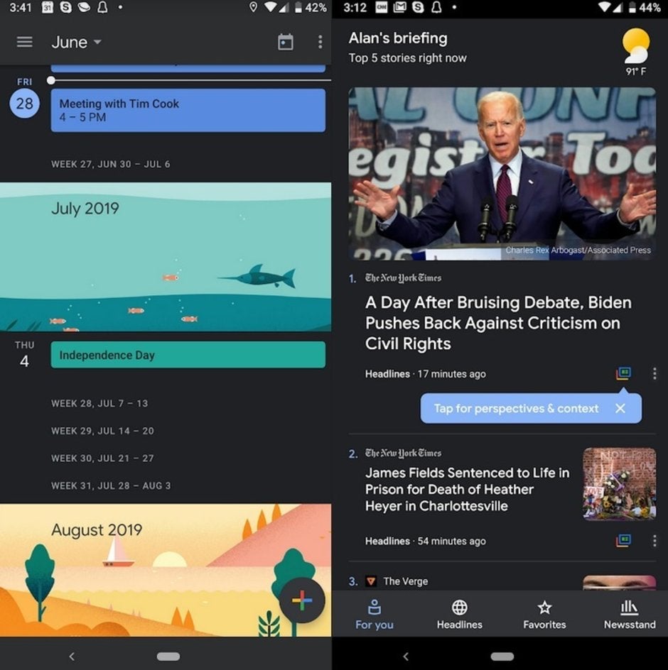
Dark theme in Google Calendar and Google News
In Android Auto, dark theme will stop drivers from being blinded by the glare created from a bright white background. Google decided to keep graphics simple instead of using the multiple layers found on other Android apps. This is done so that drivers don't have to keep swiping on the screen while trying to keep their eyes on the road.
In Android Q, users will have the option of enabling a system-wide dark theme. We should also point out that dark theme isn't just for use at night or in dark rooms; there are many users who just like the way it looks and have dark theme always turned on for certain apps.





Things that are NOT allowed: