Google Plus undergoes huge redesign

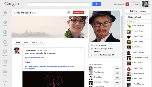
Google wants to make you use its own social network Google Plus and it’s now bringing a completely overhauled user interface, with panels you can drag and drop, and customize to your liking, to make you like it.
And this redesign gives some good reasons to look into Google+: it’s easier to share with your circles and the Hangouts video calling platform has been improved.
The biggest change you’d notice from the first sight is the “dynamic ribbon” on the left. Apps you don’t access much are hidden under the new “More” section.
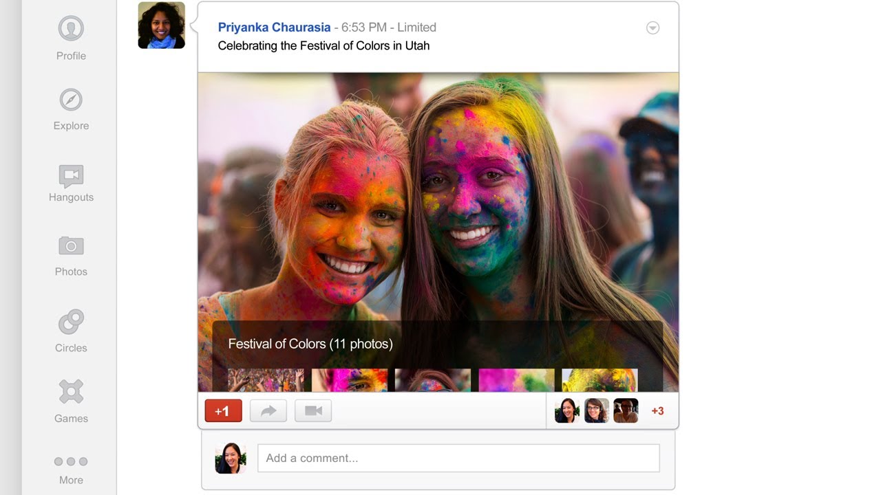
Galleries now support bigger photos and there’s more space for videos too, contributing to a better viewing experience.
Conversations are presented in cards and there’s a new activity drawer for talking to your circles. For Hangouts, you have a new page with recently updated chats, and public hangouts that you can join. Check out the new features in the videos below and let us know what you think in the comments.
Just keep on hitting the refresh button, the change should appear automatically soon.
source: Google












Things that are NOT allowed: