Android L is likely going to be released sometime within the next 6 weeks or so, and Google still has work to do in updating its own suite of apps for the Material Design changes on the way. An update hit recently for Hangouts and partially to Chrome a while back, and now we're seeing a leak for the Play Store redesign.
The Play Store content pages has already seen a visual update bringing it closer to the Material Design aesthetics, but it looks like version 5.0 of the Play Store is on the way, which will complete the update. As you can see in the images below (where the current design is on the left and the update is on the right), the update will be bringing color to the navigation tabs, making it blend in with the title bar. The colors themselves are getting slight changes with the Apps green, Music orange, and Books blue getting darker, and the Movies red and Newsstand blue getting lighter. The typography is also getting a bit bolder than before.
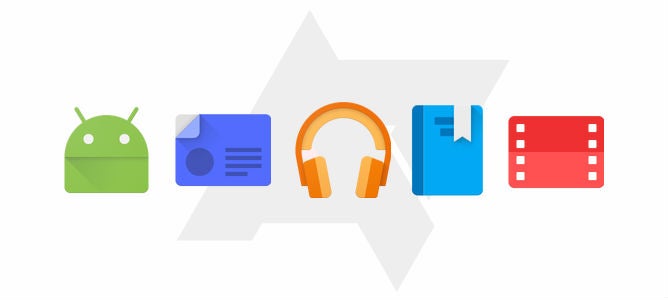
As you can see with the title image above, there are also changes coming to the app icons associated with the various sections of the Play Store. They are all flatter and look good, but we would say that the Newsstand icon doesn't really provide the easily inferred meaning that the others do. It kind of looks more like a radio than anything from the print world.
No word on when the update to the Google Play Store will be released, but it should be fairly soon.








Things that are NOT allowed: