Opinion: Google, please release a Pixel looking like that
This article may contain personal views and opinion from the author.
Okay, I admit: at first I was a bit put off by the radical new Pixel 6 renders. In fact, this piece initially carried a polar opposite title that shed a rather pessimistic light on the leaked Pixel 6/6 Pro design. But now, after I've contemplated things a bit, I'm absolutely convinced Google could knock it out off the park with this one and have come around to love the design language.
Granted that the real Pixel 6 and Pixel 6 Pro look anything close to the visualizations we've seen, Google's next flagships will both stand out from the competition, pay homage to some of their predecessors, and finally, turn around the bad aftertaste from some of the recent Pixel releases.
In a world of mostly similar flagships with large camera bumps that stick out, the Pixel 6/6 Pro has the potential to turn heads with its interesting design. The rectangular, edge-to-edge camera module sticks out both literally and figuratively, whereas the intriguing three-tone design of the back plate brings back memories to the panda-colored Pixel 2 series, which were one of the best-designed Pixels in my opinion. Don't let the large bump scare you off—I like that it's symmetrical and would eliminate wobble, and in the context of enormous camera islands, this one doesn't look too intimidating at all in my humble opinion. Not when we have monstrosities like the Xiaomi Mi 11 Ultra roaming the land.
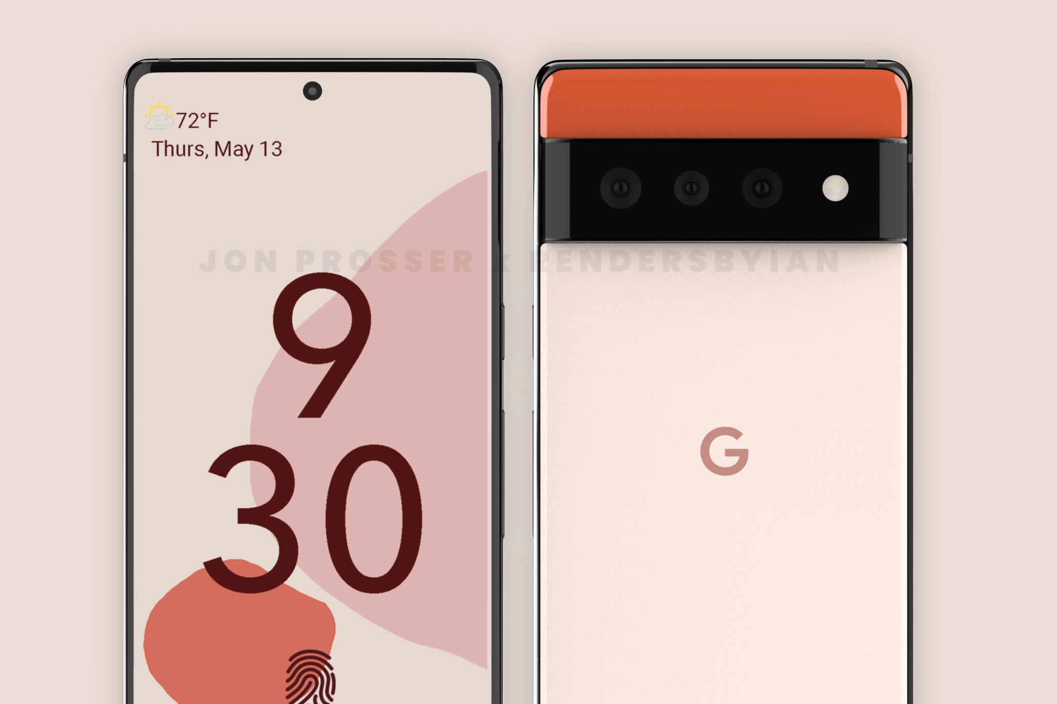
Google Pixel 6 Pro
What's more, the overall design looks quite similar to the Google Nexus 6P, the last generation of Nexus devices before the Pixel inception. It's a nice callback to the roots of Google's phone lineups and would definitely appeal to tech enthusiasts partial to the classic Pixel looks. But not only them—regular Joes would probably find the design friendly and appealing as well. So, it's a win-win situation that bids farewell to the forgettable design of the Pixel 4 and Pixel 5.
Finally, the exterior design of the Pixels looks pretty fitting of Android 12's overall looks. As a reminder, one of the new things that will arrive to Google's operating system are refreshed looks that will tone the whole interface in accordance to the wallpaper that the user sets. Such a quick theming feature has been absent from Android so far and would bode well with the Pixel 6 and 6 Pro's friendly looks.
All in all, these renders look hot, and while I understand why some of you might dislike the design at first, take a step back, take a look, and you might come around. Just like I did.
However, we shouldn't forget that we are merely talking rumors and renders here, and in spite of the endorsement of several leakers and insiders, these would remain leaks and rumors well until Google decides to unwrap its next devices officially. As much as I'd love for Google to release Pixels that look 100% to the renders pictured above, there's no way of telling if everything will be similar. There's a possibility we could hear about the new Pixels come Google I/O next week, though it's more likely to see the devices unveiled later this year. What's more probable is seeing the Pixel 5a unveiled next week. One way or another, make sure to check everything we know about the Pixel 6 and Pixel 6 Pro in our dedicated phone hub here.





Things that are NOT allowed: