Google Nexus 6 specs review
Design
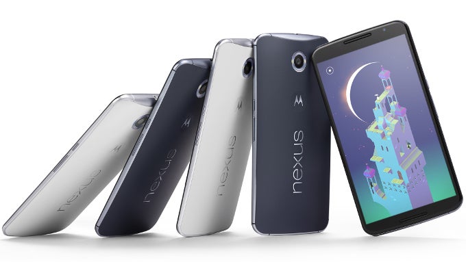
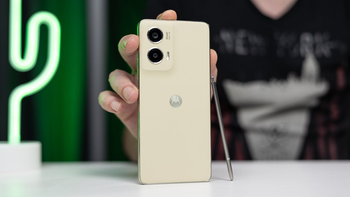
While we try to steer away from oversimplifications, to not point out that the Motorola Nexus 6 is essentially identical to its maker's other new flagship device, the Moto X 2014, would be to mislead you. Indeed, for the most part, you're looking at the same device -- the same soap-shaped body is in place, with its pleasantly-rounded rear and aluminum trim around the profile. Like the X, the Nexus phablet is also water resistant.
But there are differences between the Nexus 6 and the new Moto X, and the most obvious one is size. That's right, at 6.27 x 3.27 x 0.40 inches (159.26 x 82.98 x 10.06 mm), this is one of the biggest phones you'll come across, and it's also fairly heavy, at 6.49 oz (184 g) -- a true phablet, if we've ever seen one. Said otherwise, unless you're prepared to dedicate both your hands to the task of operating this device and have space other then your pocket to keep it, you might want to think twice before going for the Nexus 6.
Moving on, also different are the front-facing speakers of the new Nexus -- unlike the Moto X, we're now looking at a duo of true stereo speakers which should hopefully provide rich sound playback. Also different is the placement of the power button and volume rocker, both of which are only slightly off-center on the right, making them easy to reach on as big a device.
Display
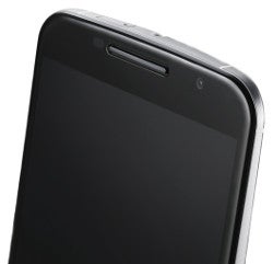
We're yet to get our hands on a Nexus 6 unit and get cracking with our scientific measurements, but if the Moto X is any reference, then we'd expect the phablet to show off similarly gaudy, overstated colors -- in line with most AMOLEDs currently on the market. Then again, if we consider the Nexus 5, which offered excellent, on-target color reproduction, then we might as well have our second phone with a color-correct, Quad HD AMOLED display this year (along with the Samsung Galaxy Note 4). Unlike the Note 4, however, the Nexus 6 won't offer a choice of color calibration profiles to users.
Interface
Even though older Nexus devices just might get Android 5.0 Lollipop over-the-air before the Nexus 6 ships out to consumers, that doesn't change the fact that the N6 is Google's designated device to showcase what new is on offer with the next major update -- and quite a bit is on offer. Undoubtedly, the most striking difference between KitKat and Lollipop is the transition to a new, flatter "Material Design" philosophy, which now calls the shots across a large number of Google's products and services. The interface in Android 5.0 is also far more colorful than in the past, with primary colors making a decisive appearance, not to mention that Google has worked hard to ensure that most all actions and operations one can carry out in Lollipop will provide rich animated feedback. This new theme has also been implemented with the usual stack of built-in apps, including the Dialer, E-mail, Clock, Calculator, Chrome, and many more.
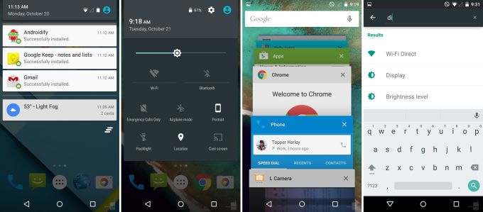
Also different are the software navigation keys that traditionally occupy the bottom-most part of your screen -- those are now shaped like a triangle (back), a circle (home), and a square (recent apps). Speaking of recent apps, the multitasking menu has changed in terms of its design -- instead of running apps being separated with their own window, those are now stacked together, making it harder to tell what's going on. It boils down to personal preference, of course, but we can't say we've got the hots for this particular 'improvement'.
The way notifications are handled has also changed -- specifically in terms of the lockscreen, which will now give you at-a-glance summary of what you missed. What's more, notifications on your lockscreen are actionable, so you can either jump right into the respective app, or perform actions right from the lockscreen. Other stand-out new features include support for different users, a battery saving profile (finally!), and the ability to quickly search for particular options right inside the Settings menu.
Last but not least, this being a Nexus device, you can expect to be among the first people on the planet to get the updates that will certainly follow Lollipop -- from the incremental to the major ones.
Processor and memory

Also on board is an improved Adredno 420 GPU, which Qualcomm promises will bridge the gap between mobile and console-grade graphics thanks to its expanded feature set, which now includes support for hardware tessellation (the implications of which can be seen on the right) and geometry shaders. According to the chip maker, the Adreno 420 provides up to 40% better performance while also being 20% more power-efficient than the Adreno 330 in the Snapdragon 800.
On the memory side of things, the Google/Motorola duo has been quite generous with the amount of RAM we get -- 3GB. As for native storage, we're looking at just two options -- 32GB and 64GB. Unfortunately, neither of these offers storage expansion through a microSD card, which has become something of a statement with the Nexus line.
Camera
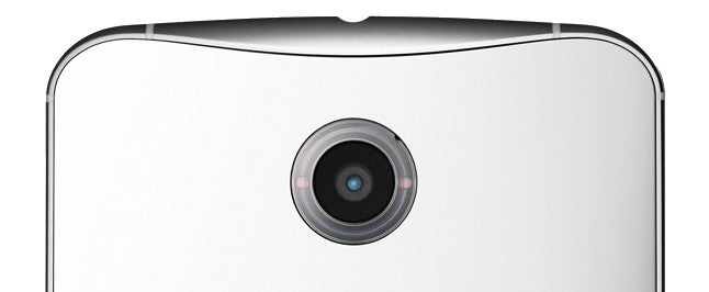
On the camera front, the Nexus 6 is destined to amount to quite a bit, though we nevertheless have some reservations considering the line's not-so-stellar history with imaging. In any case, we're looking at an impressive configuration on paper, with a 13-megapixel, 1/3.06'' stacked Sony IMX214 (Exmor RS) sensor with 1.1-micron pixels, wide f/2.0 lens, and a dual LED ring flash. Like the Nexus 5, the entire setup is also optically stabilized, which should theoretically help with compensating for hand shake and tremor during video capture and also allow for lower shutter speeds in low-light environments without causing blur (and thus, brighter photos). The camera is also taking advantage of the improved ISP on board the Snapdragon 805 processor, which improves performance in several areas (in a nutshell: expect very low wait times when snapping photos).
The shooter should also prove fairly versatile, with several stand-out features, including 4K UHD video capture, HDR+, high resolution panoramas, Photo Spheres (360-degree panoramic shots), and Lens Blur (for a software-induced, fake bokeh effect) making themselves available.
As for the front-facing camera, we're looking at a 2-megapixel selfie snapper, capable of 720p video capture.
Battery
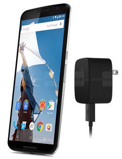
At this point in time, however, the only stats we have are the official ones provided by Google. According to the figures, talk time sits at 24 hours (network not specified), with 9.5 hours of browsing time on Wi-Fi and 10 hours on LTE. Lastly, the Nexus 6 is rated as good for up to 10 hours of video playback. We are also told to expect quick charging with the Nexus 6 (so long as the battery is low) thanks to the included Motorola Turbo Charger.
Expectations
In conclusion, we can definitely say that Google is counteracting the hike in the price of the Nexus 6 by throwing as much bleeding-edge hardware as possible. We're looking at a device with very few compromises from a specs stand-point, and that should sit well with the Android-faithful and specs junkies alike. Obviously, while it'll be hard for some to shake off the feeling that they suddenly have to overpay for the privilege of getting a Nexus device, it must be made clear that it's still going to be somewhat cheaper than most competing flagship, so you're definitely getting your money's worth. But here's the catch -- the Nexus 6 is not for everybody.
Indeed, with its 6-inch diagonal, this enormous phablet will turn off a bunch of people, and many will question Google's reasoning behind releasing as massive a smartphone. We can't know for sure, of course, but our guess would be that Google simply wants to demonstrate the wealth of form factors available within the Android ecosystem -- especially since making money off the Nexus line hasn't seemed like Google's main goal for a while now. And while this means that the Nexus 6 will necessarily alienate a part of the core Nexus followership, it does also mean that a select niche will finally have exactly what they're looking for -- Android,as was intended by Google, on an immersive, giant screen.








Things that are NOT allowed: