Google adds a COVID-19 layer to Google Maps
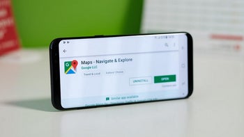
Google continues to work on improving Google Maps and on Wednesday a "COVID-19 layer" started rolling out. With this layer, users can see areas where the virus is spreading and it is coded by color based on the number of people with the coronavirus in each region. The layer produces these color codes based on the seven-day average for the number of new COVID-19 cases per 100,000 people and even reveals whether the number of cases is trending higher or lower.
In a blog post published yesterday, Google said that over a billion people rely on Google Maps to help them safely get from point "A" to point "B." And that includes safely navigating around the virus by using the COVID-19 layer. As Google says, "This week, we’re introducing the COVID layer in Maps, a tool that shows critical information about COVID-19 cases in an area so you can make more informed decisions about where to go and what to do."
When you open Google Maps, tap on the layers button in the upper right corner of the screen and click on "COVID-19 info." You will then see the seven-day average of new COVID cases per 100,000 people for the area of the map you're looking at. The color-coding also reveals the density of new cases in the area. The COVID-19 layer starts rolling out on iOS and Android phones this week.
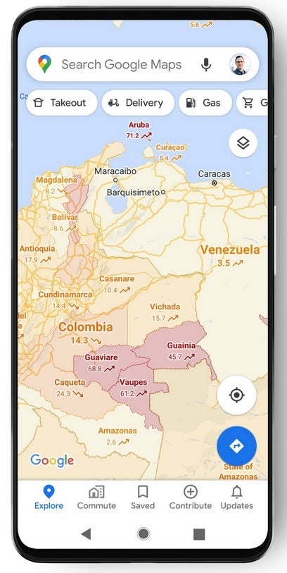
Google Maps is launching its COVID-19 layer this week
The source of the data that you'll see comes from legitimate places such as Johns Hopkins, the New York Times, and Wikipedia. Those places get their info from the World Health Organization, state and local health agencies, government organizations, and hospitals. And while consumers can get the same info through Google Search, they can also obtain it from Google Maps. As Google says, "While getting around is more complicated these days, our hope is that these Google Maps features will help you get where you need to be as safely and efficiently as possible."






Things that are NOT allowed: