Material Theme design begins rolling out to Google Drive for Android and iOS
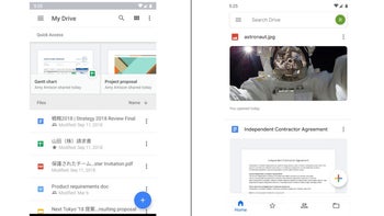
Google is bringing its Material Theme design to additional core mobile apps. This time, the search giant is updating Drive with significant visual changes that should make the app more streamlined when it comes to navigation and design language.
But Material Theme doesn't mean just new colors and icons, but also a new layout. Four new sections are now part of the Google Drive app, while the “My Drive” view of folders is located to the right side in the Files tab, 9to5Google reports.
Home, Starred and Shared are the other three tabs that are part of the new layout. Just like the other G Suite apps that received the Material Theme design, there's a FAB in the bottom right that you can use to create new Google Docs, Sheets, and Slides.
There's also a new hamburger menu that will allow you to open the navigation drawer, as well as an account switcher on the right. Apparently, the new Material Theme design will be rolling out to iOS users today, while Android users will receive the update at the beginning of the next week.
But Material Theme doesn't mean just new colors and icons, but also a new layout. Four new sections are now part of the Google Drive app, while the “My Drive” view of folders is located to the right side in the Files tab, 9to5Google reports.
There's also a new hamburger menu that will allow you to open the navigation drawer, as well as an account switcher on the right. Apparently, the new Material Theme design will be rolling out to iOS users today, while Android users will receive the update at the beginning of the next week.









Things that are NOT allowed: