Google Contacts update brings revamped UI and features from the web version
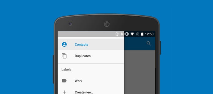
Google Contacts v1.5 ditches the familiar “Favorites” and “All” tabs for a slide-out side menu, that is both sleeker-looking and richer in features. Within it are nested options for viewing duplicate contacts, creating and managing labels, and quickly changing between multiple synced accounts. Settings, once found in the three dots drop-down menu in the upper right-hand corner of the screen, has also found its place in the new hamburger hub.
Since the “Favorites” tab is gone, starred entries are now displayed at the top of the contacts list, followed by all others in alphabetical order. Strangely enough, the scrollbar has been almost completely flushed with the side of the screen, and can't be held and dragged for quickly jumping between letters.
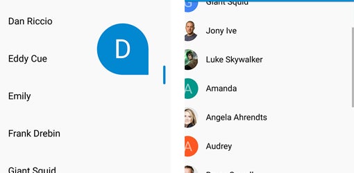
The scrollbar has changed in Google Contacts 1.5, and not necessarily for the better
If you'd like to check out the new version of Google Contacts before it hits the Play Store officially, use the verified source below to download the APK and install it on your device.
Google Contacts v1.5 vs 1.4 and older (left - old; right - new)
via Android Police
Follow us on Google News






Things that are NOT allowed:
To help keep our community safe and free from spam, we apply temporary limits to newly created accounts: