In Android P, Google Chrome may hug the notch
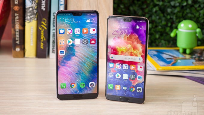
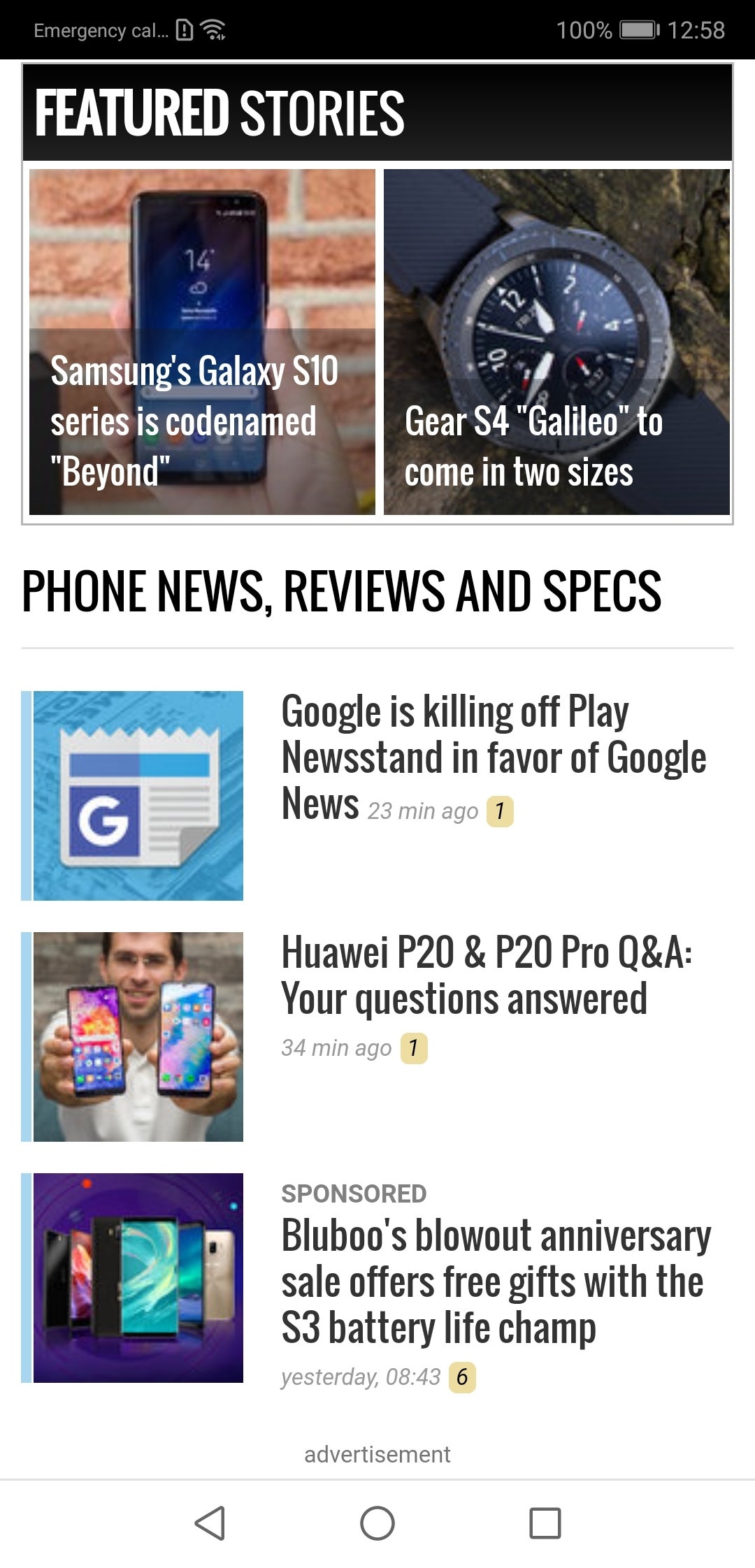
Chrome could use some notch-y optimization, says the P20
LG, Huawei, OnePlus, Oppo, and plenty of other less known Android warriors already issued, or are reported to have phones in the works that flaunt a top bezel cutout to house the front camera, earpiece and other paraphernalia, in an Essential Phone, or, the more likely inspiration - an iPhone X notch style. Copycat legalities aside, the "notch" allows a manufacturer to boast extremely high screen-to-body ratios. The iPhone X's 82.35%, ratio, however, is lower than on the Galaxy S9, which sports an oldfashioned uninterrupted, but very thin top bezel, returning 84.36%, which only gives way to the Essential Phone's 84.85% with its most minimalistic of notches.
The Notch and the Horns. While that may sound like the name of an English pub, the horns on the two sides of the notch can actually serve a purpose with their active screen area, believe it or not, and we don't mean simply showing the battery icon or network status. We are very curious to see how mobile Chrome may extend visible area and functionality into the horns of the P20 or the LG G7, though.
Does that mean the address bar will be moved at the bottom, like Google's recent Chrome Home experiments hinted at? It might all be revealed as soon as next week at the Google I/O conference.

source: Chromium
Follow us on Google News





Things that are NOT allowed:
To help keep our community safe and free from spam, we apply temporary limits to newly created accounts: