Here's why Google added gesture navigation in Android Q (not because everyone else has it)
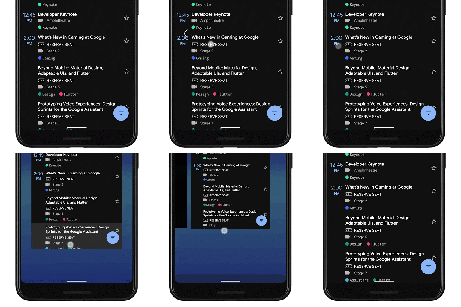
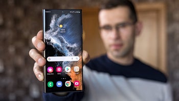
Samsung is a bit handicapped when it comes to navigation gestures, as the sides of its curved OLED displays are doing their People Edge or other duties, so busting a move from there is a toughie. It already has a pull-down and swipe-up gestures on an empty screen area to bring the notification shade from the clouds or open the app drawer, therefore the only side left for a new navigation party, is the very bottom. You can, however, download its app that adds side gestures and much more.
Samsung's Good Lock app that lets you sideload features and options to the interface now allows you to enrich the Galaxy S10 or Note 10 gesture systems. Dubbed One Hand Operation +, the plugin can assign side-swiping gestures to do a variety of things, including to serve as your back key, too. All in all, that makes the top-tier phone makers all on board the gesture train now.
Google, of course, didn't point this as the main reason it caught up, or that gestures have already been proven incommensurately more comfortable and ergonomic to perform than stretch all the way down on a 6"+ phone to hit a small triangle or arrow at the bottom of the phone. It's because... wait for it... they make the screen larger:
By moving to a gesture model for system navigation, we can provide more of the screen to apps to enable a more immersive experience.
That's not all there is to it, of course, as, Google being Google, they ran the numbers and are supplying the tests behind the choice for adding gesture navigation to the usual three-button strip option at the bottom. Ultimately, they concluded that "gestures can be a faster, more natural and ergonomic way to navigate your phone," and, "gestures are more intentional than software buttons that you might trigger just by grabbing your phone." Sherlock level deductions right there.
We kid, as Google posted the following charts and graphs to illustrate why gestures are a better idea than virtual or physical buttons. First off, here is the heatmap that shows the reachability of left and right thumbs when you are holding your big-screen phones with one hand.
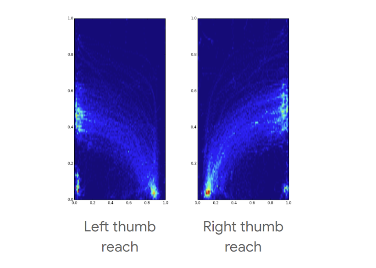
As you can see, not much wiggle room here, and we can't fathom why it took manufacturers years to figure out that the decade-old navigation buttons - on or off screen - system, had reached beyond its shelf life as soon as phones went beyond four or five inch screen diagonals. Better late than never, though, and Google has the charts to prove why it went with the gestures it went with - because multiple tests showed that's what users prefer, leaving the smallest subset of them uncomfortable with the change, as should be the case with any drastic measure.
Google ran the numbers, and gestures won the Android Q navigation paradigm
Another fascinating tidbit is the research on wrong swipes or the break-in period of users adjusting to the new way of doing things around Android, and here's the final conclusion that Google reached:
Because it’s never a goal to change out behavior on users, we tried several ways to enable users to distinguish the drawer gesture from the Back gesture. However, all these paths led to users pulling in the drawer when they were trying to go Back and having less confidence that Back would work.
Beyond drawers, gestures are a big change for people and it took on average 1-3 days to adapt - in particular, users struggled with patterns like swiping right or left on a carousel and triggering Back.
In qualitative studies, we found that after an initial break-in period of 1-3 days, users became fluent and could consistently distinguish between these two gestures. The majority of users did not want to switch back to 3 button nav (even though that remains an option).
Additional research showed that there is a clear adjustment phase for users to get used to a new system navigation (across many different navigations). In our Q model, we found that usage of Back goes down for the first 1-3 days. After that period, the average # of Back presses/day ends up being the same as 3-button and our P navigation.
We can't say if Google was wise to put so much energy in this kind of research, seeing as Chinese phone makers and most others, have already implemented them beforehand and they have proved popular in the wild but in the end we are glad that gestures won the day on a system level. Are you?
Will you set Google's new Android gesture navigation as default?
Yes, bottom navigation and one-handed usage don't mix well indeed
48.15%
I'll give it a try to see if gestures work out for me
40.56%
I prefer the old on- or off-screen button ways
11.3%
Follow us on Google News






Things that are NOT allowed:
To help keep our community safe and free from spam, we apply temporary limits to newly created accounts: