Google tests Play Store settings redesign

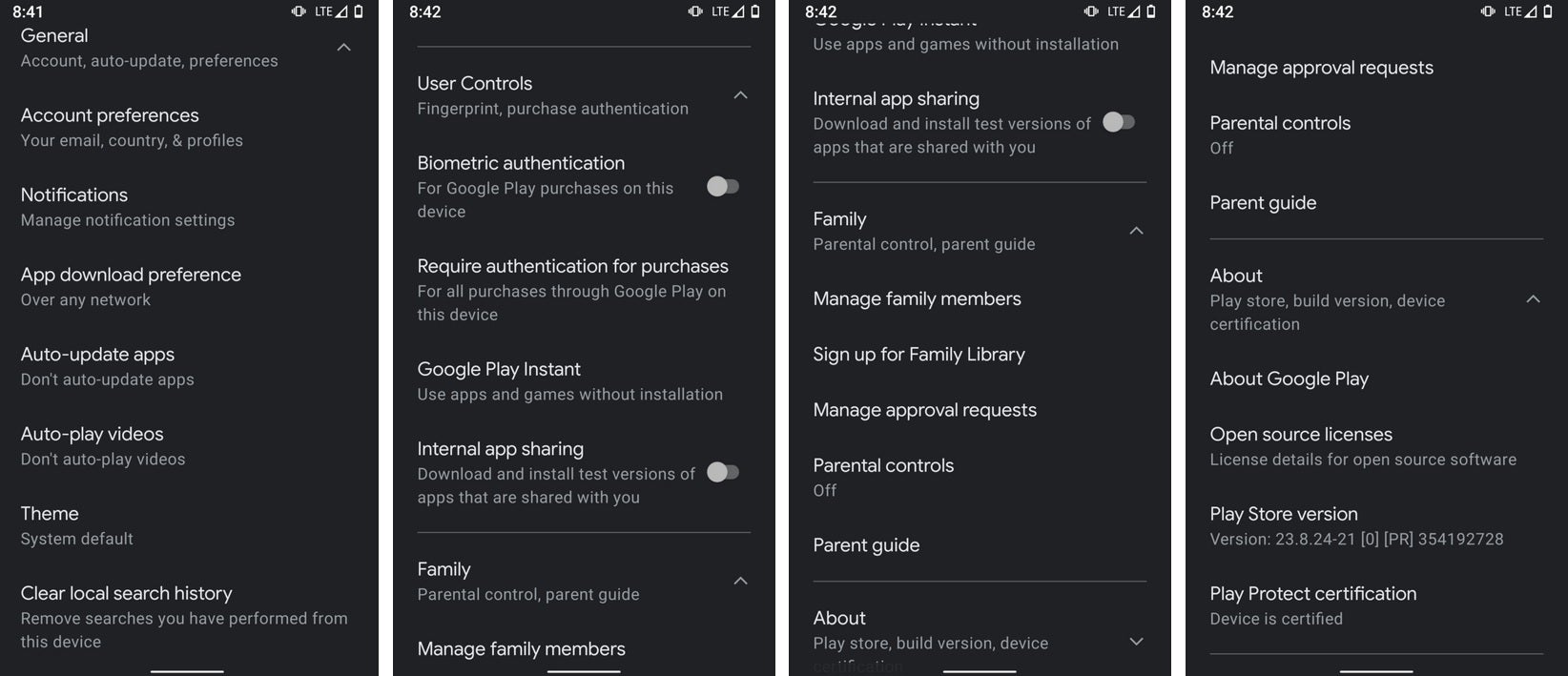
According to AndroidPolice, Google is running an A/B test on the Play Store. There is already some minor work going on that moves the contents of the hamburger menu to the account switcher. But based on screenshots obtained by AndroidPolice, Google is also working on the app's settings page with the goal of making it easier to use. The new settings page is divided into four sub-menus: General, User Controls, Family, and About.
All four can be expanded by tapping on the downward-pointing arrow near each category. Of the four sections, the only new one is Family which will feature a new Parental Guide link and the Parental controls feature found now in User Controls. Also, the Family section from the hamburger menu will be found there as well. So yeah, most family related entries are moved to the new Family section.

Screenshot shows update that Google is testing for the Play Store
The bottom line is a cleaner settings page which, as we mentioned above, makes things easier to use. Still, if you count the number of taps it takes to get you where you want to go, you might need to count an extra one. But once you get to the category you need, finding the exact listing will be faster; the combination could still save you some time.
If you're hoping to see this test on your Android phone, you have a better shot at winning the lotto. Not only don't we know how widely Google is testing this, but it is a server-side update which means that you can not enable it; it's all up to the whim of Google. And of course, if the testing doesn't meet Google's hopes, the entire update can be scrapped and never meet the light of day.


Things that are NOT allowed: