Galaxy S8 vs $2000 mirrorless camera and DSLR: Ultimate camera face-off
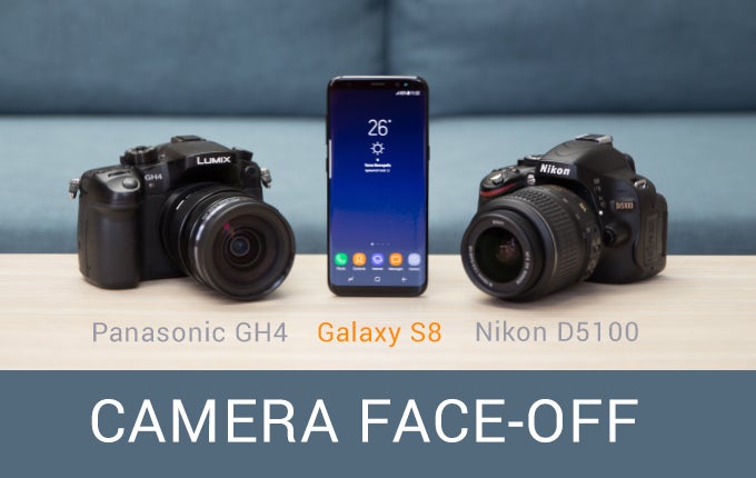
For the purpose of this comparison, we'll be using the following gear:
- Samsung Galaxy S8 – stock camera app, on “Auto”, with HDR turned off for consistent results
- Panasonic GH4 equipped with an Olympus Zuiko 12-40mm f/2.8 lens
- Nikon D5100 equipped with a Nikkor 18-55mm f/3.5 kit lens
We will be shooting in aperture priority mode on both cameras, with the aperture wide open, and let the cameras adjust shutter speed and ISO automatically. White balance will be set to auto on all devices. The Olympus Zuiko lens is a sharp one, while D5100's kit lens is not the cream of the crop — it's a kit lens, after all — but it should do good to represent the other side of the spectrum.
With all this out of the way, let's cut straight to the chase:
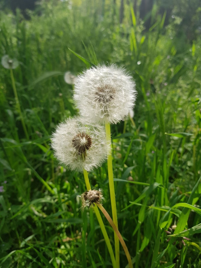
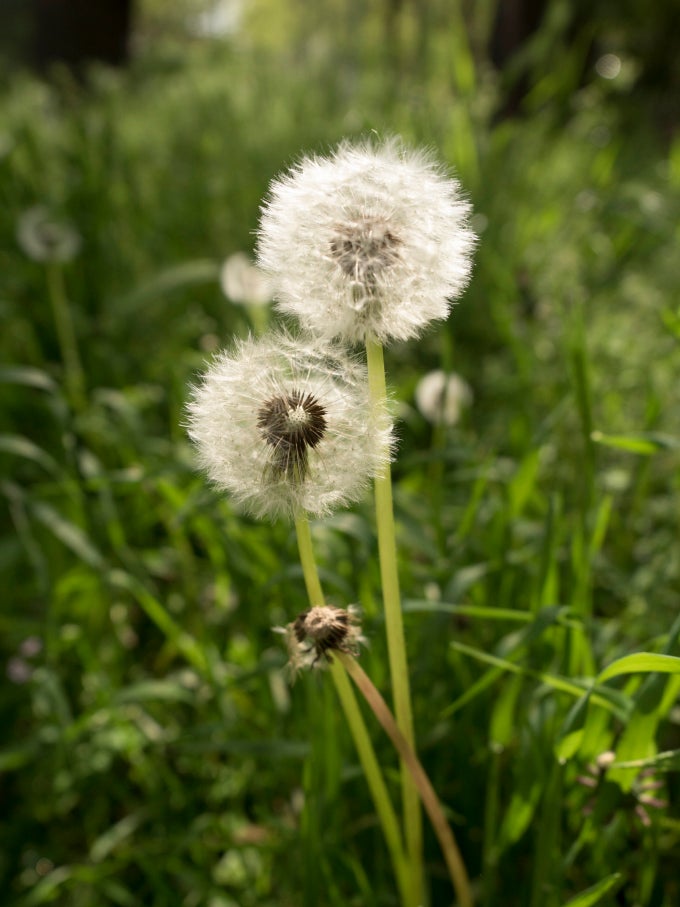
Scene 1: Dandelions up close
Full-size images:
If there's one thing smartphone cameras are particularly good at, it's close-ups. For this scene, I refrained from using Samsung's “Selective Focus” feature, which creates an illusion of a shallower depth of field, but it still managed to blur out the background nicely.
Anyway, the Galaxy S8, like its predecessors, is no stranger to oversaturation and excessive sharpening. This scene is a perfect example of both these “vices” acting full force. The greens are just too much, while the dandelions' florets have undergone unnecessary sharpening. This is not to say that these two traits of the S8's camera and software can't lead to good results, however. Quite the opposite, in fact.
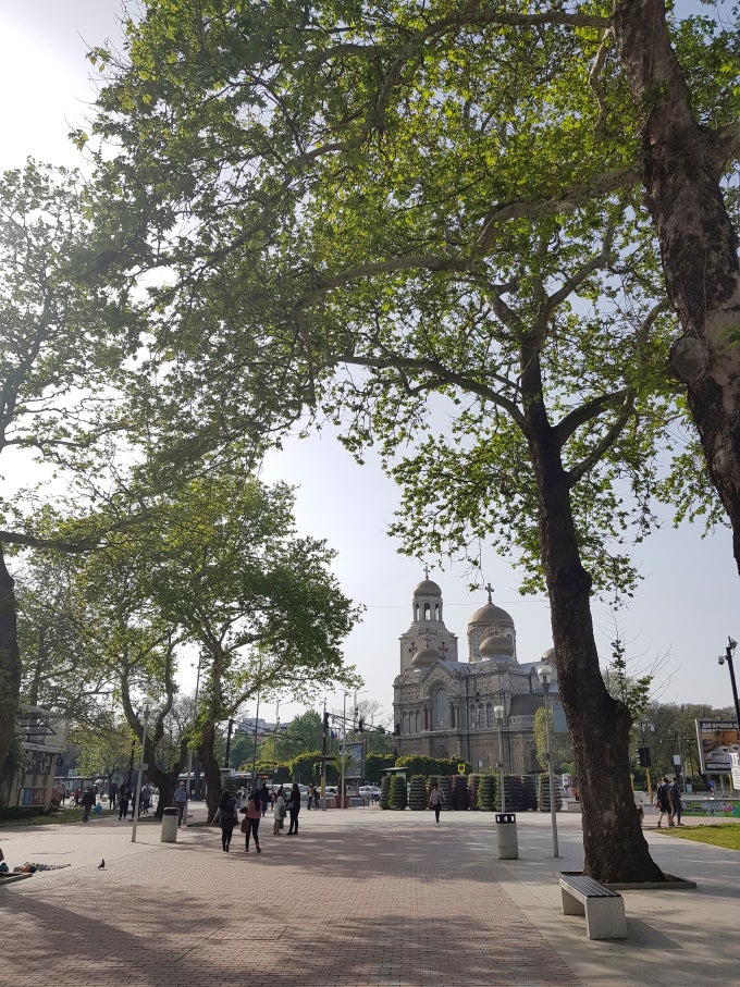
Scene 2: The cathedral
Full-size images:
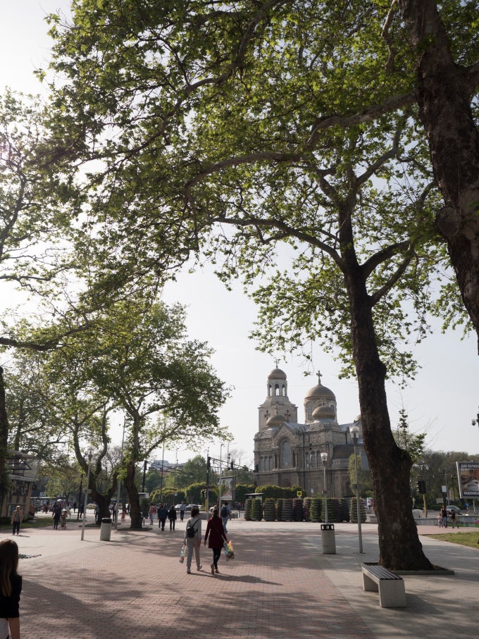
Flat light – one of the worst enemies of a good photo. Barren skies, little to no contrast. But it is something that you'll face very often when taking pictures, so it's worth examining how the cameras compare in this situation.
And this is where the above-mentioned “shortcomings” of the Galaxy S8 actually lead to a better shot. Not only does the S8 photo have more detail in the shadows, but the higher overall sharpness of the image really brings out the intricate details on the cathedral's facade, which is the point of interest in this photo. Further, the S8 has managed to pull out some blues from the dull sky, without going overboard on saturation, while the GH4 has not.
Scene 3: Details, details...
Full-size images:
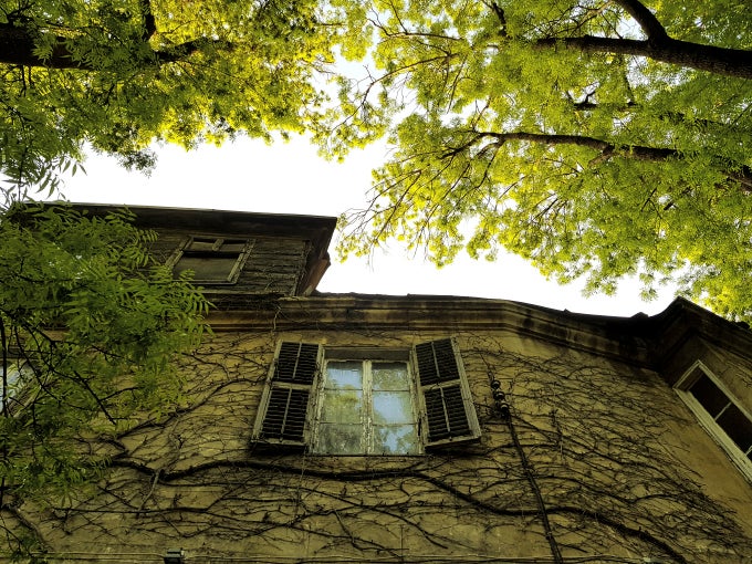
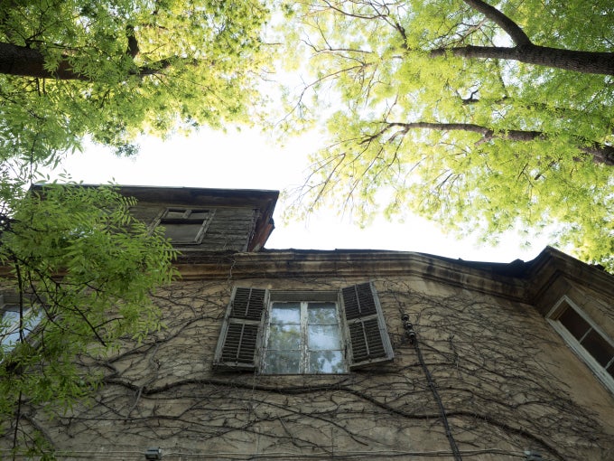
Saw this dilapidated house with vines crawling up its walls in the old town, thought it would be a good candidate for a shot with so much going on its facade and above. I feel like the Galaxy S8 has done a better job at capturing the detail in the leaves above the house, whereas the GH4 has muddled things up quite a bit in this area. On the other hand, the colors in the S8 shot are way too warm. This is also something typical for Galaxy cameras, and in this case, it's doing the picture a disservice.
Scene 4: Bike lane
Full-size images:
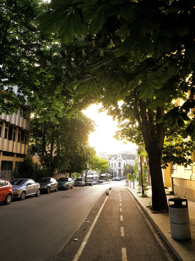
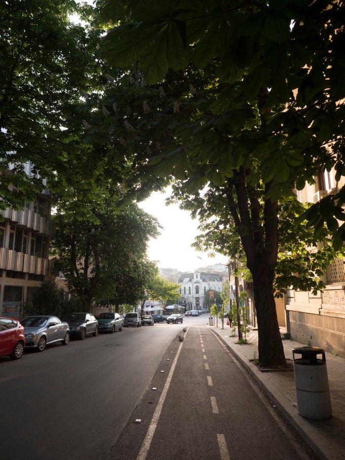
This scene struck me as a good opportunity to test how the S8 fares when shooting against the light. I kept my expectations in check, but was very pleasantly surprised by the results. In fact, the Galaxy S8 photo, in my opinion, is a better representation of the scene as it appeared to me when I was there.
The warm light coming through the trees is one of the things that made an impression and the S8 photo makes me think “that was a nice moment”, while the GH4 shot makes me think “oh yeah, I remember what the scene looked like. Too bad the photo doesn't represent it all that well.” It's just too cold, because the camera tried its hardest to compensate for the warmness of the light.
Scene 5: Graffiti
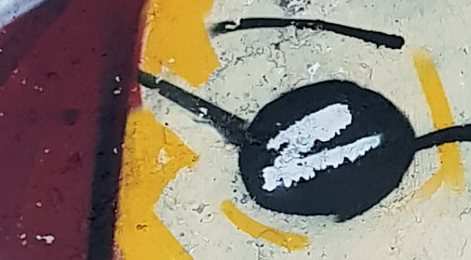
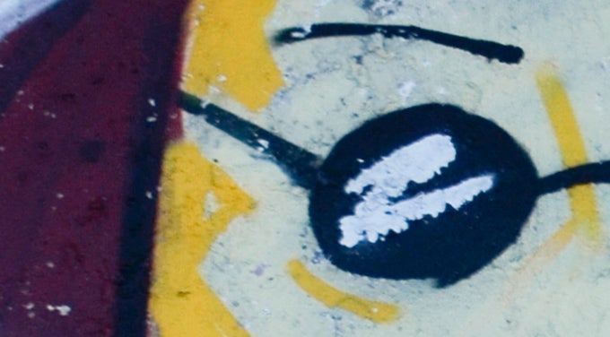
A scene that's both rich in detail and color. The Galaxy S8 absolutely trumps the aging Nikon D5100 in this face-off, delivering more detail and more accurate, pleasant colors. The Nikon is too cold and suffers from a slight loss of detail. The Galaxy S8 photo has some much-welcome “pop” to it, and even when scaled up to fit in the Nikon shot, it still looks decisively sharper.
S8 photo enlarged to fit over D5100 shot
Scene 6: Subway drama
On my way to the port, I went through an underpass and thought it would be a good place for some contre-jour action. It also offered an occasion to shoot in black and white. For this scene, I quickly switched to the “Classic” filter on the Galaxy S8 and to “Night vision” on the D5100. I wasn't able to match both shots perfectly, but it isn't exactly easy taking two identical photos on two different cameras while you and your subject are moving. Still, this one is on me.
In this situation, the Nikon aims for a neutral response curve, so as to capture as much information as possible across the shadows and highlights, which leaves us with a flatter image that begs to be enhanced in post. This is what a dedicated camera should strive to do, in all honesty. However, while trying to expose for the dark silhouette, the Galaxy S8 blows out the highlights and produces a dramatic image that's high in contrast, with little to no data preserved in the shadows and highlights. The S8 photo is not better, technically speaking, although it is visually more interesting than the more mundane-looking DSLR shot.
Scene 7: Legally parked
Full-size images:
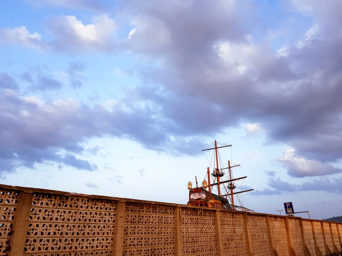
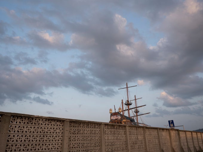
With the sun hanging low at this point, the light is nice and warm.
The S8 photo came out saturated and high in contrast. The highlights in the sky are likely clipped, and yet, looking at it now, I feel it is a better representation, albeit an exaggerated one, of this scene.
Scene 8: The lighthouse
Low-light territory
Full-size images:
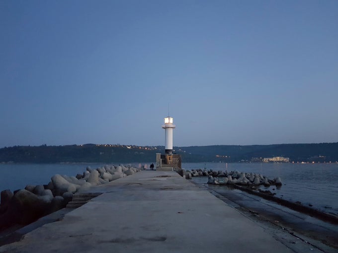
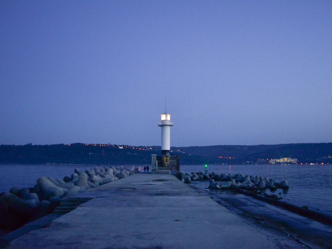
The S8 photo looks cleaner as a whole, but it also suffers from a loss of detail in some areas. For this scene, the S8 chose an ISO of 640 and a shutter speed of 1/10, while the Nikon had to bring the ISO all the way up to 1250 to shoot at the same shutter speed, due to the smaller aperture.
The lower ISO on the S8, combined with the noise reduction algorithms on board, keeps things noise-free, but it also results in loss of detail in some areas of the picture. For example, the railing of the lighthouse has been all but erased in the process, and the same can be said bout the water – it looks flatter with most all ripples gone. However, other parts of the image have been spared and even look better in the S8 photo. An example for this are the stone base of the lighthouse and the graffiti on the wave breakers.
Scene 9: At bay
Full-size images:
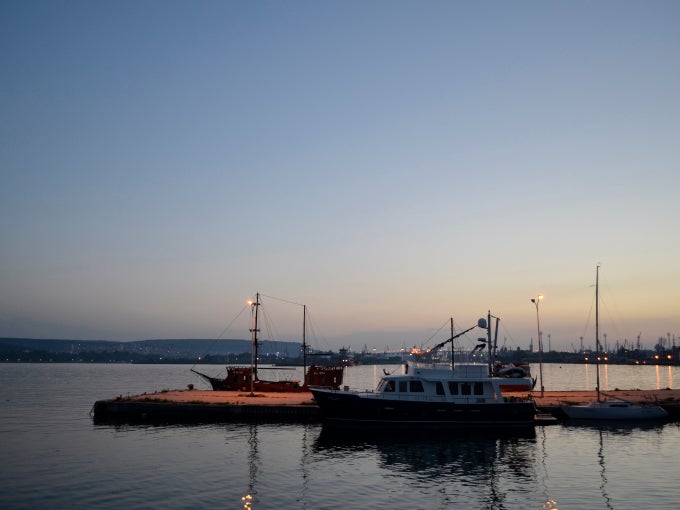
This is a tough one. The two photos look remarkably similar colors-wise, although the S8 shot has a bit more “pop” to it. Both cameras perform well in this scenario and I'd call it a tie.
Scene 10: Last rays of sun
Full-size images:
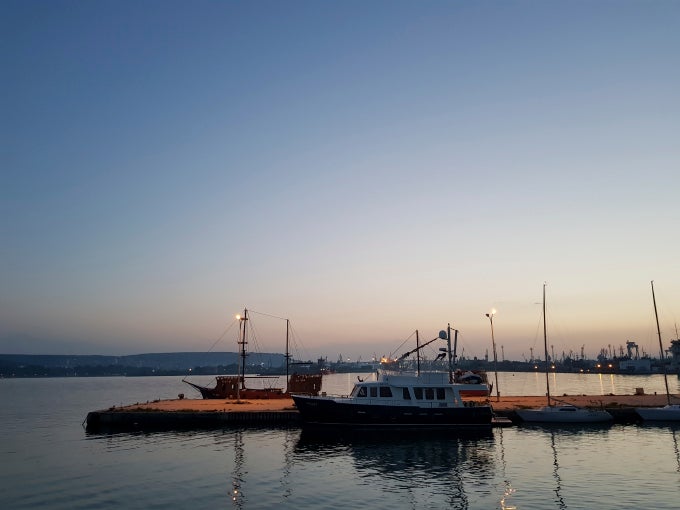
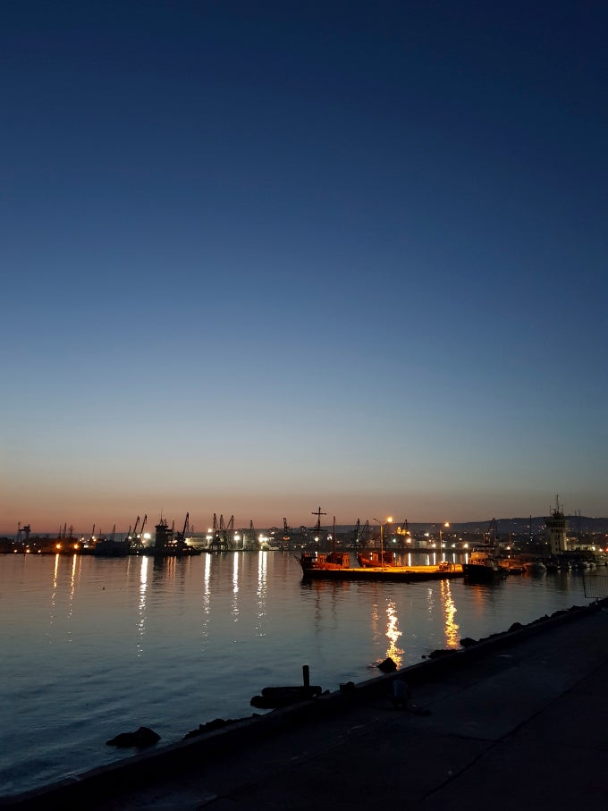
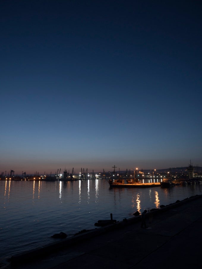
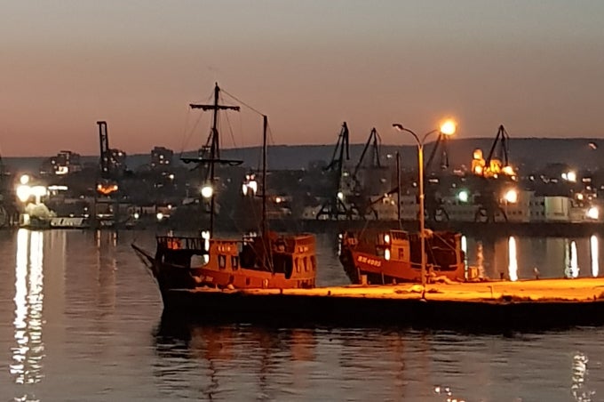
There was almost no light left at this point, and I decided to put S8's low-light performance through one more trial. The shot came out well-exposed, with punchy colors to boot. The water may be lacking in detail when compared to the GH4 shot, where ripples are more well-defined, but the S8 manages to achieve an overall better look that comes closer to what people would otherwise strive to achieve in post. And here is a crop of the GH4 photo with the S8 shot enlarged and overlaid on top, because "shrinking a larger image will only make it look sharper yada, yada."
The Galaxy S8 shot at ISO 500, with a shutter speed of 1/10, and so did the GH4. However, this shutter speed proved to be too slow for shooting handheld with the GH4
And the winner is...
That the Galaxy S8 is able to stand its own against these two cameras is nothing short of impressive. The S8 produces sharp, vibrant images that consistently capture the essence of a scene, even when it comes to less than optimal lighting conditions. Galaxy S8 photos often look as though they were touched up in post, only they aren't, they are being enhanced on the fly by the phone itself. Although this may lead to somewhat exaggerated results at times, in most situations it helps emphasize the best parts of an image.
Truth be told, S8's camera is not that big of a leap forward from last year's S7, technically speaking. However, Samsung has obviously been working on the camera software for the S8 and tweaking it to deliver improvements in a few key areas – most notably in low-light performance, which has been traditionally problematic for small camera sensors. Samsung's latest flagship is a perfectly capable pocket camera that doesn't disappoint.
As you may have noticed, most of the photos from the GH4 and the D5100, look a bit washed-out in comparison to those from the S8, and there's a reason for this. Dedicated cameras usually aim for a neutral response curve, that is, they strive to deliver a data-rich file which contains as much information as possible in the shadows and the highlights. This results in a rather flat-looking image that gives you rich editing options for making fine adjustments in post. However, this is only good for when you shoot RAW and are willing to spend the time editing afterwards. If you want good-looking photos straight out of camera, you are going to have to spend some time to experimenting and developing your own custom color setting ("Photo style" in the case of the GH4), as well as a custom white balance profile.
I'm not saying that shooting RAW and editing your photos is bad — heck, I do it all the time — it's just that sometimes, when you're not doing a photo shoot or don't want to carry your DSLR or mirrorless everywhere you go, it's good to know that your flashy new smartphone really does cut it as a general-purpose camera. A smartphone can't be a definitive replacement for a dedicated camera, but it can be a great part-time substitute!
Ever more often, when I'm just out and about, I don't really feel like bringing a camera on me without having a clear idea of what I want to do with it. Besides, I know I always have a capable pocket camera on me wherever, whenever. This, of course, is outside the realm of professional photography. If I'm doing a shoot or want a print for the wall, I bring out the big guns.
Samsung Galaxy S8 vs two dedicated cameras
Follow us on Google News




Things that are NOT allowed:
To help keep our community safe and free from spam, we apply temporary limits to newly created accounts: