Galaxy Note 8 vs Galaxy S8+ UI comparison: are there any major differences?
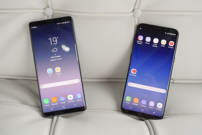
Today, Sammie unveiled another one of its high-end contenders - the Galaxy Note 8. Apart from the dual-camera setup at the back, the handset's appearance is almost identical to that of the Galaxy S8+. At a first glance, it looks like the UI has also largely remained the same, but is this truly the case?
The short answer to that question is "no". The Note 8 will hit the shelves with Samsung Experience version 8.5, while both S8 models still run on SE 8.1. However, a newer version isn't always a guarantee for any observable changes in the visual department.
We have obtained some screenshots of the Samsung Experience on the Note 8 during our quick hands-on with the device, so let's dive in and see if we can find anything new that is currently exclusive to the 6.3-inch phablet. Keep in mind that we're not including any features associated with the new S Pen, as we'll give them a more detailed look in the future.
And that's pretty much it. These are the only differences between the new and old version of Samsung Experience which we were able to locate. Granted, there are a few more sections of the UI which we weren't able to capture with our limited time on the Note 8, but we'll make sure to update this article if we notice anything interesting once the phone arrives at our office. Now, let's move on to some example shots that portray the uniformity between the interfaces of Samsung's high-enders.







Things that are NOT allowed: