First screenshot from the Essential Phone shows one weird looking status bar
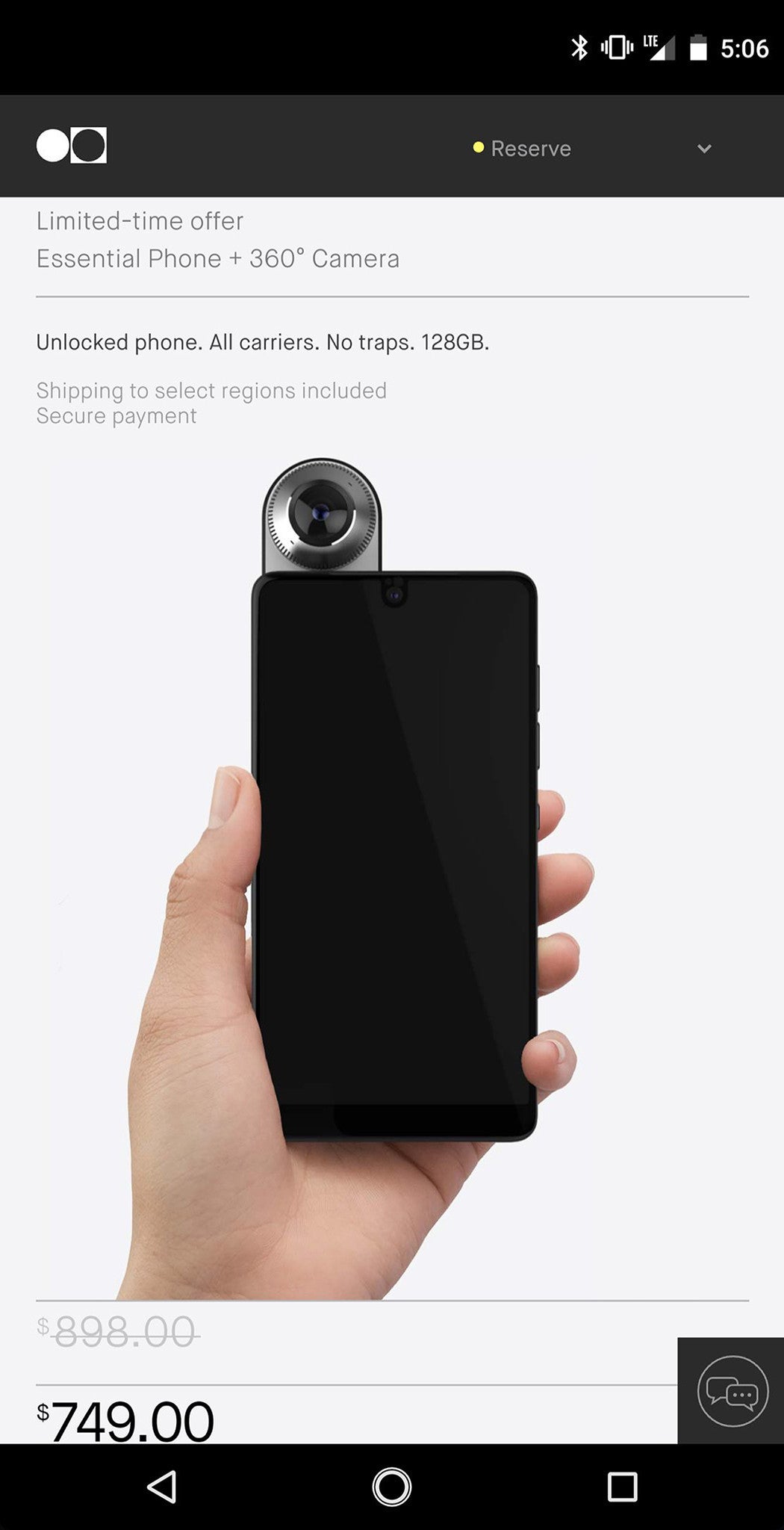
But we can notice a couple of other interesting things: the home button, for example, features a second ring around it, which reminds us of the Google Pixel a bit. This wouldn't normally be a big deal, but when one remembers that the device is set to launch with a new virtual assistant baked into the OS, it sure starts to look like Essential will be replacing the Google Assistant with its own alternative.
And also, the screenshot in the Twitter post's aspect ratio is noticeably off (though we've fixed it in the version embedded into this post). This could, in theory, be a Twitter bug, but we're more inclined to believe it's the Phone itself that's causing the problem: after all, devices don't get inexplicably delayed by months if there are no kinks to be worked out in the last moment.
source: Jason Mackenzie via reddit
Follow us on Google News
![T-Mobile is about to test the limits of customer loyalty [UPDATED]](https://m-cdn.phonearena.com/images/article/179374-wide-two_350/T-Mobile-is-about-to-test-the-limits-of-customer-loyalty-UPDATED.webp)


Things that are NOT allowed:
To help keep our community safe and free from spam, we apply temporary limits to newly created accounts: