Technology is advancing at a rapid pace, and the software powering our beloved gadgets isn't an exception. With each new release, mobile platforms are growing sleeker, faster, and more versatile than ever before. That's mobile OS evolution we're witnessing, and we're calling it evolution not only because software is constantly being improved, but also because the fittest are the ones that survive, while those who can't keep up eventually meet their demise. So, which is the best survivor of them all? The ultimate mobile operating system? Well, that's one of those questions that seem simpler than they actually are. Many would give Android 4.4 their thumbs-up, while others are really into Apple's iOS 7. In reality, these two platforms have become quite similar on many levels and there's a lot to like about them. However, there is a number of things that make them different – things that make one of them better than the other in one way, or inferior in another. Allow us to elaborate.
Lock and home screens
Simplicity is the fundamental concept, around which iOS 7 has been designed. This becomes evident as soon as an iOS device is picked up and turned on – the first thing displayed is a seemingly basic lock screen, inviting you to “slide to unlock”. We said “seemingly” because the iOS lock screen is a tad more advanced than it appears to be. A swipe from the top displays the Notification Center and a swipe from the bottom brings forth the Control Center menu. There's a shortcut for the camera as well. And that's what makes the iOS lock screen so great – it is intuitive and uncluttered, but highly functional at the same time.
The Android 4.4 lock screen is just as straightforward to interact with – pull the ring in any direction and you're good to start using your device. Yet functionality hasn't been sacrificed. The slide-down notification panel is accessible, and so is Google Now with a swipe up from the bottom. A camera shortcut hasn't been forgotten either. That's pretty much all that a typical smartphone user would require, but for those who are serious about personalization, Google has added a handful of useful lock screen widgets. With their help, the user has near-instant access to their notes, their email inbox, social network updates, and more. What's even better, new ones can be downloaded from the Play Store. A small downside to Android's lock screen widgets is that setting them up can be somewhat unintuitive, but other than that, we love the functionality that they add.
Once past the iOS 7 lock screen, the user is introduced to a minimalist home screen menu with large, easy to hit icons and clearly legible labels. Again, Apple is keeping it all as simple as possible, meaning that even first-time users can get the hang of the system's UI in no time, while experienced owners have quick, hassle-free access to their apps. Android, on the other hand, puts the highlight on functionality and personalization with its option to populate home screens with widgets of all shapes and sizes. Downloaded and pre-installed apps are listed in a separate drawer, which leaves more room on the home screens for widgets, shortcuts, and folders. Speaking of folders, we tend to like their execution in iOS 7, where there's no limit to how many apps we can place inside one. Android 4.4 lets you place no more than 16 apps inside a folder, which is okay, yet somewhat limiting.
Search is deeply integrated into the UIs of both platforms, which is great to know considering how people love to Google anything nowadays. In iOS 7, a swipe down on any home screen displays a search bar for looking up stuff online and for finding a specific app or contact – an elegant solution that doesn't occupy any screen real estate, but is always there when you need it. In Android 4.4, a search bar for apps, contacts, and Google queries is permanently affixed to the top of any home screen. Some might find this annoying as it eats up more space than it probably should, although we don't thing that its constant presence is too big of a deal.
Appearance and customization features
Apple's iOS 7 was launched to mixed reviews, regarded by some as fresh and stylish, but dismissed by others as flat, too childish and cartoonish-looking. In our opinion, the appearance of the platform is more than acceptable. In fact, we're perfectly fine with the way it looks now that we've grown used to its interface and layout. Stacked against iOS 7, Android 4.4 looks pretty lifeless with its black and gray theme. But there's a number of neat things about its UI as well, including the translucent status bar and the redesigned icons.
Customization is, without a doubt, one of Android's major advantages over iOS. And that's not only because of the widget functionality we mentioned above. Android users are free to use third-party lock screens, on-screen keyboards, live wallpapers, and launchers that alter the way the system's UI is organized. In other words, if you've grown tired of its plain old look, or if there's something about Android that you don't quite like, a replacement for it is likely available at the Play Store. We must mention that with Android 4.4, Google is making it even easier for users to switch back and forth between launchers with a new “Home” option in the settings menu.
There isn't much about iOS 7 that a user is free to modify. Sorry, that's just Apple's way of doing things. Looking at it from the bright side, the company's tight control over the feel and appearance of iOS prevents customization apps of sub-par quality from affecting the user experience in a negative way. There are things one can change, of course, and make their phone or tablet more personal. iOS 7 brought a few new personalization features, including dynamic wallpapers – animated background that behave a lot like Android's live wallpapers. Sadly, no new ones can be downloaded from the App Store, at least not for now. Still wallpapers have been spiced up with a so-called parallax effect, which shifts the background image depending on the angle, at which the handset is being held. That creates an illusion of depth and the effect is really nice in our opinion – pretty, yet unobtrusive.
Quick controls and notifications
Apple did the right thing by adding a menu with quick controls and toggles to iOS with the platform's seventh major release. Called Control Center, it is easily accessible by swiping up from the bottom of the screen – this gesture works from the lock screen, on any home screen, even while running a game or an app. But while this feature is a major and welcome advantage to iOS, it has been available in third-party Android UIs for quite a long time. Even the stock Android 4.4 interface has a menu with toggles and shortcuts accessible from the notification panel. However, we don't find it neither as pretty, nor as functional as iOS 7's Control Center.
The overhauled Notification Center in iOS 7 now takes the user straight to their agenda. That's very convenient for people who actually use the Calendar app. Those who find it too crowded in there are free to pick what notifications are to be displayed – stocks information, unread email, Game Center alerts, reminders, and more. While the Notification Center is not too bad of a solution as a whole, it leaves room for improvement. For example, we see no benefit in having the weather forecast displayed there in plain text – text that we actually have to stop and take a few seconds to read – when a simple weather icon with a digit for the temperature would do just fine. Android's notification bar is a bit different for it doesn't display much if there aren't any pending notifications. If there are new ones, they can be easily dismissed with a swipe to the side, or tapped on, which takes the user to the app that displayed the notification. A neat improvement brought by Android 4.4 is the option to access the notification panel even when a full-screen app is running, meaning that you can read notifications without exiting that game you're playing. In iOS, the Notification and Control Centers work in a similar fashion.
Dialer and contacts
Kudos to Google for adding a smarter Phone app in Android 4.4. What makes it better than ever is that it can search for the phone numbers of nearby businesses and venues. In other words, you just type the name of a place near you that you need to call – a restaurant, a bank, a store, you name it – and the app will get its number for you, pulled from its vast database. This works the other way around as well, so if a business is calling you, its Caller ID will be filled in by the app. Of course, how well this feature works depends on whether the business you're contacting is in Google's database or not. But we gave it a shot and it worked quite well.
This isn't the only change brought by the Android 4.4 Phone application. Its layout has been altered as well, so the first thing you see upon launching the app is your list of favorites, as well as the person you last contacted. Like it or not, there is no list of frequently called people, but chances are these are going to appear near the top of your call log anyway.
The iOS 7 Phone application is simpler, and not necessarily in a good way. Contacts, for example, don't have a photo displayed next to them, unless they are listed in your favorites. This little drawback aside, the app is intuitive and well laid out, displaying the user's own phone number of top for those times when it is needed.
When it comes to contact management, iOS 7 does have a thing or two to stand out with. It has the neat feature to block specific contacts, thus preventing them from calling, texting, and even initiating a FaceTime conversation with the user. Calls from blocked people appear in red in the log, in case you're wondering. Also, we appreciate Apple adding the option to set not only individual ringtones to specific contacts, but also specific vibration patterns for their texts and/or calls. Both Android and iOS will sync and back-up your contacts with the cloud.
Keyboard and messaging
Typing on a mobile device quickly and efficiently is often a matter of getting used to its on-screen keyboard's size and layout. With iOS 7 and the iPhone, in particular, we can easily type texts using a single thumb because the phone's width is optimal for the purpose. The Google Nexus 5, running Android 4.4, is wider and is therefore more comfortable to use with two thumbs rather than one, and that is usually valid for any Android device with a screen of 4.5-inches and above. Overall, both virtual keyboards are pretty nice. International users can rest assured that both support a wide variety of input languages.
The messaging experience on iOS is augmented by iMessage – Apple's alternative to SMS, routing texts via the web instead of sending or receiving them through your wireless carrier. Texts transferred via iMessage are usually faster, with higher-quality media attachments, no character limit, and display a notification when the message is read. The downside to Apple's service, however, is that it works only on Apple devices. As for the iOS 7 messaging app itself, we have nothing to complain about. It is simple and intuitive, while texts are easy to read.
On Android 4.4 KitKat we see that Hangouts has taken over messaging, thus encouraging users to use Google's IM solution instead of SMS, all the while eliminating the need for a separate texting application. The app itself isn't bad and we love the option to attach our location to the message we're sending.
Email
Whether you're using Android 4.4 or iOS 7, setting up your email account is a straight-forward process, requiring you to input nothing but your address, password, and perhaps your real name. Email settings can be entered manually, in case that is required. Android users may use the stock and plain Email app, or the Gmail app in case they are using Google's email service. We're into the latter, by the way, as there's a lot to like about it. Gmail automatically filters out social network updates and mail from businesses, placing them in their separate tabs. The result is a clean inbox containing mail you are actually interested in reading. What's more, there's the Priority inbox, which automatically highlights only emails from people you communicate with the most. Apple's approach to email is a tad simpler and its iOS app doesn't quite pack as many features. But it still definitely gets the job done. In iOS 7, the email app has the so-called VIP inbox option, where emails from people you mark as important are collected. This marking process, however, has to be done manually.
Productivity tools
No mobile OS can be considered complete without its pre-loaded set of productivity features. Thankfully, neither Android 4.4 nor iOS 7 disappoints in that respect. On both operating systems we find minimalist, streamlined Calendar applications for organizing appointments with their help. Nothing in terms of features is missing – new events can be added in just a few steps, and a reminder will alert you prior to that event's beginning. Both Calendar apps can be synchronized with the cloud, which makes them accessible from other devices as well.
At a glance, the calculators on Android 4.4 and iOS 7 look pretty similar, but those who need to access advanced functions often will appreciate Apple's solution a lot more. The advanced panel is accessible with a flip of the phone in landscape mode, while stock Android 4.4 requires the user to bring forth the advanced panel manually.
Android's clock used to be poorly organized, but things have changed with version 4.4. The app is now clean and intuitive. The Clock application on iOS 7 feels just as well made, if not a tad prettier. Both provide easy access to additional timekeeping features.
Notes and reminders in Android 4.4 are organized using Google's Keep application, which is a very simple, yet very handy little tool. The app lets you take down quick notes and to-do lists on the fly, with the option to assign alerts to each of them, activated at a given time or location. Moreover, audio and photos can be attached to the note. And if that's not cool enough, your notes are automatically synchronized with the cloud, which makes them accessible from your PC or tablet. Apple, on the other hand, has chosen to have two separate apps for Notes and Reminders. The former is really basic, allowing us to input text only. The latter is a bit more advanced, allowing us to organize to-do lists and set time- and location-activated reminders to each of them. The user interface of the app, however, can be a bit confusing at first. Both Notes and Reminders on iOS 7 can sync their data with the cloud.
Extras
Apple has sprinkled iOS 7 with a number of goodies that many users will appreciate having. Passbook is one of them, used for managing boarding passes, movie tickets, retail coupons, and more. In addition, you get a Stocks app, voice notes, compass with a built-in level, and a gorgeous weather application. Android 4.4, on the other hand, is pre-loaded with Google Earth for exploring in detail every square inch of the planet, as well as Google Drive for storing files in the cloud, and Quickoffice, allowing us to quickly open and edit Word, Excel, or PowerPoint files.
Game Center vs Play Games
Both Android and iOS users play games. In fact, games are one of the most popular app categories on these platforms' markets, which is why it makes sense having an app dedicated to organizing all the games that the user owns. Apple's solution is called Game Center. Introduced with iOS 4, it lists the user's games, as well as all achievements and scores. Game Center is also used to send and receive turn requests and challenges to and from friends. Having the app recommend us games we might be interested in based on others that we've played is a neat, clever feature. Android's Play Games application is very similar when it comes to functionality. Google has also added the option to see what games our Google+ contacts are playing, which is a good way of discovering download-worthy titles. All in all, both Game Center and Play Games will be of great use to those who spend a lot of time playing games on their iOS or Android device.
Mulitasking and multiple users
When it comes to multitasking implementation in iOS and Android, we don't really have anything to complain about. Switching between apps is a smooth and lag-free process – just open up the multitasking menu and pick the app you wish to go back to. Both UIs present us with screenshots of all recent apps in their last state. If you need to close a particular app, just flick it to the side.
Support for multiple users is built into Android 4.4 and available to users of tablets running the stock variant of the operating system. Each person has their own personal workspace, with apps and widgets arranged to their liking, and switching between profiles happens in a snap. That makes Android tablets highly suitable for sharing with classmates or family members. What's more, users can have their personal stuff secured with Android's option to prevent a specific account from launching particular apps. At this time, Apple has yet to implement support for multiple user accounts into iOS.
Siri vs Google Now
Siri is the name of Apple's voice-controlled virtual assistant built into iOS. At first she was seen as more of a gimmick rather than something one would have a need for on a daily basis, but to tell you the truth, that's not really the case anymore. Apple has done a great job at expanding the list of uses for Siri, thus making her more useful than ever before. She can launch apps, send text messages, set reminders and alarms, check the weather, convert currencies, adjust the device's settings, or look up things on Wikipedia or Twitter. And that's just a fraction of Siri's repertoire. Best of all, she's very good at interpreting our voice input despite it being provided in every-day language. Don't speak English? No worries! Siri recognizes French and German as well.
Android's Google Now feature is a bit different. Like Siri, it is capable of recognizing voice commands accurately, but in addition, it attempts to provide the user with relevant information exactly when they need it. For example, driving directions will appear if it is the end of the work day. If you just looked up some place on Google Maps, Google Now will show you how to get there when triggered. If you have a plane trip coming, it will provide you with up-to-date details about your flight. And if you're in a different country, Google Now lists places of interest, currency exchange rates, and other useful information. And these are just a small number of the things Google Now is capable of.
To wrap things up, both Siri and Google Now are great additions that can come in handy in a number of situations. They do a great job at complementing the overall user experience, all the while demonstrating how intelligent our mobile devices have become.
Android Beam vs AirDrop
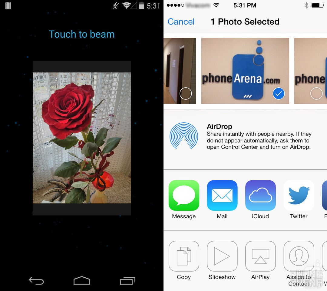
Android Beam is used for transferring files, bookmarks, contact information, YouTube videos and more between nearby Android devices. It seems like a cool feature on paper, but it has a number of limitations that make it not as practical as we wish it was. To initiate a Beam transfer, two Android devices are tapped together, back to back, so that their NFC radios can take care of the pairing process. But the NFC radios on different phones don't always communicate well with each other because of variations in their placement. That's why some phones won't “shake hands” unless they are aligned the right way. Then there's the speed, at which data is transferred. Images, in particular, can take quite a long time to copy because of their size. Apple's AirDrop, on the other hand, moves photos between devices almost instantaneously. Furthermore, it does not require devices to be as near as Beam does – no need to go around the room bumping your handset with others' phones. Long story short, AirDrop is faster and easier to use. It works only on recent iOS devices, however.
Internet Browser
Android 4.4 uses Google's Chrome web browser by default, while iOS 7 relies on Safari in its latest form. Both applications are ideal for surfing the web as they are very fast, although the latter seems a tad smoother and more responsive. The two offer essential internet browsing features like Incognito mode, multiple tab support, and bookmark synchronization between devices, which is pretty cool for people who switch from one device to another. We only wish that Chrome had Safari's Reader mode, which cleans all unnecessary content from a web page, leaving only an article's text and some images for easier reading.
Maps
There was a time when Apple Maps, found in iOS, was ridiculed for its shortcomings, but things have changed since then. The fact of the matter is that Apple's maps application is now more reliable and has all the features one would expect out of a proper app of this kind. It can give you adequate directions depending on whether you're driving, walking, or using public transportation. Locations can be quickly shared with others or bookmarked for future use. Real-time traffic information is available as well, which can save you from a traffic jam on your way home from work. All of these features can be found on Google Maps as well. While neither solutions will provide you with true offline navigation in a way that Nokia's maps would, both Apple Maps and Google Maps can cache map data in order to navigate you without relying on internet connectivity.
Camera and Gallery
The stock camera interface on Android 4.4 leaves something to be desired. For people who aren't familiar with its arrangement, the UI can be confusing and frustrating to use, especially when it comes to switching scene modes. But it is not all bad. Android 4.4 comes with PhotoSphere – a mode that let's you take impressive 360-degree photos. A new HDR+ mode is present as well, producing better results than HDR found in previous Android releases. On iOS 7 we find a clean, simple, much better laid out user interface. It offers a modest, yet welcome selection of extras, such as its HDR mode, image filters, and 120fps slow-motion videos.
The Android 4.4 Gallery application is not only for viewing photos. They can be modified as well using the built-in editing tools. Images can be cropped, frames can be applied to them, their exposure, vignette, contrast, saturation and more can be adjusted. From there, once can easily share one or multiple photos via email or their favorite social network. The iOS 7 Photos app, on the other hand, isn't as functional when it comes to sharing images. It does not seem to get along well with some third-party apps – Instagram, Skype, or WhatsApp, for example, are not among the available options; you have to use these services' apps instead. But the new Moments feature is nice. It intelligently sorts the user's photos in collections, based on when and where they were taken.
Music and video apps
To move music or videos from a computer to an Android device, once simply connects the two over USB and copies the files into the device's music folder. It is a straightforward process that works even if the user's music collection isn't organized well. With iOS 7, however, copying media requires additional software – iTunes, usually. Now, that's not too bad of a solution, but perhaps not every single iOS user out there is a fan of Apple's application. Thankfully, some popular third-party media players now come with built-in or optional iOS device support for managing the media on iPhones, iPads, and iPods.
Of course, one is free to purchase media straight from their device – via the Play Store for Android devices and via iTunes for iOS users – where millions of songs, movies, and TV shows are available at a tap of a few buttons. Alternatively, there's streaming. Apple has iTunes radio, which is a free service delivering tunes over the air and straight to your device, with stations across various genres and intelligent recommendations based on what you've listened to previously. Best of all, the service is free, although there are ads baked into it. On the downside, there's a limit of skipping no more than six song when tuned into a station. Android offers a similar radio-like streaming service called Play Music All Access. Described as “radio without rules”, it lets you reorder the tracks in your queue or swipe away the songs you don't want. If you're into a particular song, the service can build a radio station by populating a playlist with similar tracks. And unlike the case is with iTunes radio, Google's solution lets you skip tracks as much as you want. All Access, however, comes at a price - $9.99 per month, to be more specific, which is as much as a premium Spotify account costs.
The default music players on Android 4.4 and iOS 7 are quite similar in terms of functionality, although Apple's app feels a bit more polished and better organized. But Play Music is nice as well and it gets the job done once one gets used to it. Both apps are smart enough to display playback controls on the lock screen for quick and easy pausing or skipping tracks. What's really cool about them is that they allow the user to have music stored in the cloud, available for streaming over the internet at any time.
It is a bit strange that on Android 4.4 we still have to use the Gallery application to watch the videos we have stored onto the device. Having a dedicated video player would have been nice since the Gallery seems a bit too simple for the purpose. Fortunately, the Play Store offers a good selection of third-party alternatives. The iOS 7 video player is okay with its simple UI and support for closed captions.
Conclusion
There was a time when Android was regarded as an OS for geeks and techies, as an OS incapable of delivering the smooth and flawless experience often associated with iOS products. Well, things have changed since then. Android in its latest form is a well-polished, reliable, and feature-rich mobile platform that would appeal to a broader-than-ever range of consumers. At the same time, it sticks to its traditions of being widely open to visual and functional modifications, without actually requiring any in order to be a top-notch, full-fledged mobile OS.
But the big question remains to be answered: can Android 4.4 be considered better than iOS 7? Well, we don't quite think so, but we can't rank Android as inferior either. The fact of the matter is that both platforms have their own unique traits and personalities. People who are into tweaks and personalization, and those who like the feeling of having control over their smartphone would be quite happy with Android in its latest form. Besides, Google's OS stands out with its broader selection of free software. On the other hand, folks who favor a clean and elegant interface, or those who simply aren't sure what they want, would be perfectly happy with a device running iOS 7. It is intuitive, built with a lot of attention to detail, and providing superb user experience complemented by the best selection of applications a mobile OS can offer.






Things that are NOT allowed:
To help keep our community safe and free from spam, we apply temporary limits to newly created accounts: