Facebook Messenger's redesign is rolling out to some users, check it out here
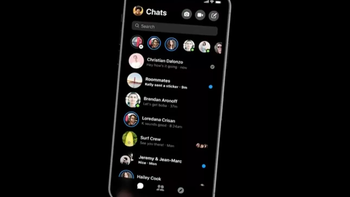
Hey, remember about that Facebook Messenger redesign that we told you about all the way back in January? Well, it seems that the redesign is very close to being ready as a small amount of users have received an overhauled version of the messaging app. As usual, however, the changes are not available in a specific version of the app but are turned on server-side, which means there's now easy way of getting the new UI on your device right here and right now.
What's this redesign all about? From the get-go, judging from the screenshots that are circulating around, the redesign will be all about simplifying the interface, though it should be noted that Facebook hasn't necessarily followed Google's Material Design 2.0 guidelines as much as we might have liked. Facebook seems to be following a design language of its own, and we can't help but draw some similarities with the design language that Microsoft pulled with its most recent Skype redesign.
Messenger also seems set to score colorful and relatively large interface elements that are rather non-ambiguous and seem quite user-friendly. In separate chat threads, the differences fall down to refreshed and more expressive iconography, which also extends to the contact-managing page that lets you assign a custom color or quick-access emoji to a particular chat contact.
The dashboard of the app is rather different, though. A much cleaner search box has been put near the top, while the bottom navigation bar has been very simplified and now only features three icons - for your chats, your contacts, and the Explore tabs.
source: AndroidPolice









Things that are NOT allowed: