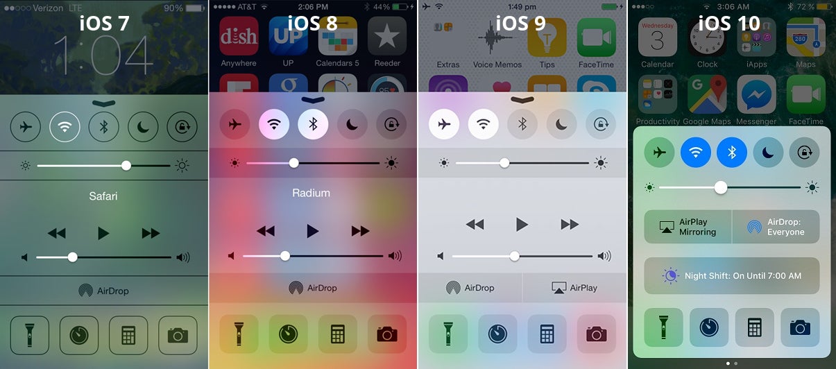
The Control Center of iOS is a little overlay, which an iPhone user will probably open about a dozen times per day, as it contains nifty buttons for the Wi-Fi and Bluetooth, quick shortcuts to Calculator and Flashlight, and sliders for display brightness and sound volume. It has been around for about 4 years, first introduced with iOS 7, and hasn't changed much over time. The exception here is last year's iOS 10, which made Control Center into a 2-page deal, separating system controls and shortcuts from the media player toggles.
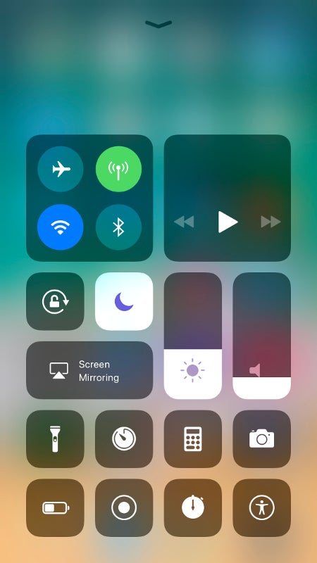
In iOS 11, the overlay is getting a full — and we'd say much-needed — makeover. It is no longer this single transparent slate, which holds buttons that can't be changed. It is now more like a mosaic, which the user can customize and rearrange. Yeah, we were surprised, too.
While it is extremely functional, we can see how it can look like an off-putting garbled mess. In our opinion, it's one of the most practical new features in iOS 11 and we do believe that the visuals will be easy to learn to live with. What about you?
Read the latest from Preslav Kateliev









Things that are NOT allowed: