Do we already know what a Surface Phone would look like?
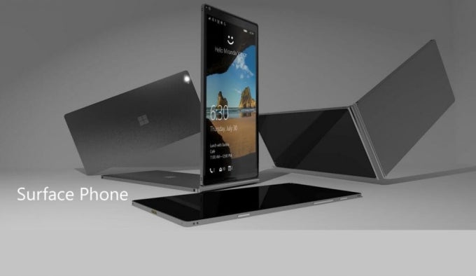
A render of an imagined Surface Phone
At Build 2017, Microsoft’s annual developer conference, Microsoft was busy announcing a bunch of new, forward-thinking developments including new updates to Windows 10 and their cloud computing platform. Perhaps the most exciting underlying theme was that Microsoft wants to make better software that works really well between devices, and they did not only mean working well between Windows PCs, but between all your devices, iOS and Android included.
Turning to the present, we are hearing rumors that there may be a ‘Surface Phone’ in the works. As of October 2017, Microsoft decided to stop feature development for Windows 10 Mobile, so it would make sense that the device would run the most versatile mobile OS: Android. Even better, we do not need to work hard to imagine what the Surface phone’s interface could look like, because Microsoft has been fine-tuning a suite of mobile apps for a few years now.
As an experiment, I decided to go all-in with Microsoft apps and services, and see how close I could get to a Microsoft phone. Hopefully, this will give an insight to how a Surface Phone could perform. For the purposes of the experiment, I am using a Windows 10 powered computer and a Galaxy S6. While I am using an Android phone, many of the experiences are very similar on iOS devices.
The Core(-tana) experience
At the core, Microsoft’s ecosystem revolves around the Cortana assistant and their OneDrive cloud storage service. With these two services, available for both Android and iOS, you will have access to most of the information from a Windows 10 PC. OneDrive will sync files between devices with ease, and Cortana can keep track of most of your preferences.
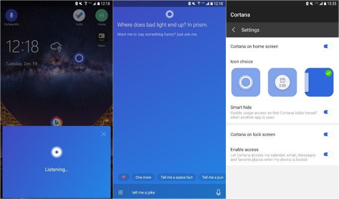
Cortana wants to be your assistant of choice
Cortana can be a handy assistant. With permission, she can keep track of your calendar and reminders, as well as keeping you up to date with the latest headlines – you can configure all these preferences within Cortana’s Notebook. You can ask her to search things on the web and I would rate her searching ability as a step above Amazon’s Alexa, but still not as good as Google Assistant. There are some things that she cannot do outside of her native OS, Windows 10, however. For example, she cannot set timers or open apps.
OneDrive is the second app that forms the core of a Microsoft experience. OneDrive is Microsoft’s cloud storage platform, and you can get 15GB of free storage just by signing up for a Microsoft account. You will need a Microsoft account in order to get the most out of the experience. OneDrive can store all your files and can even back up the photos and videos you take on your phone, similar to Google Photos.
OneDrive for Android | iOS
If we are trying to get a look at how a Surface Phone’s software might look, then we need to look no further than a pair of apps that are currently available on Android: Next Lock Screen and Microsoft Launcher.
Next Lock Screen…taking your lock screen to the next level
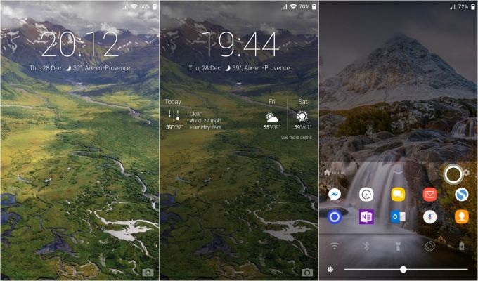
Next Lock Screen
Microsoft released their lock screen alternative in 2014, and it has been getting better ever since. Right away, it is apparent that Microsoft wants to give you quick access to frequently used apps and contacts, all of which can be found in the dock at the bottom of the lock screen. If you find the dock to not be terribly useful, you still have the option to disable it from the settings.
Next Lock Screen has a bunch of helpful and interesting features. It allows you to change your wallpaper directly from the lock screen by swiping between a variety of featured Bing wallpapers by tapping the Bing logo in the top left corner. Another hidden feature is being able to see an expanded weather widget by tapping the widget. Particularly helpful is the ability to bypass the lock screen using fingerprints, something that other alternate lock screens are unable to do. This feature makes Next a true alternative.
In all, Next Lock Screen is a good alternative and a solid part of the Microsoft experience on Android. Although it does suffer from a bit of design redundancy, those features can be turned off due to the extensive customization options.
Next Lock Screen for Android
Making home efficient with Microsoft Launcher
Once we bypass the lock screen, we are greeted by our new Microsoft designed home screen alternative. Visually, it is really nice, following Microsoft’s design language called Fluent Design. Microsoft Launcher is Microsoft’s vision of a modern smartphone interface centered around Microsoft apps and services.
Once we start to explore the launcher’s features, there is ample evidence that Microsoft is focusing on productivity. On the first screen, you are greeted by a simple home screen with a dock and a clock widget. Swiping up from the dock reveals the same layout that is found on the lock screen. Points to Microsoft for consistency, but that does not make the settings toggles any less redundant.
To the left of the main home screen is the widget page, a hub for keeping track of Microsoft services. This page has the features that make Microsoft Launcher so interesting. Default widgets include one which tracks recent tasks, one that hold reminders, one for notes, and one for recent documents. It reminds me of iOS’s Today page and it seems to be a good way of keeping your home screen uncluttered. By tapping on the menu button for each card, you will see that you have the option to make it its own page. I use Microsoft Office for writing everything, so I pinned Recent Documents to its own page so I can get back to work quickly.
Microsoft Launcher is not for everyone. Its focus on productivity makes it ideal for anyone who wants to get things done on the go, but that focus also makes the launcher feel very heavy and many would prefer a lighter home screen experience.
Tightening the web with Microsoft Edge
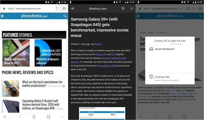
Microsoft Edge has a dark theme
Microsoft recently released their Edge web browser for iOS and Android and while it will not appeal to everyone, it is useful if you are a dedicated Windows 10 user and want the best cross-platform experience possible.
Edge is a fairly light web browser with a few nice settings including a dark mode. While the default search engine is Bing (any surprises?), you can change that in the settings. Like other browsers, Edge will sync your bookmarks, reading list, and history between devices.
We mentioned above that Edge is perfect for Windows 10 users, and the button in the navigation bar which looks like a phone with an arrow pointing away from it is proof of that. If you are using a Windows 10 PC, then this button will allow you to push your current tab to your PC. Once you tell the browser which computer is yours, the site will open instantly in Edge on your PC assuming that you are connected to WiFi. There is also the option to ‘Continue Later' on your linked PC, which sends a notification to your computer instead of opening Edge, but this did not work properly for us.
Microsoft Edge for Android | iOS
Tools for busy bees
Microsoft bought Wunderlist in June of 2015 and shortly after, began development of their own app called Microsoft To-Do. The Wunderlist stated on their blog at the time of To-Do's release that it would eventually replace Wunderlist, and since then they have been making small improvements to make it a viable replacement.
Despite being designed by Microsoft, To-Do still does not sync with other reminder services throughout Microsoft’s ecosystem. Wunderlist meanwhile, syncs with Cortana reminders and also appears as a To-Do pane in Microsoft Launcher. Microsoft also offers Outlook Tasks which live inside of Outlook and does not sync with any of the other services. Microsoft still has a lot of work to do with consolidating their reminders/to-do/tasks services. It is all very confusing, and getting this straightened out is essential to the creation of a good ecosystem. My recommendation: stick with Wunderlist.
Note taking follows the same story as task management. While Microsoft Launcher offers a widget for Notes, these do not appear anywhere else. The best solution is OneNote, Microsoft’s note taking app that is available cross-platform. OneNote is a powerful note taking app that allows you to draw, type, speak, and insert attachments onto a blank canvas. I find OneNote extremely useful for staying organized because it can hold anything need on one page. Microsoft makes OneNote easy to access with a Today widget on iOS, and multiple widgets on Android. The Android version of the app also comes with the ability to have a floating button or persistent notification so that your notes are merely a tap away. You can also take notes in OneNote by talking to Cortana.
Wunderlist for Android | iOS
Microsoft OneNote for Android | iOS
Microsoft Office is available for iOS and Android
Microsoft Office is still the gold standard for productivity apps and Microsoft has had them available for mobile since 2014. While an Office 365 subscription is needed for working on your computer, Office is free to use on mobile screens below 10.5 inches. There are still a few features that require a subscription, but most of the editing functionality is available for free. The Microsoft Launcher makes reaching your documents simple and all your documents can sync nicely with OneDrive.
Word for Android | iOS
PowerPoint for Android | iOS
Excel for Android | iOS
Finally…
Microsoft’s ecosystem is still a work in progress but they have been making huge strides to make all of your devices work seamlessly together via Microsoft services. The major underlying tone of this article should be clear: Microsoft’s vision of a mobile experience is not for everyone. But for people who regularly use Windows 10 to get things done and have a very busy mobile lifestyle, then I think that the Microsoft experience could finally be a successor to what BlackBerry did for productivity back in the day.




Things that are NOT allowed: