All about Dark Mode in Android Q, and force-switching it for Instagram or WhatsApp
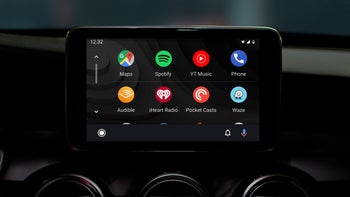
Dark mode needs no presentation, as anyone who has woken up in the middle of the night to read something on their phone would attest. Not only does it save your retinas from burning when ambient light is low but is also a godsend for OLED displays which consume way less power when displaying darker colors.
Back in January, we saw that an optional dark interface mode has been greenlit for development by Google's software team and it is now officially baked into the new Android 10 Q features.
No surprise, as that is one of the most requested options that Android users have been clamoring for since time immemorial, to the extent that major phone makers like Samsung and Huawei started implementing it in their own interface overlays due to popular demand.
Stock Android apps with dark mode
Google just flipped the switch on dark mode in its popular Keep app, but before it many of its own Android apps went various shades of gray, and it all culminated in the systemwide Android Q dark theme that can also be extended to third-party apps at will.
Said Keep app now joins a plethora of other Google apps like Drive, desktop Chrome, Phone, Contacts, Messages, Google News, Play Games, YouTube, and even Android Auto, as you can see from the header above.
These are becoming too numerous to list, as they should, if all stock apps are to go lights-out when Android Q rolls around the corner in a few months.
Dark Mode goes Q, but what about Material Design?
In previous Android Q betas, there was no settings option to turn it on, and you had to turn on the battery saver mode in Android Q, and set a battery percentage above your current one as the threshold. It was pretty inconsistent, too - the Photos, Files and Contacts apps had it, for instance, but not Messages or Calendar. In the public Android Q beta, however, the dark theme could be either activated manually, or scheduled to turn on as a battery saver option automatically.
How does it all fit in Google's Material Design ethos that it urges phone makers to adhere to in their Android overlays? Well, there are now firm and detailed guidelines how to go about darkening your app or launcher's interface. There, the team advises against using saturated colors that will clash with a dark background, for instance, or using shades of grey instead of black, unless you are specifically targeting battery preservation on devices with an OLED display.
Material Design dark themes are defined by the following properties:
Contrast: Dark surfaces and 100% white body text have a contrast level of at least 15.8:1
Depth: At higher levels of elevation, components express depth by displaying lighter surface colors
Desaturation: Primary colors are desaturated so they pass the Web Content Accessibility Guidelines’ (WCAG) AA standard of at least 4.5:1 (when used with body text) at all elevation levels
Limited color: Large surfaces use a dark surface color, with limited color accents (light, desaturated and bright, saturated colors)
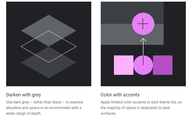
Illustrated Material Design guidelines for dark mode on Android
How will Instagram or WhatsApp go dark?
Dark mode was not prime-time ready in the first Q beta, and manufacturer overlays ran circles around it with their own dark modes, but Google has now made strides to implement it not only in Android, but actually force its design guidelines on third-party app devs. When the app developer adds the "android:forceDarkAllowed="true" string, Android will convert their app to the dark theme on its own without having to put in the work and they can even disable it on a piecemeal basis within the app if they don't like some of the looks.
For users, there are three ways to enable the Dark theme In Android Q. There is a a new system setting (Settings > Display > Theme) that lets you turn on dark mode, or you can use the new Quick Settings switch from the notification tray to turn it on or off in a jiffy once the theme is enabled from settings. On Pixel devices, the Battery Saver mode can also enable Dark theme just as in the early betas, but it's up to other Android manufacturers if they will support this option in their own overlays. Most of them currently do, though.
Google is not content to simply offer a dark mode option for its launcher and default apps, or provide a way for developers to turn on a generic one automatically. You can force it on your own over third-party apps as well, if you so desire, even those that haven't thought about it yet.
We tested it on a few popular apps and it works pretty well most of the time. If you want to see how it looks like on staples like Instagram or WhatsApp, you can go into the Android Q's Settings > System > Developer options, search for the "Override force-dark" switch, turn it on, and watch the magic happen. What do you think?
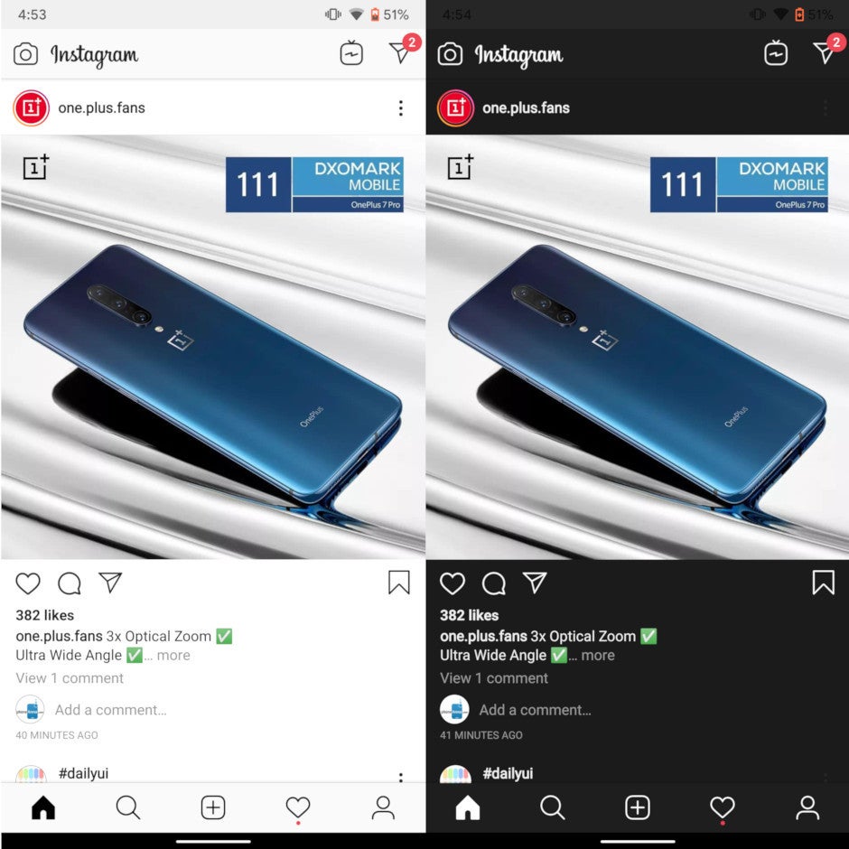
Instagram app dark mode forced by Android Q (right)





Things that are NOT allowed: