Change to Google Search will help you quickly decide which results to read
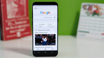
Google today announced a change to the Google Search app. More specifically, the change is in the way search results are presented. For example, the cards that appear on the screen as a result of your mobile search will show the name of the website that the information was sourced from, along with the site's logo. This will make it easier for users to know exactly where a particular search result came from. It also will allow users to quickly scan these results to decide which ones to stop and read.
When you request information on a product or a service from the Google Search app, the top of the results card will now clearly display the word "Ad" in bold print next to the related website address. Again, Google says that this is being done to show users where information is coming from.
"As we continue to make new content formats and useful actions available—from buying movie tickets to playing podcasts—this new design allows us to add more action buttons and helpful previews to search results cards, all while giving you a better sense of the web page's content with clear attribution back to the source."-Google
The changes will be coming to mobile and desktop with the former getting it first. Google says that the changes will be pushed out to mobile devices starting in a few days.
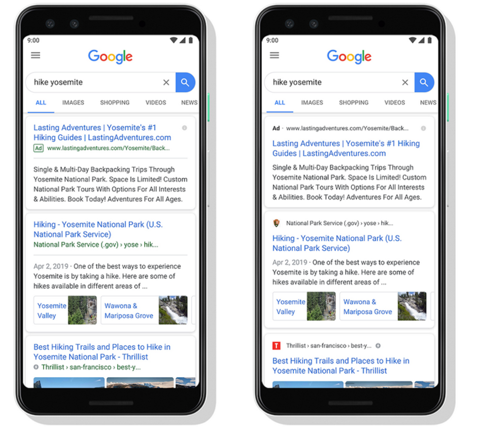
Google is making some changes to result cards on Google Search (R)









Things that are NOT allowed: