CTIA 2007: Live Report

We've arrived!
We are at CTIA 2007 in Orlando, Florida. In the following pages you will be able to see hands-on photos and read our opinions on the latest phones by various manufacturers, announced at the show. We will also provide you with hands-on video clips about the most interesting devices.
Sony Ericsson announced two new devices during the CTIA 2007 expo. Thefirst “is Sony Ericsson’s first tri-band HSDPA phone for the NorthAmerican Market”. Actually, the Z750 is overall the first HSDPA deviceSE will offer.
If you’ve seen the European Z610, the new Z750 is almost exactlyidentical to it in appearance, dimensions and weight. Its front isextremely glossy with mirror like finish. The hidden OLED display underit is very hard to read no matter under what angle you look at it.
Z750 Interface
The rest of the feature-set is overall standard and includes 2-megapixel camera, music player, M2 memory expansion slot, and full HTMLbrowser with RSS reader.
The scheduled availability is set to be in late September or earlyOctober. Even though no specific carrier was announced, it should beavailable through AT&T Wireless.
Sony Ericsson W580 and Sony Ericsson W710
The phone is a standard Walkman device with the same user interface we know from previous models. The Walkman software of course is the new version 2.0 which does not offer a lot of new features compared with the original one. We are happy to see the TrackID software here again. It, in a nutshell, recognizes the author and the song name and album after recording a short 10 second sample. During our review of the W880, we thoroughly tested it were very impressed with its results.
W580 Interface
The feature set is excellent for such device. The W580 offers its consumers 2.0 mega pixel camera (no autofocus), 2.0” display with 240x320 pixels resolution, Bluetooth 2.0 with Stereo A2DP broadcasting. For Internet browsing, the device offers full HTML browser with RSS feeds support. For the fitness fanatics, the phone offers application which tracks running speed, distance and burned calories.
Fitness function
The W580 is scheduled to be available in Q3 with price of about $100 to $150 (subsidized). Even though no official carrier name is announced, we expect it to be available from AT&T Wireless.
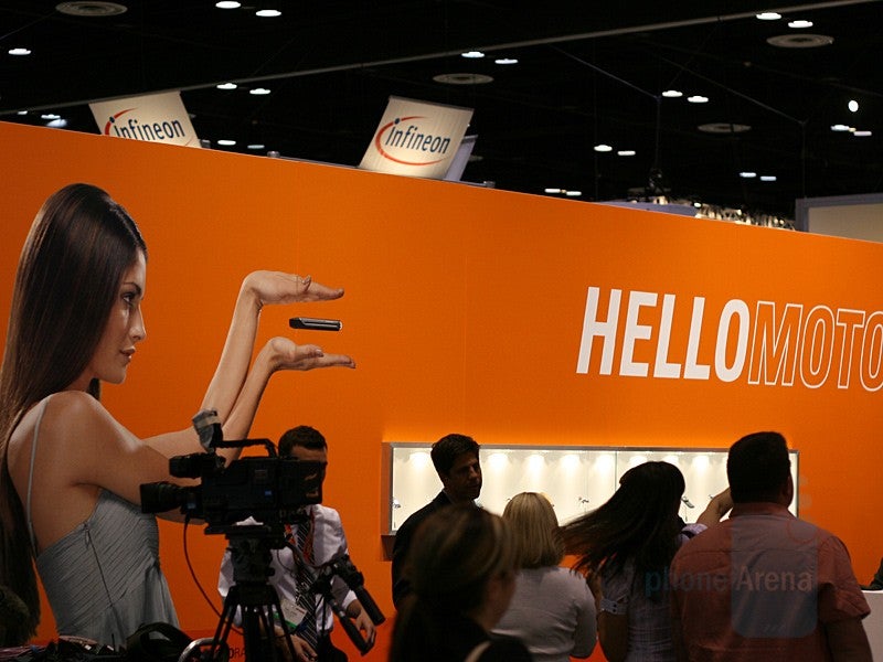
- The RIZR was renamed to ROKR as Moto wanted to tie a name not to a form-factor (slider) but to a user-experience (whatever this means).
- The Q Q9 to Q 9h is even better. Moto (and the rest of the manufacturers who come with weird numbering schemes to keep the users as confused as possible) has to realize consumers have a lot of other things to do, then to try to decipher if Q Q9 is a version of the Q, new model or?
Now back to the new models. Information about the Maxx Ve came originally from Motorola itself back in October. At that time, an observant user noticed that on a promo image, a guy was wearing what appeared to be a regular Maxx (GSM phone with HSDPA data). When the image was zoomed, Verizon’s logo, larger external screen and different hinges were visible, which of course prompted everyone to realize that a CDMA version is in the works.
The front shell of the MOTORAZR Maxx Ve is dominated by the large 120x160 pixels external display with touch-sensitive music controls just below it. The camera is 2-mega pixels with autofocus. Overall, the device does not offer any ground breaking feature – just a nice design with decent feature set including QVGA display, microSD memory and Bluetooth with A2DP.
Motorola MaxxVe Interface
Motorola W360:
Inspired by the SLVR L2, this one cuts down even more features to reduce the price to minimum. Still, the budget half-inch thick body manages to pack a 65k TFT display (with 128x160 pixels resolution) and built-in camera (VGA) on the back. The W360 can store up to 500 contacts with up to 5 numbers per each. It features iTap predictive text input system, Wireless Village instant messenger and supports 32-polyphonic ringtones, but can also use MP3 file for one.
Motorola W380 and W385 share similar design – RAZR-like clamshells with grayscale vertical display. Above it is situated a VGA camera. The internal display has 128x160 pixels resolution and 65 thousands colors, like the one on the W360. The W385 is dual-band CDMA while the W380 is tri-band GSM (it has two versions – one for Americas and one for Europe/Asia) with FM radio.
Motorola W380
Motorola W385
Being a single-band CDMA, the W355 is for the developing countries. Ultra-budget model, instead of external display it has 3 color indicator icons. Again the internal display is 128x160 pixels, 65k color TFT unit and the only feature of the phone is its FM radio.
LG VX8700 Interface
The whole idea of the Fusic is kept alive – a phone with music player merged in one. Unfortunately, it is not the only thing kept. The lousy 1.3-mega pixel camera is still here, as is the meager 176x220 main display. Increased is only the resolution of the external one and it is now 160x128 pixels.
The music controls on the front has been changed and now are touch-sensitive. Changed is the keypad and is now flush and in the short time we spent with it seems more comfortable compared with the LX550 Fusic.
The unit which LG had at the show did not have charged battery, so we can not comment on the phone’s interface.
Overall, the LG570 looks like an interesting design, but we’ll need to spend a little more time with it in order to give a definite thumbs up or down.
next to its predecessor - the FUSIC
SamsungUpStage
The almost unthinkable happen during this year’s CTIA expo. Samsung announced just ONE new device! But at least it is definitely an interesting one! Based on the F300 GSM phone, its purpose in life is to merge phone and music player in one. The novelty is the dual-sidedness. On the one is the 2.1” display with a touch-sensitive pad with four directions, END and BACK buttons. We’ll call this side The M-side - this is the music player side used to see the full Menu, navigate the music playback, create playlists etc. Pushing the MENU button will open the full menu. If you for example want to type a SMS, you can start here, go to Messaging, New Message etc but when you have to input the recipient or the actual message, the phone will advise you to flip it over and look at the small 172x65 pixels display on the other side.
We’ll try to explain how this functions, but you have to be careful and pay close attention! Entering the menu from the this K-side, you will have only Call History, Find Contact, Send Text Message and Add New Entry. If you want to change a setting for example, you will have to push a small FLIP button, flip the phone and use its M-side (music side).
Let’s go back to the M-side and start the music player and see how it works. First, its interface is not very attractive. It looks very ordinary and not visually appealing. Starting it gives you the option to go to Sprint’s Online store where you can purchase music or go to your stored music, Playlist or Create a Playlist. Creating a new Playlist is easy – just give it a name, then browse your music and highlight all songs you want to add to is.
Aside from the playlists, the music player lacks any other features. Samsung should have gone an extra mile if they really wanted to create a really music-player/phone converted product. We were expecting to see at least equalizers or Song Rating/Sorting… Being a music oriented device, the Upstage comes with 3.5mm jack for everyone who wants to use their own headsets. Of course, stereo A2DP Bluetooth music streaming is also supported. In case a call comes in while listening to music, the text-to-speed software will read you who is calling. If you don’t feel like talking to anyone, the phone’s functionality can be turned off completely, while the music playback is still working.
The touch-sensitive keys are hit now, but still manufacturers have work to do to improve their performance. During out Upstage testing, on several occasions our presses were not registered by the phone so we had to repeat them. Given the short lag between a key-press and the phone’s response, if the action is not registered we waited a few seconds before we realized the phone will not respond we have to touch the key again. Aside from that, the Upstage construction seemed very sturdy. The d-pad, soft keys and the keypad on the K-side were very good even though are also flush (but regular, not touch sensitive).
While playing music, limited “multitasking” is available. By limited we mean only: Background manager, Send text message, My contacts, On-demand and Music.
An innovation is the included battery sleeve which extends substantially the battery times. The “wallet” as Samsung calls it helps protect the phone and charge it in the same time. From 2.5h of talk time, Samsung claims with the wallet it is extended to 6, while the music playback is up now up to 16h.
The UpStage will be available April 1 from Sprint PCS and should cost around $150 with a contact.
Samsung UpStage
HTC, the World’s largest manufacturer of Windows Mobile smart-phones so far has made two attempts to enter the CDMA market. The first was the HTC Harrier which was introduced in 2004 and available from both Sprint and Verizon Wireless and the successor HTC Apache which actually is still available from them plus from Alltel and Qwest! During a press only event here at CTIA, they showcased two new devices which are expected first to be released in Canada.
The S720 is the CDMA version of the S710 and runs Windows Mobile Standard. That is why the display is not touch sensitive. Below it is the d-pad and the numeric keypad with exceptionally easy to press keys. Unlike the S710, which bottom row of keys is narrower, the S720 keeps almost the same width, so all are equally convenient to press.
Unique to the S720 and for that matter to the S710 is that the full keyboard slides open to the left, while most other HTCs slide to the right. The actual sliding actions is extremely present and smooth and actually on the S720 is even spring-assisted which adds even more to the overall superb experience the S720 offers.
The internal full keyboard felt a little less comfortable compared to the one of S710, but when releases in the US, it might actually feature different design. HTC Wizard’s T-Mobile and AT&T versions had completely different keyboard and slightly different outer look, even though they were same device. The same thing might happen with the S720.
Unlike the GSM version, which does not have 3G, the S720 will be EV-DO capable. Currently, the S720 is EV-DO rev.0, but it is expected to be updated to rev.A which Verizon and Sprint have rolled out.
The rest of the feature include 400 MHz processor, 2-mega pixel camera and Wi-Fi.
HTC S720 and S710
The second new CDMA phone announced is the P4000 or TITAN. It is very similar to the GSM version which is Cingular 8525 or HTC TYTN. As every device sold in the US must go through FCC approval, we already knew there will be two different version of the phone – one for Verizon Wireless (XV6800) and one for Sprint PCS (PPC-6800). The only difference is the slightly different design.
Compared with the Apache, gone is the external antenna and the sliding is now spring-assisted just like on the S720. Obviously, every new HTC device which has sliding keyboard will be from now on assisted which for the frequent QWERTY user is a definite plus.
The unit present at CTIA was with WM5 OS, but it is expected the final version to ship with WM6. Again, when it becomes available, the phone is also expected to have EV-DO rev.A high-speed data.
HTC P4000
HTC P4000 and HTC TyTN
The Advantage – a hybrid between a laptop and phone was showcased as well. Even though we covered it in our 3GSM article, here is a rundown of its main features: 5-inch display with 640x480 pixel resolution, 8GB hard drive, 128 MB of RAM and mini-SD memory slot. The phone module is quad-band GSM with tri-band UMTS/HSPDA and for local connectivity the Advantage features Wi-Fi and Bluetooth. The Advantage runs on Windows Mobile 5 and uses 624 MHz processor and also has a built-in GPS.
An interesting feature is the build-in acceseratomer which can be used to scroll a webpage by tilting the device forward and back.
The Advantage will be available sometime in June through Amazon.com and other retailers in the early summer (most probably June).
A step up is the new HTC Shift. Unlike the Advantage, which is a large Pocket PC device, the Shift is real UMPS, a fancy word for a very small, full featured laptop. The screen is slid back and titled to about 75 degrees, at which point it looks like a regular notebook. The screen is touch-sensitive, 7” with 800x480 pixels resolution and the user can use the included stylus to write on it. The Vista Business Edition which runs the laptops is stored on the 30GB hard drive. With memory of 1GB, Wi-Fi, Bluetooth, quad-band GSM and tri-band HSDPA, the Shift is something that you should definitely consider if you will be looking a super-small laptop. The only drawback we se so far is its scheduled availability – Q3.
The C710 is the most advanced of all. It is a 3G phone supporting UMTS high-speed data but lacking support of the faster HSDPA. It is US-bound phone, being tri-band GSM and dual-band UMTS. Pantech advertise it as a 3G multimedia handset but we prefer to think about it as for a 3G stylish phone: it is very pretty clamshell, all black, with glossy front surface. Here you can see the sign for the multimedia capabilities – two small speakers. C710 is very nice phone with excellent keyboard and mediocre as resolution (176x220 pixels) but still very good internal display. The C710 supports MP3, AAC, WMA and WMV formats, features 1.3-megapixel camera and Bluetooth Stereo. The 25MB of memory are expanded with microSD card. Its release date is sometime in the summer.
Pantech C710
Pantech C600 is the other 3G phone: just like C710 it is tri-band GSM and dual-band UMTS, scheduled for Summer 2007 release in North America. It is stripped down version of the C710 and cuts the stereo speakers, memory slot and downgrades the camera to VGA resolution. Packed in another clamshell, it is a budget 3G phone. Its keyboard is flush but with very good tactile response and overall comfortable to use. The main drawback of the C600 is the degree at which the small degree to which its shell opens. If you see the keyboard right, the display will not be perpendicular to your field of view and vice versa which is not pleasant at all.
Pantech C600
The C510 is 2G only music-centric device. It is a small clamshell with front metal cover housing 3 music external keys and mono-negative vertical display. Featuring 1.3-megapixel camera, 30MB of memory with microSD slot and Stereo Bluetooth, its main drawback is the small resolution (128x160 pixels) of the internal display. Still it is bright and does well what it is supposed to. The keyboard here is also comfortable, like in the other models. Overall, C510 left us with highly positive feelings. Expect it during the summer.
Pantech C510
The C3b is the successor of the C3, which on the other hand is based on the C300. It adds just Bluetooth, and nothing more. Being a small phone, the C3b is designed as a phone only. Unfortunately, it has the same hinge problem (with opening) like the C600. This one is scheduled for the spring.
Pantech C3b
The only candybar phone is the C150 – it is another plain device, being just a phone. The numeric keyboard and the navigation joystick are comfortable and the phone is small, slim and lightweight. The display looks well, although it also has very low resolution. The C150 is also expected during the summer of 2007.
Pantech C150
Kyocera announced its new line of phones which are targeted to the mid and mass-level segment. Just like Motorola, the most used form-factor here is also clamshell and in addition to it, there is just one candybar, which is the ultra low-level phone.
Probably the most interesting new Kyocera is the M1000, due to the fact it is a side-opening clamshell. Just like the LG enV (Verizon Wireless) and its predecessor (Kyocera KX21 Switch Back), it has numeric keypad and display on the front and can be used closed, but opens to reveal slight bigger screen and full QWERTY keyboard that is essential for chatters. The new phone has reduced the dimensions compared to its predecessor but has bigger external display.
Unfortunately the internal display has only 160x128 pixels resolution but week in mind this is not even a mid-range device. The QWERTY feels just fine, keeping in mind how small the phone is, when closed. It is more comfortable than the one of the Strobe/SwitchBack. We were disappointed by the low quality of the plastic which makes the phone feels like a toy.
Expect the M1000 this summer.
Heading to the standard (vertically opening) clamshells, our attention was captured by the E5000 which is the most advanced of all new phones of the manufacturer. It is part of the higher end of the mid-level segment and has stylish design to attract fashion-cautious consumers. Kyocera advertise it with the S-styled hinge of the clamshell which looks unique when the phone is opened and takes it out of the crowd of Motorola-RAZR-look-alike phones. At the beginning, it was supposed to be made out of stainless steel but it appeared to be too fragile and the steel molecules had to be manipulated in order to get sturdier. Still the showcased phone appeared to be a beta-version as the hinge was shaky and wobbled only after a couple of days of usage. We hope the final commercially available phones will not have that problem.
The phone has rounded edges and the keyboard lines also have the same design-language. Although the keys are flat, they are pressed well and with strong tactile feedback.
As specifications the E5000 is also not a miracle, but features most of the important things. It is CDMA/EV-DO phone with the front housing a small color display, 1.3-megapixel camera lens above and touch-sensitive music-control keys below it. The memory can be expanded via microSD slot for memory and Bluetooth with A2DP support for Stereo Audio.
Kyocera E5000
The E2000 takes what the E5000 is and cuts its key-feature – the design. The E2000 packs exactly the same functionality but in common clamshell form factor without the fashion appeal of the 5000. The external keys are ordinary buttons instead of touch-sensitive ones.
The internal keyboard has also different design, but the one of the phone we tested was plain horrible. It was very hard to press, especially the D-Pad. As a whole, it was unusable. We are almost sure this will change with commercial units.
Considering its features, E2000 is still a nice option for the Average Joe that doesn't want to spend more money just for the look.
Kyocera E5000 and E2000 will be available with global CDMA carriers in Fall 2007.
Kyocera E2000
The E1000 is the most affordable of all clamshells, but also the simplest one. It even lacks EV-DO support but also doesn't have memory slot and music-dedicated keys on the front. Using combination of black and metallic color it manages to have stylish look. The keyboard has bigger and more comfortable keys than the one of the E2000.
The Kyocera E1000 will launch this summer.
Kyocera E1000
Follow us on Google News





Things that are NOT allowed:
To help keep our community safe and free from spam, we apply temporary limits to newly created accounts: