BlackBerry streamlines look and feel of BBM app on Android and iOS devices
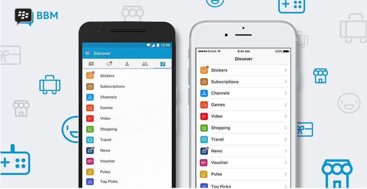
Even the team behind BBM confirmed they had been hard at work over the last few months working on the new version of the application. The new version of BBM brings some updates to the look and feel, mostly for iOS, but also for Android.
The iOS version of BBM received the most changes, so if you're using the app on an iPhone, then you will notice the Chats, Contacts, Feeds, Contacts and Discover icons have been updated to make it easier to navigate through the navigation menu.
A couple of tweaks have been implemented too, so you'll now find that BBM Channels have been moved from main navigation to BBM Discover screen, while the Discover icon has been relocated on the main navigation menu.
The user profile picture, PIN and other detail on one's settings have been grouped together under the “Me” menu. There's also a new gesture that will allow you to mute conversations by swiping left on items in the chat list.
Both Android and iOS users will now be able to so a combined view of Groups and multi-person chats, along with a new Discover menu in list format, as opposed to a grid of icons view available in previous versions of BBM.
Also, when Android users now update their profile pictures, they will show up as a full image in the feeds of other people. All the new features and many others have been added in the latest version of BBM, which is already available for download via Google Play and App Store.
source: BBM via CrackBerry








Things that are NOT allowed: