Now that consumers are able to snatch up the BlackBerry PlayBook, it’ll be interesting to see the kind of reception it’ll get with the general public. Mounting an offensive push in a new product market is undoubtedly one way that RIM can differentiate its past with its future, but with most new ventures, their visibility and longevity will be based on how well they’re able to capitalize on attracting people to their tablet from the onset. Shedding most of their roots in the process, they’ve seemingly taken a new approach with their QNX based platform, and interestingly enough, they’ve managed to develop and branch out their new platform in a timely manner – and good for us, the wait wasn’t extraordinarily long.
Knowing that RIM is indeed intent on maturing their shiny new platform, we’ll have to delve into every nook and cranny of its bounty in order to better gauge how well it stacks against the existing crop of tablet platforms out there. Visually, there’s no denying that it takes advantage of the PlayBook’s mighty processing power, but as we all know, it’s going to take more than beautiful looks to concretely solidify its position as a top tiered tablet platform. With that, let’s dive in and take a close look, shall we?
Recommended For You
The QNX based platform looks eerily familiar, but is it a standout on its own?
Having been impressed with HP’s webOS mobile platform when it first showed itself three CES events ago, the first thing to pop into mind after checking out the PlayBook’s QNX based platform is that it’s very similar to webOS. It employs some of the same exact gestures in use with HP's platform, and also shares some elements of the UI design, like the dock of icons at the bottom and the card-based multitasking on the homescreen. Overlooking the similarities, the one instantly distinguishable difference that we adore about the platform is that RIM happily decided to start off with a clean slate for it. We’re not saying that BlackBerry OS is a bad mobile platform, but rather, we haven’t seen much of a drastic departure to warrant a worthy commendation. For better or worse, their decision to drop their mobile platform and instead rely on a totally new one is a fact now, and it's definitely good to see the refreshing change of pace for them.
We’re glad to see that they totally stray far away from the heavy menu based interface of BlackBerry OS, and instead, we find a cleaner and more straightforward approach that reduces the learning curve from the start. In essence, it has some close ties with Apple’s iOS since the platform isn’t structured around menus – however, it’s apparent that the OS has to compromise with certain aspects like personalization. Undeniably, there’s still plenty of eye candy seen throughout it, like its nifty looking transition effects, but it’s a shame to find that you’re only limited to changing the background wallpaper of the homescreen.
Finally, there’s just this high level of responsiveness evident throughout the entire platform that makes just about everything you do so satisfying. Of course, it’s not saturated with a ton of snazzy looking 3D effects, but then again, the compromise is made there to offer a tight and intuitive experience. Even more, we rarely find the platform struggling to execute certain tasks, whether they’re simple or complex ones – which can be contributed to the latest build of the platform that was pushed out on launch day. Knowing that we’re still literally on version 1.0 of the platform, it’ll be intriguing to see how RIM will approach its new OS in the coming months. Although they’ve nailed down some of the basics, it already needs to do a lot of catching up in order to expand its reach amongst consumers.
Home screen, main menu and visuals
Minutely, you can still find some evidence of RIM’s mobile platform on the PlayBook’s homescreen, but thankfully enough, it’s not something that particularly glances out in front of you. When no apps are running, the homescreen consists of a top bar that displays the clock, date, connectivity status, battery indicator, and a tiny button that pops up the settings menu. However, this bar disappears the moment that an app goes into full screen – but you can always bring it back at any time by simply executing a diagonal gesture from the top left or right corners of the display. Regretfully though, personalization is nearly non-existent since you’re only left with the ability to change its wallpaper – and that’s all!
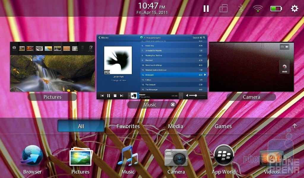
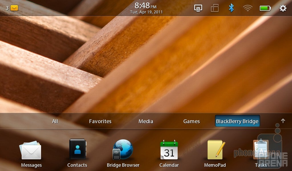
The only underlying element that RIM carries along from BlackBerry OS is the apps panel that basically displays the first row, but when you either click the up arrow or execute a swipe up gesture from the bottom bezel, it’ll bring the full panel into view. From here, it’s broken down to 4 distinct categories from the onset – these include All, Favorites, Media, and Games. Based on what the App World categorizes each app, they’ll automatically place themselves in the appropriate category. In addition, you can always rearrange the finger friendly sized icons to your liking by performing a long press on any single icon. However, it’s worth noting that a 5th category (BlackBerry Bridge) will appear if you happen to pair the PlayBook with a RIM-made smartphones using the BlackBerry Bridge app.
The homescreen with the apps panel
Needless to say that we have to applaud RIM for providing a simple, yet intuitive, process when it comes to juggling around through multiple opened applications. Granted that it might have some similarities with HP’s webOS, the consistently fluid speed of the platform allows us to effortlessly move between each app without losing place in any of them. When launching an app, it’s accompanied with a subtle transition effect that places it into its maximized view – which then encompasses the entire size of the display. Of course, a quick swipe up gesture from the bottom bezel minimizes it, then allowing you to navigate between any of the other opened panels, but you can also perform a quick swipe gesture from either left or right bezels as an alternative to jump from one app to another. Depending on the app, swiping down from the top bezel will uncover some additional functionality that’s related specifically to that specific app. Lastly, closing an app is obviously completed by minimizing it, then swiping the panel towards the top bezel – and surely enough, there’s an animation to go along with it.
Multiple opened applications
Although the QNX based platform is light in terms of 3D heavy visuals or personalization, it makes it up with its super responsive performance. In any event, we find a certain balance with it seeing that the fluid nature of the platform is commendable in providing an intuitive and quick experience in almost every aspect – though, its memory capacity isn’t limitless. In fact, we managed to load up to 10 different apps simultaneously with barely a hit being found whatsoever, but after attempting to load another app, it basically closes out one of the others automatically, which actually isn't the bestest of solutions. Regardless, it’s agreeable to say that RIM has done a decent job in keeping things very stable with their new platform.
Finally, we want to graze slightly on the PlayBook’s notifications system – which is nothing if you don’t use the BlackBerry Bridge feature. If you happen to be lucky enough to own a BlackBerry smartphone that’s compatible with this feature, you’ll get a taste of notifications with it. In the top bar of the homescreen, there’s generally a tiny mail/message icon with a number next to it that appears when the PlayBook is connected with your smartphone via BlackBerry Bridge. Clicking on it will display the notification, but whether they’re unread emails or message, we like that it isn’t obtrusive in any way. Still, it would’ve been nice to see a small preview of it, but rather, it informs you to tap the icon to launch the Messages app. Nonetheless, it’s decent for a version 1.0 platform, if we don't count the fact that you need to have a BlackBerry smartphone.
The PlayBook’s notifications system
Contacts App:
Regarded as being a “professional grade” tablet, it’s rather disconcerting to find that the PlayBook isn’t a dedicated device on its own – which is due to the stringent requirement of needing to connect it with a BlackBerry smartphone to unlock some of its features. In essence, you’re locked out of being able to manage contacts on the PlayBook without using BlackBerry Bridge, but if you happen to be fortunate, you’ll find that the contacts management system isn’t anything different from what is out there.
Yes, it relies on a familiar two-paneled interface – the left being your scrollable listing of contacts, while the right displays the detailed information of the selected person. Honestly, its appearance and functionality is a good indication that RIM simply didn’t spend much time on it. Much like most things out there, you can add a new contact and input all their associated information, which syncs up directly to your Blackberry smartphone’s address book, but it’s unfortunate that you can’t assign a photo with each person directly through the PlayBook. Even more, we can see that RIM didn’t do anything different with its portrait style layout because it’s merely a linear layout that displays the scrollable list at first, then the detail information once a contact is selected.
The Contacts app
Messaging and Email:
Undeniably, the PlayBook’s 7” display might not be the most ideal thing to use when it comes down to inputting text – especially if you happen to have larger sized fingers. In our experience, the general typing experience is still ultimately left as a one-at-a-time inputting process that requires a great deal of concentration. Even though the PlayBook exhibits a responsive feel when it comes to keeping up pace with the fastest of typers, buttons are remarkably small in size, and adding to its reduced input options, there are only a few punctuations offered from the main keyboard. Moreover, you’ll have to tap the numbers and symbols button on the keyboard in order to input additional characters – thus limiting your overall speed.
The keyboard of the RIM BlackBerry PlayBook
Interestingly enough, we actually prefer the portrait style keyboard seeing that the experience is somehow similar to any smartphone out there. Generally relying on your thumbs, the layout is narrow enough to allow your thumbs to completely encompass the entire space – which obviously makes for a better experience. Still, we find ourselves a bit limited in speed primarily because of its lack of additional numbers and symbols directly on the main keyboard.
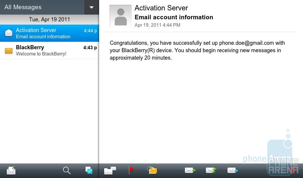
For a second there, you’d think that the “Messages” app would allow you to compose SMS or MMS message, but it’s only reserved for emails – nothing more. Fittingly, the layout is once again familiar seeing that it divides the screen into two sections when it’s in landscape. First, the left panel breaks down the contents of your folders, while the right panel will obviously display the selected email. Conversely, the portrait layout of the Messages app is identically the same with the Contacts app with its linear presentation.
The “Messages” app
Not surprisingly, we’re presented with some basic functions to get you somewhat productive with emails – like being able to search for specific messages, flagging, and the ability to select multiple messages. In all honesty, there isn’t much to differentiate the experience from a smartphone – and it’s frustrating to see it handling only the most basic of operations.
Organizer:
Continuing the theme of requiring you to use the PlayBook with a BlackBerry smartphone, the Calendar app is only unlocked when the two are connected together via BlackBerry Bridge. And once again, we see the common trend of only providing the most generic experience with its Calendar app. Naturally, it’s rather difficult move outside the box in offering a refreshing experience with this aspect, but it still would’ve been gracious to see RIM do just that. Instead, they decide to stick it out with their all too plain looking, yet functional calendar.
The calendar has the usual set of three views: month, week, and day, with appointments being appropriately noted in all of them, but it’s only with the month view that we’re presented with a distinguishable green color. Not only can you specify the timing of the appointment, but you’ll also be able to set reminders and add attendees to it as well. As we’ve seen thus far, there’s nothing really out of the ordinary with this one – and in the way, it’s a little disheartening. And finally, there’s nothing different with its portrait layout seeing that it simply adjusts to fit correctly.
The Calendar has the usual set of views
Even up until now, we have yet to see some marginally decent clock apps that do more than just sitting pretty displaying the time. Unfortunately though, the same boring experience is evident with the PlayBook’s clock app. Running the program, we’re instantly presented with an analog clock that displays the time, a stop watch, and timer – all of which work like they’re made out to do. And even though the PlayBook lacks a world clock, you can seemingly find the clock app to run like one seeing that you have the option to make a new clock and set its proper time. Generic and bland for the most part, it would’ve been nice to see some other elements added to it – potentially like some weather details or being able to run a slideshow.
The PlayBook’s clock app offers the same old experience
And then there is the Calculator app, developed by the recently acquired TAT (The Astonishing Tribe) company, which interestingly provides a useful take on a classic app. Besides having the ability to quickly calculate something, we like how the virtual tape on the left side of the interface allows us to keep track of our calculation history. Moreover, swiping down from the top bezel provides us access to the scientific calculator, unit converter, and tip calculator.
The Calculator app of the RIM BlackBerry PlayBook has a rich functionality
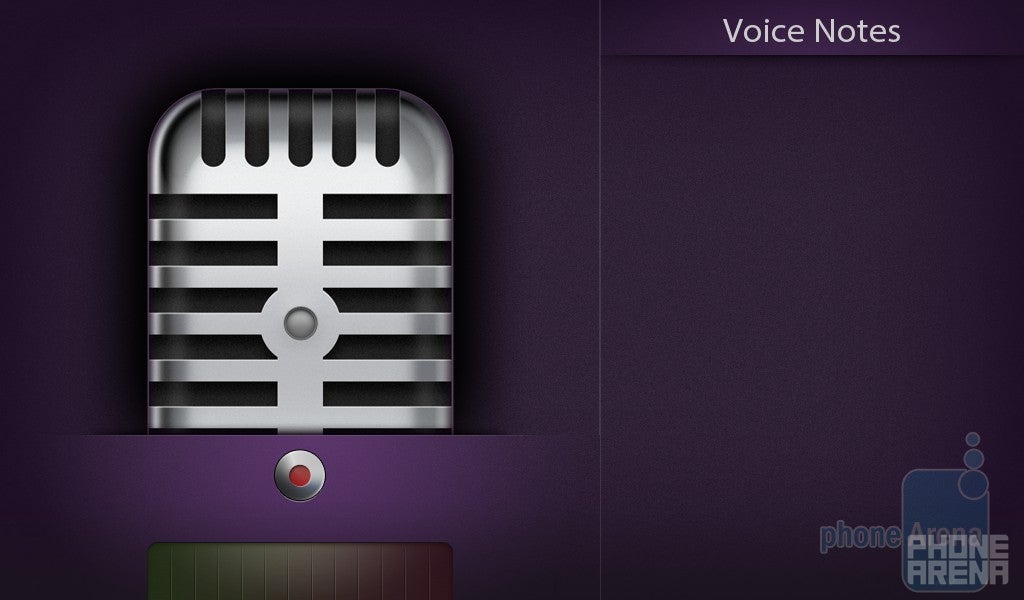
Undoubtedly unoriginal with its interface, the Voice Notes app allows you to record notes on the fly. Greeted with a rather super-sized microphone on the left side, you press the distinguishable red button to start recoding. Once done, it’s saved to the listing panel on the right side – while deleting them is accomplished by executing a swipe gesture from the top bezel to reveal its edit mode.
The Voice Notes app
Browser:
Indeed the most satisfying part about the PlayBook’s QNX based platform is the fulfilling web browsing experience, and rightfully so, it delivers on so many levels to put most things out there to shame. Connected through a Wi-Fi hotspot, complex pages load quickly and render nearly identical to what you expect to see with a standalone desktop web browser. Even more impressive is the fact that you don’t need to wait for the entire page to load before being able to navigate through it; which is of course nice seeing that you can quickly get right into it from the moment the first picture or text load. Meanwhile, you can access some of the other core features of the web browser, like opening up a new tab or getting to your bookmarks, by simply performing a swipe down from the top bezel.
Boasting full Flash Player 10.1 support, this fully equipped WebKit browser is able to deliver an amazing experience seeing that it replicates the desktop experience to the teeth. In the face of even some heavy Flash web sites, the browser doesn’t slowdown or stutter with its operation – so you’ll continue to see some smooth kinetic scrolling and responsive pinch gestures. From embedded YouTube clips to Flash based ads, there’s nothing that this web browser can’t handle, and even more, the full fidelity experience is complemented by the platform’s strong multi-tasking prowess. However, it’s missing some goodies, like the ability to quickly share URLs. But with most things we see, we’ll cross our fingers and hope for now that future updates will increase its capacity.
The web browsing experience is the most satisfying part about the PlayBook’s QNX based platform
BlackBerry App World:
Advertising that there would be approximately 3,000 apps available at launch, we’re not all that impressed with most of the offerings since it’s missing some key ones. Launching the App World app, we’re instantly greeted by some of the platform’s featured apps, both free and paid, and accompanied by some rather large and boxy looking icons. Furthermore, two other distinctive headings outline the general layout – these are Categories and My World.
Naturally, there’s an assortment of categories that break down apps to their specific case usage. Meanwhile, selecting a category will display all the relevant content associated with it – which can be further filtered by clicking on either the All, Paid, and Free buttons on the upper right corner of the interface. Finally, clicking on the My World heading on the main screen will load all the apps downloaded and installed on the PlayBook.
The App World app lacks quality third party apps
As we quickly downloaded a few apps, the first thing to come to mind is their general lack of functionality and quality titles. For example, we download a free Twitter client called TweeKL, which horrifically lacks any uplifting presentation, as it distastefully makes itself less useful than actually using their web based client. Obviously, the App World’s lack of quality third party apps handicaps its general appeal from the onset.
Camera:
Keeping most of the focus on its viewfinder, there isn’t much clutter found with the PlayBook’s camera interface. However, the only two buttons found gracing the interface upon startup are the on-screen shutter key and another that switches it to video recording mode. Although hidden from view, tapping anywhere on the screen will reveal some additional items – like the digital zoom slide, geo-tagging button, and another button that switches to the front-facing camera. Additionally, swiping down from the top bezel uncovers some additional settings – like turning off/of stabilization, changing the ratio, and three specific white balance modes. As a whole, there isn’t enough options to appeal even the most basic photographers out there – though, the overall snapshot quality of the PlayBook is especially good.
Camera interface
Camera samples shot with the RIM BlackBerry PlayBook
As for the video recording, the layout of the interface remains similar, but you can set the PlayBook to shoot in either 480p, 720p, and full 1080p. Surprisingly enough, the PlayBook captures high definition videos at the ridiculously smooth rate of 30 frames per second – and yes, you get that at 1080p. Definitely a remarkable thing to say the least, the only issue found with the PlayBook’s recording is its lack of auto-focus – meaning, items up close and personal will always have an out of focus look.
RIM BlackBerry PlayBook Sample Video:
Sure it’s not the most ideal thing to use for taking photos, but the PlayBook’s front-facing camera is respectable with its output – so don’t be scared off from using it more than usual.
It couldn’t get any more plain and boring, but the PlayBook’s Picture app is simple and straightforward with its interface. Chiming in with the usual looking grid-like layout when an album is selected, we’re presented with all the various gestures to acceptably navigate between photos – like pinch gestures to zoom and flicks to move left and right between shots. Sure there are barely any visually stunning animations with the gallery, but the faint overlay animation when swiping between images is decent. Of course, we see once again the platform’s limit since it lacks any sharing or editing functions.
The Picture app is simple and straightforward with its interface
Multimedia:
No doubt it isn’t pretty and lacks any appeal to make it a standout, the music player of the PlayBook is naturally functional. After launching the Music app, 4 giant sized icons break down the layout – these include All Songs, Artists, Albums, and Genres. Once you’ve made a selection, it’ll obviously play the song while displaying the album cover, track listing of the album, and some on-screen controls. And if you happen to minimize the music player or switch to a different app, you can always get access to the mini-player by executing a diagonal swipe from the upper left or right corners to bring up the title bar. Nowhere close to the glitzy visuals seen with Android 3.0 Honeycomb’s music player, the laid back approach of the generic music player once again shows off how it’s not yet fully taking advantage of the PlayBook’s supreme processing prowess.
The music player of the PlayBook is functional
Although some would think that the Pictures app would aggregate both photos and videos, there’s actually a separate app used to organize videos. Appropriately running the Videos app, it’s the centralized hub for all your video watching needs. Broken down to three categories, All Videos, Downloaded Videos, and Recorded Videos, you’ll quickly have access to everything at one place. Lamentably, there’s no option to upload videos, like YouTube of all things, which of course is somewhat of a feature that’s common amongst other platforms – even smartphones!
Video playback
YouTube:
Coincidentally enough, we’re actually taken by surprise to see a dedicated YouTube client on board with the PlayBook from the beginning. However, it’s vastly underpowered in terms of features because it lacks the ability to sign into your account, upload videos, rate stuff, and post comments. In reality, it’s nothing more than a facade to allow you to easily watch content, but the experience is less than engaging obviously since we’re locked out of some common features. Moreover, videos generally play in the highest quality – which means, you can potentially rack up some serious data if you’re tethered to a BlackBerry smartphone, as opposed to Wi-Fi.
The YouTube client
Bing Maps:
Bing Maps doesn’t offer the depth of features found with its closest rival in Google Maps, but you nonetheless have a maps experience with the PlayBook. Thankfully though, you can still get the usual set of directions to get you from one place to another without making things too complicated. Whether it’s walking, driving, or mass transit, it’s all there, but don’t expect to find voice guided instructions with it. Moreover, you’ve got four different views to choose from, but the only one that’s not something you generally expect to find is the bird’s eye view. In this mode, it simply presents a perspective look of the aerial view where you can orient the map to your liking. Aside from that, you’ve got the usual assortment of features with it – like honing into your GPS location, viewing relevant information with businesses, and the ability to view traffic.
Kobo Books:
For anyone familiar with the Kobo Books app, it’s the one area where you’ll get your ebooks fix – while having the ability to purchase ebooks through its online store. Again, there’s nothing too different with its operation, seeing that it’s your clear-cut ebook reading app, but It’s unfortunate that no animations are incorporated when flipping pages.
You can purchase ebooks through Kobo Books
Productivity Suite:
In keeping true to its professional grade status, the PlayBook’s productivity aspect is supplemented by the inclusion of Data Viz’s Suite of Office apps. Boasting Word To Go, Sheet To Go, and Slideshow to Go, it’s remarkably sufficient in handling even the most demanding needs out there. Frankly, we’re more impressed by the fact that you’re able to compose and edit Word and Excel files on the go with the PlayBook. However, it’s worth knowing that the Slideshow to Go app will only play your PowerPoint presentation – and nothing more. Regardless, the included set of apps is indeed invaluable for those business professionals who require some added flexibility with a tablet.
Sheet To Go
Conclusion:
Grazing the tip of the iceberg, RIM’s QNX based platform still requires some work in order for it to soundly compete on the same level as its competition, and if it’s unable to make those key adjustments early on in its life, we may see an early demise that would certainly shut the door on their hard work. For starters, this platform should’ve been used for RIM’s BlackBerry OS 6 seeing that it’s a stark departure from their usual vantage point. However, it fittingly makes its debut on a totally new product segment – which is naturally the ideal thing to do in order to showcase a brand new platform like this.
Without a doubt, RIM hit the bull’s-eye on this one when it comes to delivering an exceptionally fitting platform for multi-tasking. Combining its wickedly responsive performance and gesture heavy interface, the elements combine together to form a well-balanced experience that’s satisfyingly stable and intuitive from the onset. However, they really need to bring core services, like a dedicated email client and calendar, without the need to tether it via BlackBerry Bridge. In fact, its usability for being a “professional grade” tablet is mostly limited by this aspect – not to mention forced as well seeing that you’re required to have a BlackBerry smartphone in order to unlock certain services.
Until that happens, there’s no arguing that tablet platforms like iOS and Android clearly have the upper hand in offering a resounding and complete tablet experience. Moreover, third party app support will greatly contribute to its rise, but as it stands right now, it’s lacking any to keep a solid interest in the platform. Frankly, we’ll be keeping a close eye with its development, especially when Android apps support launches, but until then, you’d have to be a diehard BlackBerry user to accept the PlayBook’s incomplete experience.
BlackBerry PlayBook QNX Platform Video Walkthrough:
A discussion is a place, where people can voice their opinion, no matter if it
is positive, neutral or negative. However, when posting, one must stay true to the topic, and not just share some
random thoughts, which are not directly related to the matter.
Things that are NOT allowed:
Off-topic talk - you must stick to the subject of discussion
Offensive, hate speech - if you want to say something, say it politely
Spam/Advertisements - these posts are deleted
Multiple accounts - one person can have only one account
Impersonations and offensive nicknames - these accounts get banned
To help keep our community safe and free from spam, we apply temporary limits to newly created accounts:
New accounts created within the last 24 hours may experience restrictions on how frequently they can
post or comment.
These limits are in place as a precaution and will automatically lift.
Moderation is done by humans. We try to be as objective as possible and moderate with zero bias. If you think a
post should be moderated - please, report it.
Have a question about the rules or why you have been moderated/limited/banned? Please,
contact us.


Things that are NOT allowed:
To help keep our community safe and free from spam, we apply temporary limits to newly created accounts: