Bezel-less is not a thing, and here's why it shouldn't be
This article may contain personal views and opinion from the author.
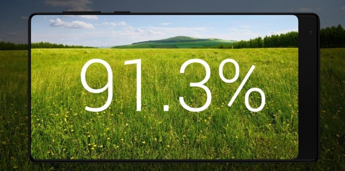
Naturally, Xiaomi isn't the only manufacturer that strives towards having no bezels. Samsung, LG, and allegedly Apple are also doing their best to achieve this goal, among others. Terms like “bezel-less”, “edge-to-edge display”, and “fullscreen design” pop up left, right, and center. But do they actually mean what they imply? Could a phone truly lack bezels, and more importantly – should it?
They all have bezels
Just because a phone has very thin bezels doesn't mean that it has none at all. If you have a tiny pin-sized hole in your shoe, your feet will still get just as wet in the rain, as if you had a long cut on your sole. Then, why do we apply double standards to our phones?
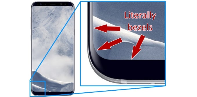
Admittedly, the Samsung Galaxy S8+, while having bezels on all sides, is the closest we currently have to an edge-to-edge display phone, at least on its left and right. However, the idea here is not to bash smartphones or manufacturers. So, let's move on to the other aspect of the piece.
We need the bezels, and more of them
All of these things require bezels to be useful. Otherwise, they will have to be either under or cut into the display, and this will neither look nor work well. Imagine watching a YouTube video with two black stripes near the left and right edges of the content. This is where your stereo speakers will be.
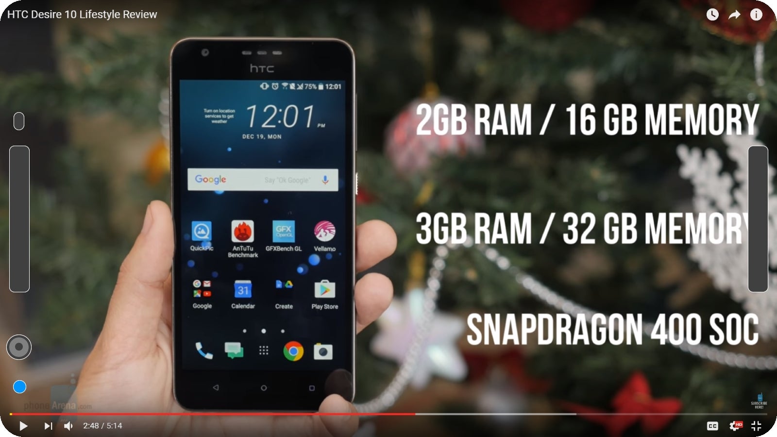
Here's what YouTube would look like with no bezels, complete with stereo speakers, selfie camera, notification LED, and light and proximity sensors.
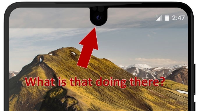
I'm sorry to inform you that it has already started, too. When Essential unveiled its first phone, brainchild of the father of Android Andy Rubin, there was a fierce debate in the PhoneArena office on how to call this new cutout display. A few names were thrown around, such as “droplet”, “crease”, and “horseshoe” (my personal favorite remains the “bus-ticket design”), but whatever we all called it, we managed to agree on something – that camera did not belong that deep down into the screen.
The strive to be “edge-to-edge” has lead several manufacturers down a very slippery slope already, Essential included. After the LG G6 and Galaxy S8, Rubin also decided to incorporate a weird aspect ratio, just to squeeze that extra bit of screen in, but while the first two made some sense, Essential comes with a 19:10 aspect ratio. What are we supposed to watch on that?
Of course, there are other arguments as to why we need bezels, but we have covered them numerous times before, so I will only skim over them this time. First, bezels protect the screen. Just look at what happens to the notoriously “bezel-less” Mi MIX when it was dropped. I am willing to bet a one-month salary that the Xperia XZ Premium will survive the very same accident with just a minor cosmetic bruise.
And there is the matter of holding the phone. Our hands need to wrap around it, or else it will end up flying to the ground every time you use it. But if they do wrap around the edges, they will make contact with the edge-to-edge touchscreen. Guess this will make butt-dials a thing of the past, and introduce palm-dials instead.
Conclusion
We've gone far enough in our desire for an all-screen smartphone. Let's stop while we can still use our phones, or better yet – let's take a tiny step back. Otherwise, we'll end up with fragile glass tiles, with questionable aspect ratios, that we can neither hold, nor use for fullscreen apps.






Things that are NOT allowed: