Battle of the Always On Display: LG G5 versus Samsung Galaxy S7
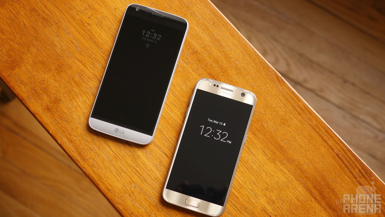
Hot off their recent introductions during Mobile World Congress 2016, the LG G5 and Samsung Galaxy S7 have notable qualities about them that make them stand out so much. For the Galaxy S7, Samsung amassed critical acclaim for the outstanding performance out of its latest flagship. As for the LG G5, it’s still on its way to being released, but rest assured, it has already sparked interest and intrigue because of its updated, modular design.
Interestingly, though, the two companies introduced similar features in its flagships. While it’s not technically the first time we’ve come across this feature, considering that it’s been something that’s been employed amongst smartwatches, including the respective bunch from both companies, the new Always On Display features in the LG G5 and Samsung Galaxy S7 makes the process of viewing the time quicker and faster than ever before. Therefore, users no longer need to press the power button, or execute some other gesture, in order to turn on the screen to view the time and other pertinent information.
We have a pre-production unit of LG G5 in our possession, so we thought it'd be a good idea to quickly to see its implementation and how it competes to what Sammy has done with the Galaxy S7.
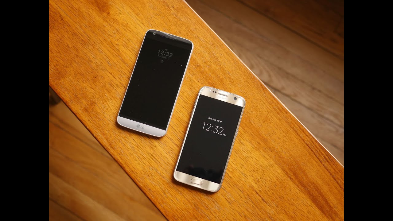
Sure, they’re similar in premise, but there’s always the matter of their executions. Considering they’re utilizing different display technologies, the outcome isn’t going to be exactly the same. We’ve been using the Verizon version of the Galaxy S7, so we’ve been acquainted with its Always On Display feature for a bit of time now. However, the LG G5 unit we’re checking out here is a pre-production model, so it’s not a final build – albeit, we can expect pretty much the same end result regardless.
The Always On Display might be perceived as a new feature, but we have to remember that previous phones offered something similar to a certain degree – such as the case of the secondary screens found in the LG V10 and Samsung Continuum. From what we’re told by LG, the G5's IPS-LCD display can keep a backlight on for about 30% of its normal brightness and have a small area of the screen display a few items, such as time, a personal message, and pending chat notifications. It’s been stated that it consumes up to 0.8% of battery per hour, according to LG.
Samsung’s interpretation doesn’t stray too far from the intended outcome, but nonetheless, there are still some subtle differences in how it’s executed. Because it’s employing AMOLED technology, pixels can be turned on individually, so that the entire panel doesn’t technically need to be powered on. Now, even though Samsung doesn’t have exact numbers for battery drain per hour, they estimate that it uses less than 1% or so of the battery per hour.
Throwing out numbers is one thing, but what about their actual, real-world performances? Well, it simply breaks down to primary things that we expand upon below.
Visibility
In the dark, or on those days when it’s cloudy and gray, we don’t find any issues viewing the content on either phones. Visibility isn’t a problem, as their respective screens deliver adequate iridescence. Therefore, the time, date, and accompanying notification icons are all quite visible from a normal distance.
However, as we inspect them closer, there’s a clear winner between them – and that’s the Galaxy S7. Under direct light, or bright conditions as whole, the information displayed by the Galaxy S7’s Super AMOLED screen is brighter, clearly defined. Under the same conditions, it’s undeniably noticeable that the Galaxy S7 is far more distinctive to make out with the eye. In comparison, the LG G5’s IPS-LCD panel is just subdued; nowhere as potent. Don’t get us wrong, we can still make out what’s there on the G5, but not from even a moderate angle. In such scenarios, the content displayed is just too dim for us to read, and we have to adjust to face the phone head-on.
Content
And of course, there’s also the matter regarding what kind of content can be displayed by them. By default, the two present us with the time, date, and icons for incoming notifications. That said—and this is important—Samsung's take on the features only shows notifications from official Samsung apps. In comparison, the G5 will display any third-party notifications. In fact, when they first hit your phone, you'll see a large icon to let you know what app is begging for your attention, eventually shrinking in size and falling in line with any other notifications you might already have received. And while that's a big win for LG in our view, Samsung does offer far more diversity in terms of customization. That’s because in addition to choosing various clock styles, we even have the option to select different calendar styles as well. Best of all, too, there’s an option to choose a stock image, which gives it a little bit more personality.
Oppositely, LG’s interpretation isn’t as diversified with its portfolio. In fact, there are no other options to choose from when it comes to the clock style. The only other option at our disposal is setting a signature to be displayed instead of the time. Yes, we can have some sort of quote or witty statement, but it’s just disappointing that it’s limited in its scope. Who knows, but maybe this call all change down the road? Maybe they’ll open it up to other styles to choose from? Still, based on this pre-production model, there’s no denying that it could benefit by offering just a bit more variety.
And the winner for now is....
Based on what we’re experiencing, Samsung’s interpretation seems like it’s the better one in terms of hardware execution. The content on the screen is noticeably easier to make out, even at an angle, and that means you save yourself the trouble of having to strain your neck to see what's going on, as you do with the G5. Samsung's is also more diversified in that you can choose between various styles for the clock and the calendar, or even set a custom image if you're so inclined.
That said, we do have to give it to LG for thinking of the many third-party apps that we all use. So whereas Samsung limits you to getting notifications on the screen from just its own apps, with the G5 there's no discrimination, and we find that far more useful. And when those inevitable "X app has been updated" notifications start hitting LG's phone, you'll know there's no reason to wake it up with just a peek.
Finally, it's worth pointing out that the widgets and images shown by the Galaxy S7 have their locations changed every once in a while. This is to avoid screen burn-in – a degradation of the screen caused by displaying a static image for long periods of time. This isn’t the case with the G5, because it uses an IPS LCD display – this allows is to keep the placement of its always-on content static.
All in all, we’re going to reiterate and say that both Samsung and LG have done a decent job, just in different areas. Quite frankly, if we were to get the visibility and customization available with Samsung's Super AMOLED displays, and combine it with the third-party app support from the G5, we'd have a far superior feature than either of the two separately.




Things that are NOT allowed: