Are you using the new Edge UX on the Galaxy S7 edge?
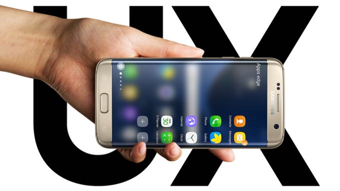
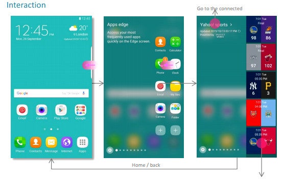
Samsung inadvertently posted new Edge UX references before it was announced
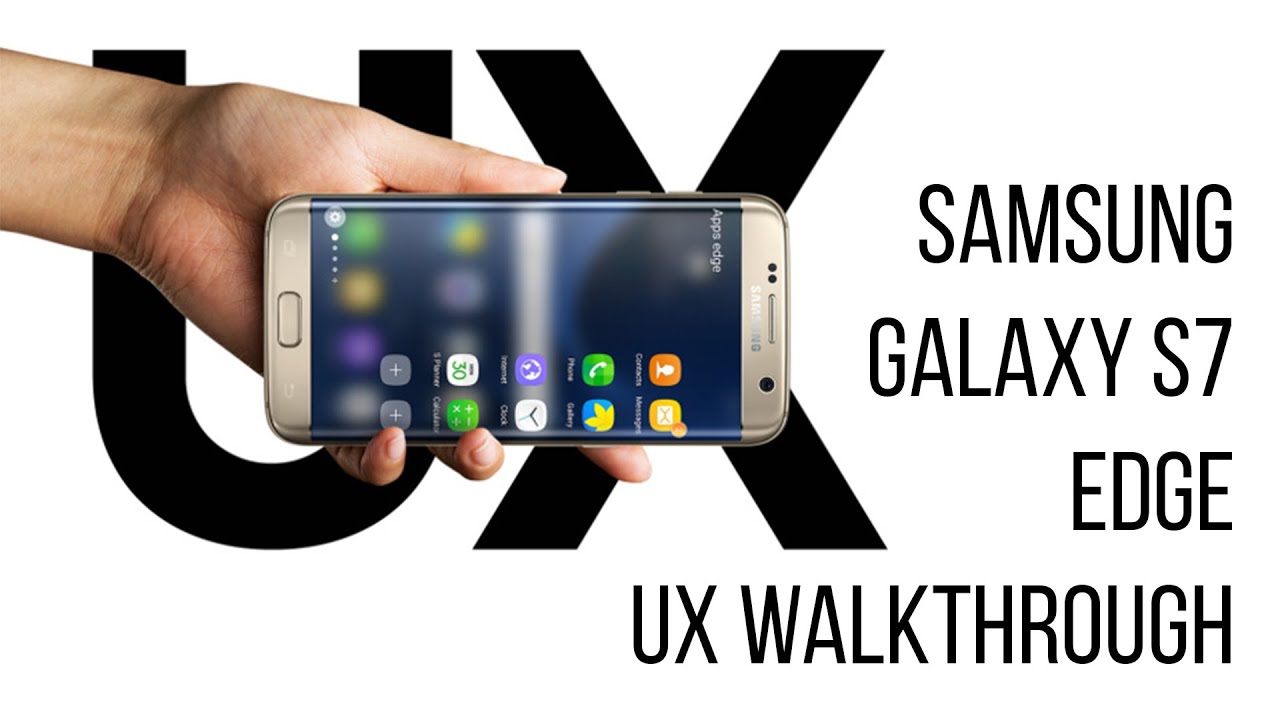
Indeed, when the S7 Edge hit (and also on the S6 Edge after the Android 6 Marshmallow update), Samsung introduced a brand new Edge UX to go with it exclusively. The side interface is now much more useful - you have two columns of apps, or you can use that space for custom widgets called edge panels, with a multitude to choose from. Some are mostly informational, showing things like weather details, the latest headlines, sports game scores, and stocks prices, while the Tasks edge lets you have shortcuts to specific modes inside apps, such as the Panorama mode in the camera. Another edge panel can show utilities like a side ruler, and so on.
The Edge UX has undoubtedly been greatly improved, yet still doesn't offer much of the kind you can't do on a flat display. You don't really need a curved part that is a fraction of an inch to show quick dial shortcuts, or read the news on a third of the display space, double-width or not. Granted, it's a bit easier to evoke the Edge UX from any place when you have that small curve to slide your thumb over, but that's about the added value here that can't be replicated on the flat screen of, say, the Note 5. This is why we wanted to ask you today whether you are using the Edge UX of your Galaxy S7 edge, or the previous "edge" generations on a regular basis now. Tell us in the poll below, and chime in the comments with what you find most useful about it.
Are you using the new Edge UX on the Galaxy S7 edge and earlier models?
Often, I find it very useful
41.27%
No, I've never fired it up
24.8%
Rarely
33.93%
Follow us on Google News





Things that are NOT allowed:
To help keep our community safe and free from spam, we apply temporary limits to newly created accounts: