Apple's iOS apps and some 3rd party ones redesigned for the iPhone 5 screen, the rest will have borders
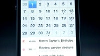
Apple just announced the new iPhone 5 with a larger 4" display, 16:10 aspect ratio, and 1136x640 pixels of resolution. There is now a fifth row of icons, just like the rumors were predicting, and Apple said apps have been updated to take advantage of it.
This includes not only the default apps like the Calendar that fits more events now, or Mail, Keynote, Page, Numbers, Garage Band and so on, but also third party applications.
Some devs have been given early access to the screen's size and specs, so they have totally reworked their apps to fit the new display. Apple's Phil Schiller gave example with CNN and Open Table, whose app interface is now more spaced out indeed, and fitting more info on one screen.
As for the other, unoptimized apps - "Well here's an app that hasn't been updated. It runs at the same size. We center it and place black borders on either side," said Phil Schiller.
Some devs have been given early access to the screen's size and specs, so they have totally reworked their apps to fit the new display. Apple's Phil Schiller gave example with CNN and Open Table, whose app interface is now more spaced out indeed, and fitting more info on one screen.
Apple's staple iOS apps and some 3rd party ones have been redesigned to take advantage of the new screen
Follow us on Google News










Things that are NOT allowed:
To help keep our community safe and free from spam, we apply temporary limits to newly created accounts: