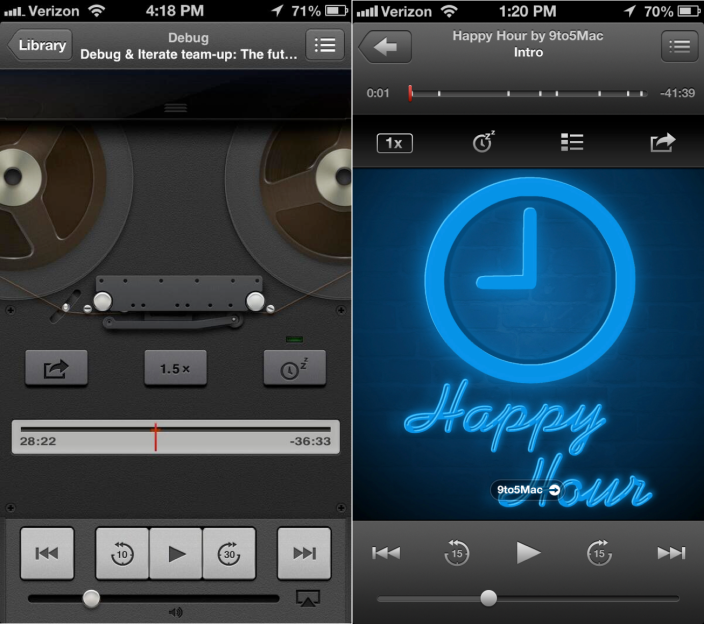
The old (L) and new look of the iOS podcast application
Apple fans, you wanted it and now you have it. According to those who have seen iOS 7, a redesigned version of the UI is on the way, designed by Jony Ive. The verdict is that those who have never seen iOS before will like it, while those familiar with the current version of iOS might be sorry that that they opened their mouth and called for a change.
Apparently gone is the
gloss and the shine of previous iOS builds, leaving a "flat" look that is said to resemble Windows Phone with its simplicity and lack of textures on digital images of real-life items. Take a look at the old and new design used by Apple for its podcast app and you can see the change from a life-like reel to reel recorder to the current design. Despite the changes, iOS 7 remains intuitive and easy to use. The code name for iOS 7is
Innsbruck and brings all new icons for native apps along with newly designed tool bars and tab bars.
Apple is said to also be looking at working on a way that users can glance at the screen to get information. Hmm. That almost sounds like the function of a widget. WWDC 2013 runs from June 10th through the 14th and iOS 7 is expected to be unveiled then. And with the two major proponents of skeumorphic design inside Apple now gone (Steve Jobs and Scott Forstall), you can expect some big changes in the look and feel of iOS 7.
source:
9to5Mac
Read the latest from Alan Friedman


Things that are NOT allowed: