Apple's attention to branding shines even when it photoshops Android

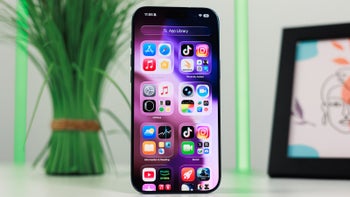
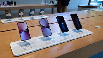
Apple is notorious for its affinity towards the exact 9:41 AM time that shows throughout its product render shots on its website, in stores, and on other marketing materials. There is a
story behind that decision, and it's that Apple's big product launches happen about 40 minutes into a keynote, so it timed the clock on its product renders to show a minute after so that the audience is left with the impression that the unveiling is indeed in real time. As per Apple's Scott Forstall:
We design the keynotes so that the big reveal of the product happens around 40 minutes into the presentation. When the big image of the product appears on screen, we want the time shown to be close to the actual time on the audience's watches. But we know we won't hit 40 minutes exactly.
Even if it is more than a minute off the mark, the infamous 9:41 AM has stayed as a branding mark for years now, and, seemingly, transfers even to doctored Android interfaces in Apple support videos. Talk about love of branding consistency.







Things that are NOT allowed:
To help keep our community safe and free from spam, we apply temporary limits to newly created accounts: