iPhone 8 vs Samsung Galaxy S8: selfie camera comparison
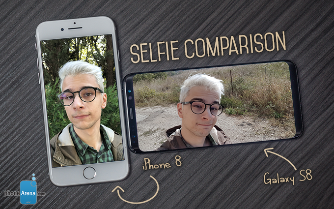
But it’s really hard doing that when your phone’s front camera is bad. And this is quite a common occurrence as most manufacturers tend to focus on the rear-facing module. And while there’s a point to be made that this isn’t the best idea — especially considering how many people out there take more selfies than regular photos — but this isn’t what we’re here to discuss today.
Scene 1
Let’s start with the best photos first — as it turns out, taking a selfie in broad daylight with an interesting but unobtrusive background will net you reasonably good results, regardless of which phone you use. Who would have thought?
But there is still a clear winner here: the iPhone 8. Despite having a considerably less realistic color palette, the end result is still more vibrant and lively. And at the end of the day, what's important is that the photo looks good, right?
Winner: iPhone 8
Scene 2
On the other hand, realistic colors can sometimes give much, much better results than iPhones’ artificial yellow tint. Such is the case here, where the boosted contrast gives off the impression of unnatural lighting.
However, it is worth noting that the iPhone was considerably better at focusing on my face: note how the untamed strands of hair to the left are perfectly visible, while the S8’s camera has turned them into a blurry mess.
Winner: Galaxy S8
Scene 3
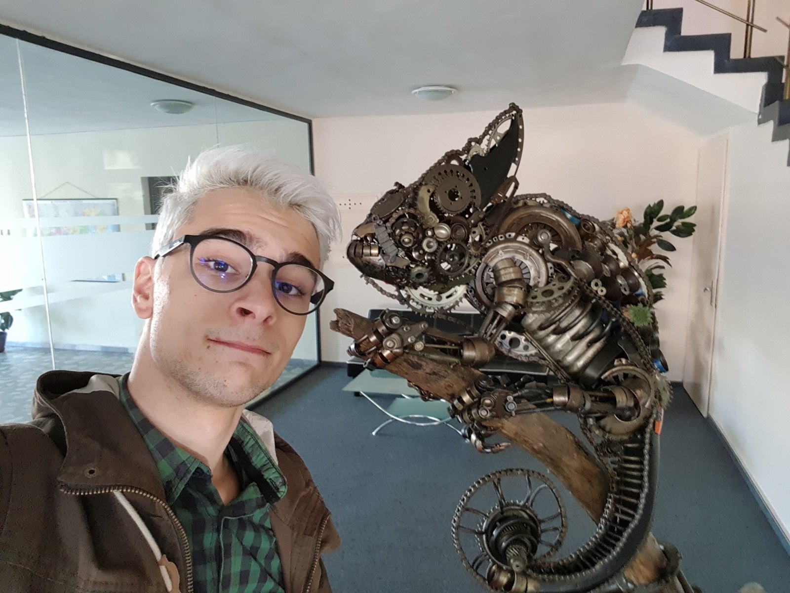
But while outdoor shots are usually fine, things start getting a little iffy when you try taking selfies indoors. Take this shot for example — even though the setting wasn’t really that dark, both phones struggled with capturing a good shot.
However, the clear winner here is the S8, as it managed to light up the scene considerably better than the iPhone. Also, while the latter’s yellowish tint may look good in some photos, it has no place in a scene like this.
Winner: Galaxy S8
Scene 4
Fear not, dear reader — the art of the group selfie hasn’t been forgotten, either (though the terribleness of these photos should serve as a reminder of why it’s usually glossed over).
And while both photos are pretty good quality-wise, the iPhone takes the cake here. There’s two reasons for this: firstly, the S8 photo has some noticeable distortion towards the edges (my neck is definitely not this thick). And secondly, the shadows on the iPhone 8’s photo look much more natural, whereas the S8 has a noticeable cutoff between the lit and unlit parts (most noticeable on Peter’s forehead).
Winner: iPhone 8
Conclusion
So the end result is... drumroll please... A tie! Which to be honest isn't that surprising — both Samsung and Apple devices have traditionally had their own unique problems with selfie quality, and those are unfortunately still present in full force.
Final results: 2:2
And taking a deeper look at the photos where the iPhone 8 failed reveals that they were both taken in uncommon lighting conditions: one has a darker subject against a light background, while the other was taken in a poorly-lit room. Thus, it's a safe conclusion to make that the bad-looking photos are mostly the result of overly aggressive post processing, with overly exaggerated shadows and too much contrast — a problem which has always been the Achilles' foot of iPhone selfies.
On the other hand, the Galaxy S8 did okay in pretty much every picture — with okay being the key word in this sentence. That is, none of the images from Samsung’s device were particularly impressive, due to a variety of problems including their slightly bland colors and dynamics, plus the exaggerated field of view which sometimes results in a distorted subject. But hey, at least they were consistent!
If you want to, you can also check out all the images, as well as 100% side-by-side crops, in the gallery below:






Things that are NOT allowed: