Apple iOS 14 Review: Hands-on with all the new features
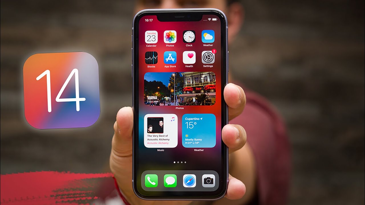
Update: Apple will release iOS 14 on September 16, 2020. The full text of the original article follows below.
How will the first online-only WWDC opening keynote be remembered in a few years' time? For many, it will be the hallmark event that finally had Apple part ways with Intel and develop its own custom silicon for the Mac. Others will certainly remember it for the unorthodox online-only keynote that was live-streamed on YouTube, of all places. Finally, many will certainly remember it as one of the most serious visual overhauls iOS has had in years.
- iPhone 13: price, release date, features, and specs
iOS 14 was announced last night with lots of new quality-of-life improvements and new features that have been a long time coming. There's still a long time until iOS 14 arrives to the list of supported devices, but the wait will be worth it.
We quickly installed iOS 14 on Betty, our trusty iPhone that's dedicated to beta builds, and delved into the new piece of software that Apple has released. Of course, it has its fair share of bugs (changing the wallpaper with a small widget stack makes it unnaturally thick) but that's normal behavior for an early developer beta. Still, iOS 14 is perfectly usable in its current form, though we wouldn't recommend installing it on your daily driver.
If you are wondering whether it even makes sense buying an Android phone now that iOS 14 has adopted many of the signature Android features, read some important notes here.
Here's a comprehensive list with all the new features that are part of iOS 14:
- Custom Widget Stacks
- Apple Music Redesign
- Apple Music Autoplay
- Picture in Picture
- Compact Phone Calls
- App Library
- Third-Party default apps
- Search in apps
- Emoji Search
- Approximate Location Sharing
- Back Tap
- Exposure Lock
- QuickTake Video
- HomeKit Control Center
- Pinned chats in Messages
- and many more...
iOS 14: Fresh, fresh, fresh!
Widgets: finally great!
The leitmotif with iOS 14 is the visual overhaul of the ubiquitous home screen, which has seen a pretty severe paradigm shift. It wouldn't be too outlandish to say that iOS hasn't seen such major changes ever since the skeuomorphic design was superseded by iOS 7's modern flat design that we've grown to love and cherish. The new homescreen widgets and the App Library might not be on the same page as far as impact goes, but it will forever change the way you interact with your phone.Widgets have been redesigned, they still show the same amount of useful info at a glance, but they are now finally great. Previously limited to the dedicated widget pane to the left of the main home screen, widgets can now be freely moved around and resized across your home screens and mix-matched with your app icons. You can completely ditch away app icons in favor of the fresh new widgets if you wish so. The best aspect of the new widgets is that they look uniform and closely follow the aesthetics of the surrounding interface elements, which makes them feel very natural and never out of place. Another excellent feature is widget stacking, which lets you create a space-efficient carousel with widgets. Scrolling and interacting with that one is pretty similar to using the Apple Watch's complications.
You will learn to love App Library
The App Library is another intriguing novelty that graces the iOS home screen which wages a predetermined war on icon clutter. Gone are the days where you'd have a multitude of unsorted homescreens with scattered apps and folders; you will also no longer have to rely on muscle memory to open that one app. Thanks to App Library, you are just a few taps away from cleaning up your iPhone's homescreens and neatly organizing all of the apps in a slew of non-ambiguous categories. How does it differ from the folders that you can create yourself? Simple, App Library does the sorting for you, which could be a very big time saver if you have hundreds of apps installed. App Library has yet another time-saver for those particular individuals - tapping on the search widget at the top not only lets you search for a specific app, but also sorts all of your apps in an alphabetical list, making it very easy to find the one you're looking for.Incoming calls now cause less anxiety
Apple finally caved in and introduced a compact incoming call screen with iOS 14. Hallelujah! You will no longer be abruptly interrupted when you receive an incoming call, as calls can now be displayed as banners at the top of your homescreen. Those banners are flickable, and this wouldn't hang up the call. If you still prefer the old-school fullscreen incoming call window, you can opt for that one.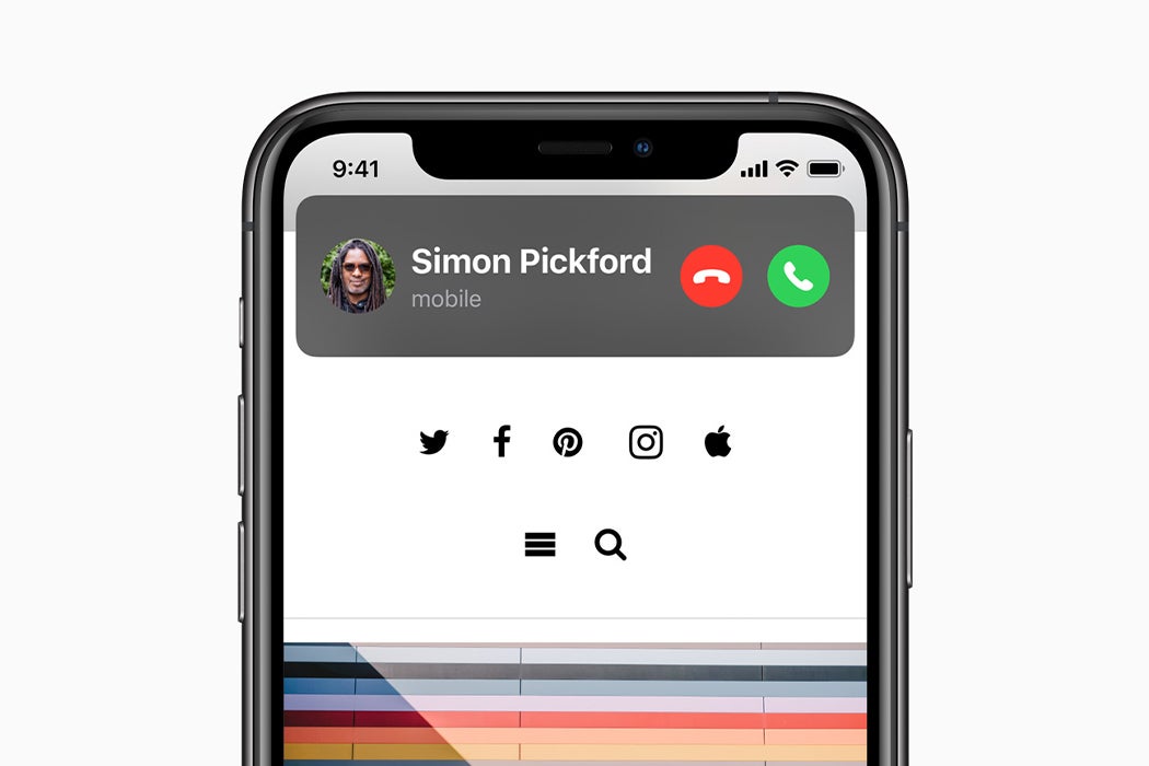
Picture-in-picture is here
PiP, as picture-in-picture is more commonly known, was introduced on the iPad all the way back with iOS 9, but weirdly enough, it wasn't available on the iPhone until iOS 14 came along yesterday. Thanks to the new feature, you can now continue watching your videos and movies in a compact mini-player while sending emails or browsing the web, which makes for an uninterrupted user experience. Of course, PiP is probably more useful on the iPads' larger displays than on the limited screen real estate that's available on an iPhone, but having the PiP option is great news nonetheless. PiP only works with select popular streaming apps right now. YouTube? We got it working by having YouTube Premium and accessing the website through Safari, but not with the official YouTube app.
Messages & Memoji
Messages now feel like a complete app that's got in covered on all fronts. You can now mention specific contacts in group chat, which will alert them even if they have muted the specific group chat. Yes, you can do that now as well. Inline replies are another life-saving feature that will greatly improve the experience in more populous conversations. Group chats can now be adorned with a custom thumbnail, which would give it a sense of individuality.Speaking of individuality, there are even more options for Memoji customization now. You can create a pink elder vampire with a cowboy hat and tons of piercings, how is that not a win? The customization possibilities are certainly not endless, but it's doubtful anyone would feel restricted in their choices.
Compact Siri
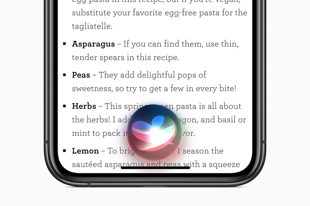
Possibly inspired by the Google Assistant's fresher interface that was introduced last year, Apple did away with the dated fullscreen interface for Siri. The assistant will now display information in polished banners near the top of the screen and wouldn't interrupt your work. A great change that was a long-time coming. This is probably a change that will help Siri be used by more people that were turned off by its old design.
iOS 14 other minor features
As usual with iOS, there are tons of small features that don't get any keynote time but get unearthed by the community as soon as the beta previews start rolling out. That's the case with the iOS 14 as well. Here are some intriguing new features that you should know about:
- Double- or triple-tapping the back of an iPhone can launch a pre-defined shortcut. For example, you can launch the camera by double-tapping your iPhone or even assign a custom automation shortcut. However, this new feature has some hardware requirements as it only works on iPhones that have Tap to Wake (iPhone X, XS and XS Max, XR, 11, 11 Pro, 11 Pro Max). Older iPhones (6s, 6s Plus, SE 1st Gen, 7, 7 Plus, 8, 8 Plus, and SE 2nd Gen) won’t support it.
- You can now mirror the front camera so that selfies are taken as previewed.
- There are tons of emoji available in the stock iOS keyboard. It's hard to keep track of all the new ones that arrive on the regular, but Apple has got you back. There is a new emoji search feature that lets you find out just the one that will help you express yourself, just like on Gboard. On-device dictation is also part of the feature list.
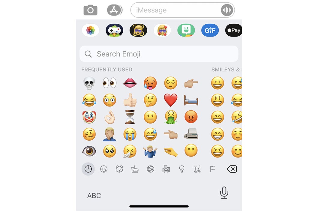
iOS 14 emoji search in the stock keyboard
- You can now set separate alarms for each day of the week.
- Sound recognizer will now alert you if it detects fire/smoke alarms or sirens, cats meowing, dogs barking, appliance alerts, door bells, water running, crying babies, shouting, car horns or door knocks. A great new accessibility feature for people that are hard of hearing, It also works with the Shortcuts app for advanced automation.
- There's a new NFC Tag Reader tile available for the Control Center.
- Come autumn and you update your iPhone to iOS 14, your AirPods will be able to seamlessly switch between any paired Apple devices with the new and improved automatic device switching. This would make device-hopping even quicker and intuitive.
There are many minor new features that will come along with iOS 14, but for the sake of brevity, we'd refrain from listing any more.
Conclusion
That's a good thing. It doesn't matter who did it first or who did it better, what's important is that both operating system gradually improve the user experience with meaningful and actually useful features. If nobody borrowed ideas or inspirations, we'd still be in the dark ages.
iOS 14 looks like the iOS update fans have been asking for years, introducing tons of quality-of-life improvements that will certainly float the boat of long-time iOS users and make the ecosystem that much more welcoming to Android immigrants. With the performance and security part of iOS getting continuously improved with the past few iOS updates, it made perfect sense that iOS 14 would finally solve some minor pet peeves and polish the visual appeal of the OS.
As mentioned in the beginning, the wait for iOS 14 won't be long - it is coming to eligible device on September 16, 2020.









Things that are NOT allowed: