Apple heard your complaints! Battery percentage indicator is overhauled in iOS 16.1 Beta 2
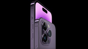
Dynamic Island. Ok, now that we got that out of the way, let's discuss a feature that Apple added to iOS 16 and is already revising due to public pressure. We are talking about the battery percentage indicator that Apple squeezed into the battery icon on the iPhone status bar. The battery percentage indicator made its debut with the iPhone 3GS in 2009 and disappeared with the introduction of the notch with the iPhone X in 2017.
Before it brought back the battery percentage indicator with iOS 16, there were only two ways to get a precise reading of how much power your iPhone had left. One way to achieve this was to open the Control Center by swiping down from the right edge of the screen to see the percentage of battery life remaining. The second way was to put the iOS battery widget on your home screen and this would also tell you how much battery life you had left on your iPhone in percentage terms.
Apple makes the battery percentage indicator even better in iOS 16.1 Beta 2
Even though Apple returned the battery percentage indicator to the iPhone's status bar in iOS 16, the design did not exactly wow the iOS fans. That's because it merely shows a number inside the battery icon to represent the percentage of battery life and frankly, it was hard for many to read. It wasn't until battery life was at 20% or less that the indicator turned red covering about one-fifth of the battery icon, and the red area would continue to shrink to stay inline with the percentage of battery life remaining.
There we go: Apple has tweaked the design of the battery percentage icon in iOS 16.1 beta 2. It now shows the proper charge level pic.twitter.com/15tvFUCaPx
— Federico Viticci (@viticci) September 20, 2022
But this was not exciting enough for your average iPhone user. No, no no! And letters poured into CEO Tim Cook's office (with probably a few addressed to Tim Apple), asking Apple to revise the battery percentage indicator to make it easier to see and more compelling to view. Well, guys, your letter-writing campaign paid off. Here's the good news. With iOS 16.1 Beta 2, a new implementation of the indicator will show a black area inside the battery icon roughly equal to the percentage of battery life remaining.
If something makes sense and is presented to Apple in a certain manner, the company will listen to you
As the battery percentage drops, the black area inside the icon will continue to get smaller (similar to what happens when your battery drops to 20% and less). A tweet from Federico Viticci (via Engadget), the founder and Editor-in-Chief @MacStoriesNet, shows what the revised battery percentage indicator looks like in iOS 16.1 Beta 2. Not only is it easier to read, but you can quickly take a glance at the icon and figure out the status of your iPhone's battery.
Also, when you plug in your phone to charge the battery, a battery percentage indicator will surface above the time. On the iPhone 14 Pro, guess where the battery percentage indicator shows up when you are charging the device. Yup, you got it. Inside the Dynamic Island. And that takes us right back to the very beginning of this article. Funny how everything about the iPhone seems to revolve around the Dynamic Island these days.
So what have we learned here today folks? Well, it appears that Apple does listen to you. It won't be bullied into making changes just for the sake of it, but if there is a good idea that improves the company's pride and joy (meaning the iPhone, natch), Apple will give you its ear.
We don't know when iOS 16.1 will be released, but if the new battery percentage indicator is something you need now, you can sign up to join the Apple Beta Software Program by tapping on this link. Keep in mind that Beta software is unstable which means that some of your favorite features might not work properly until the stable version of iOS 16.1 is released.






Things that are NOT allowed: