Apple Music scores a much-needed interface redesign, will treat you to curated daily playlists
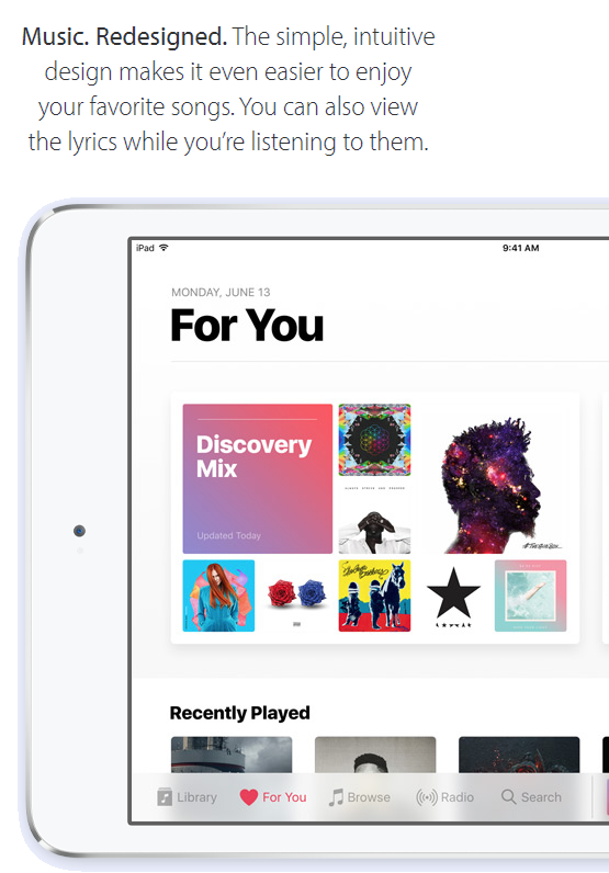
Luckily for all who have been staying away from Apple Music because of the disappointing interface are in for a treat - Apple just showed us a revamped version of Apple Music. At first sight, it looks way cleaner than before, putting what's most important up front - the music you care about. Simplicity was the leitmotif during the announcement of the design revamp.
There's now less info on each page of Apple Music, which was previously cluttered with different songs, playlists, and relevant info about the artist you're currently listening to. Apart from seeing less, you will be seeing everything better - the font is bolder and bigger, making everything easier to access. Additionally, when you play a song now, you will be able to check out lyrics by a simple swipe up. Nifty, right?
Next, we have a new section of the app, dubbed Downloaded Music, which will allow you to access all the tunes you have saved locally for offline listening. Finally, we have the For You tab, which will treat you to curated playlists on a daily basis, similarly to what Spotify has been doing with its Discovery Weekly feature.
The overhauled app will arrive alongside iOS 10 this fall, but impatient users will most likely take it for a spin once the public beta rolls out.









Things that are NOT allowed: