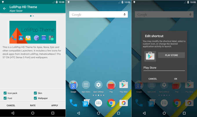
Apex Launcher 3.0 overhauled with Lollipop design and new features

- New modern UI with material design
- New material app icon
- Redesigned Apex action icons
- Lollipop drawer background and animation
- Lollipop folder style and animation
- Lollipop search bar and scroll indicator
- Lollipop drawer icon
- Lots of other UI tweaks and improvements
- New scroll speed option
- Improved app and widget picker
This last one is a feature that stands out - it mixes the Google Now launcher interface with the standard one for choosing apps or widgets. There is also a new settings option that lets you adjust the scroll speed between home or app drawer screens, too. Give the new Apex a try if you are looking for a full-featured launcher with that sweet Lollipop vibe to replace your current coat of paint.
source: Apex (Google Play)


Things that are NOT allowed: