Android's native Clock app to get some timely changes to its look in Android O

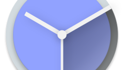
Android O is already on the third Developer Preview, and one of the native apps that is getting some work done on it is the Clock app. Let's start with the icon. Gone is the image of a clock with a purple background divided into three separate sections by the hour, minute and second hands. Instead, the clock will have a more vibrant blue color, and the dark shadowing from 2 to 6 has been eliminated. The second hand is now red, and the whole look is brighter and cleaner, especially with the shadowing removed from the clock's hands.
Version 5.1 of Clock has a new color scheme inside as well. Instead of the purple with red button seen with the current version, Clock 5.1 has a black background with a cornflower blue button. And the digital clock widget shows the time for a secondary location in a thicker, heavier font. That makes the information easier to read.
While Android users will be able to choose between Square, Rounded Square, Squircle and Teardrop for the Clock icon's shape in the launcher, Cylinder is gone, replaced with Teardrop. Overall, the features remain the same, but the Clock app is nicer to set your eyes on, both inside and out.
source: AndroidPolice


Things that are NOT allowed: