Android 9 Pie review: Perfecting the confectionery recipe
Android 9 Pie is here! Google has released the update for Pixel phones on August 6th, 2018, and the update will be coming to tens, if not hundreds, of phones in the future.
Back in March, Google released the first Android P developer preview and then in early May 2018, it followed up with the big Android P beta, a release that was definitely exciting. The final version that is now officially named Android 9 Pie includes many of the Android P enhancements that we saw in the beta Care to take a look? Then join us as we give you a full review of what the newest and most advanced version of Android brings to the table.
Keep in mind, though, that some of the features like the Dashboard listed below have only been announced, but are not yet available on actual software. Google will release those individual feature in the coming months.
And with that out of the way, let's explore what Android 9 Pie has to offer.
And with that out of the way, let's explore what Android 9 Pie has to offer.
Machine learning, digital wellbeing, Android P, and you
With all that heavy talk of AI that has been one of the leitmotifs of the industry for the past few years, it's no wonder that Google is upgrading the "smarts" of Android. This time, however, the focus is on the "digital wellbeing" of Android users, and the intent is clear: Google wants you to distract yourself with your phone less and have it do a larger portion of the work on its own. The super-charging of the Google Assistant and the introduction of Google Duplex are merely two of the brightest stars in Google's strive for a smarter, less overwhelming technology.

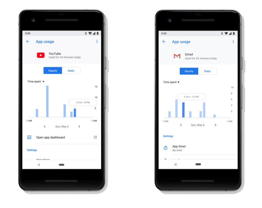
Dashboard is the key to your digital wellbeing
You can sign up to test Dashboard in beta, but the final version is not yet available
Shush!
Notifications, do not disturb me!
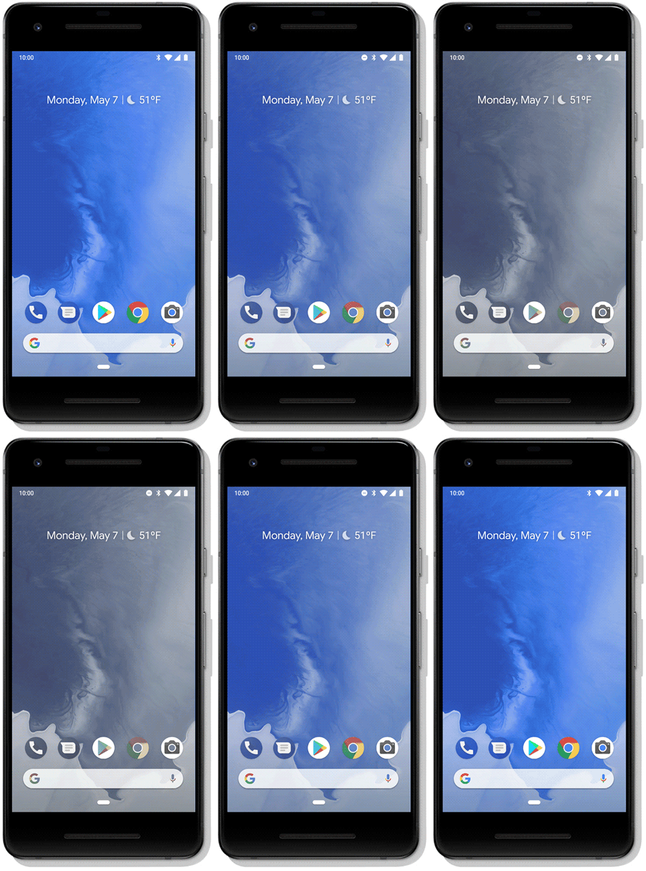
Wind Down
A gentle reminder that it's time to sleep
Time to go to bed, trooper!
Adaptive Battery & New Auto Brightness
Improves battery life and more precise brightness adjustments
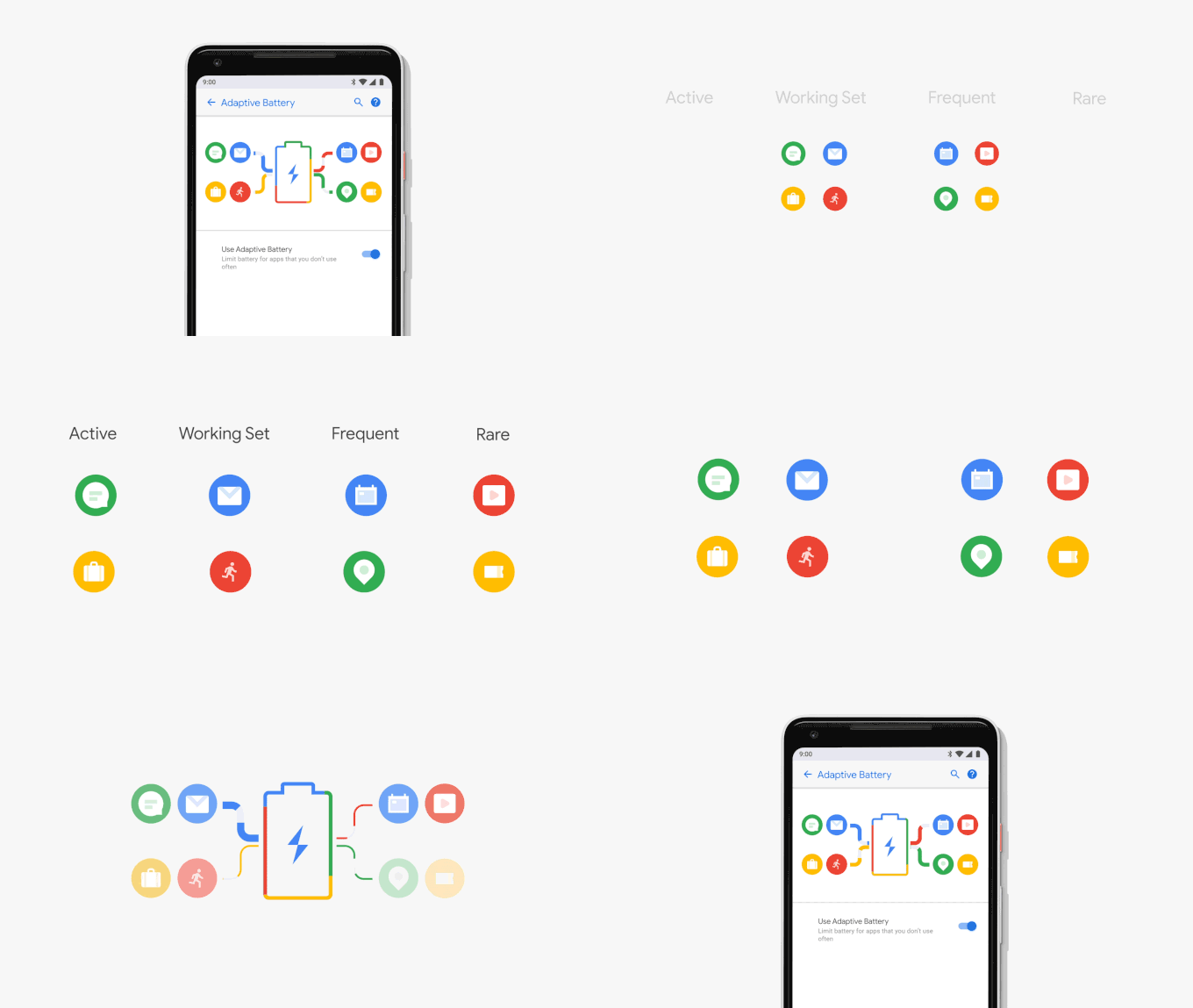
Another super-promising feature of Android Pie is the new Adaptive Battery feature, which uses on-device machine learning to understand which apps you are likely to use in the next few hours and which apps you are not likely to use until later in the day or in the week. Using this information that remains completely private because it's on-device machine learning, the Android system can adapt to your unique usage pattern and in practical tests at Google this resulted in a 30% reduction in CPU wake-ups, running more processes on the power efficient small CPU cores and overall big improvements in battery life.
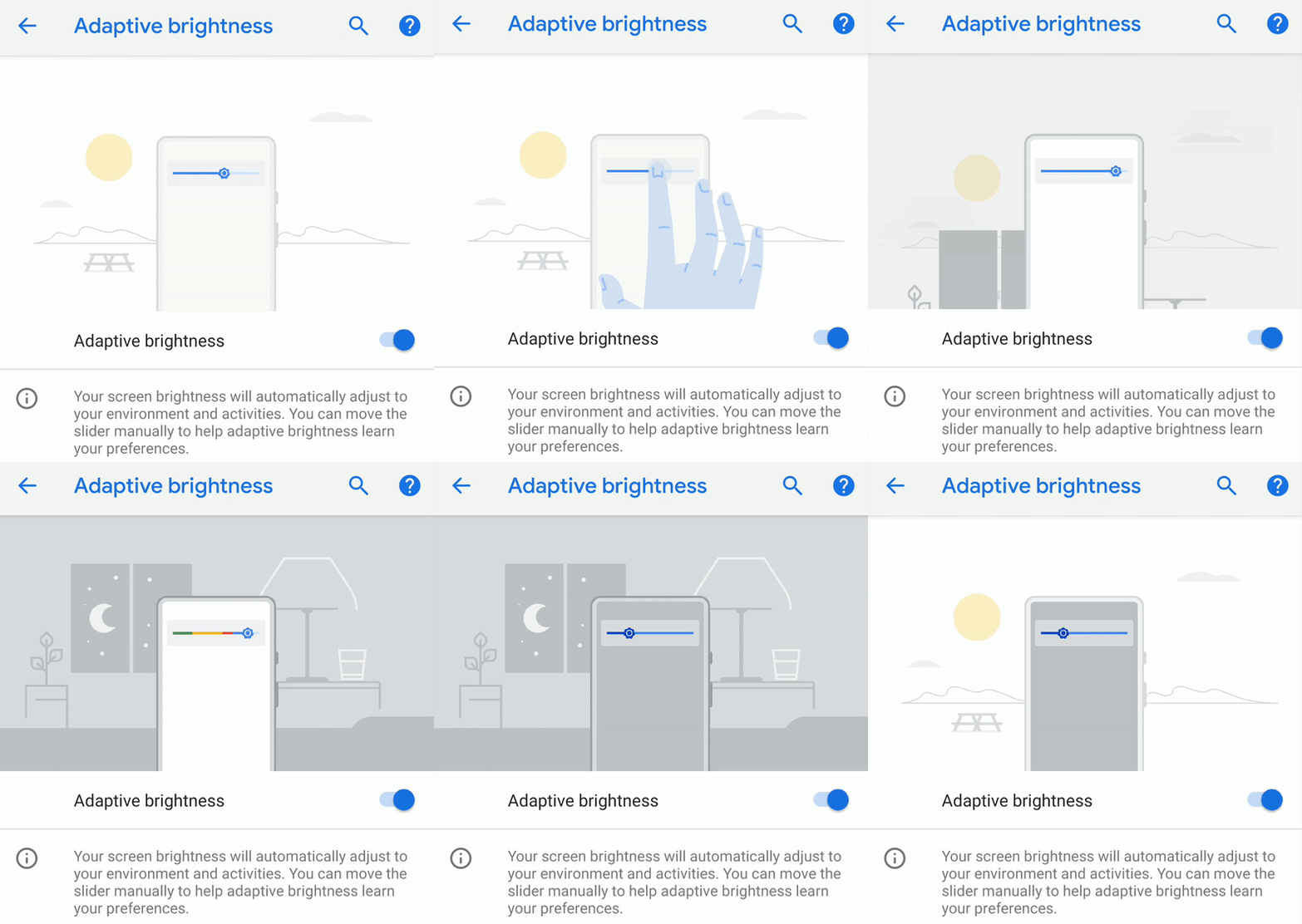
Another boon to Android's usability is the all-new Auto Brightness feature, which will now remember your slight alterations to the brightness levels in certain lighting situations and use them in the future for a more coherent experience. This way, you would have to interact less with your device, and we all know that a second saved is a second won.
ML Kit, Actions, and Slices
Super advanced features, coming soon

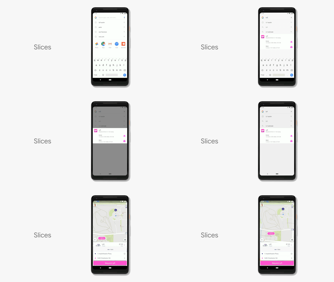
Another potentially great feature is Slices. This new API that will be available to developers will allow users to have direct access to key app features directly from the operating system or from search (in Android 9 Pie, this feature will only be available in search, but expect it to expand in future releases). For example, Lyft is using the slice API to render a slice of their app in the context of search and allow you to directly hail a cab, showing you an estimate of how much it will cost to get to work or to home, saving you time and effort.
A new gesture-based interface
Gestures are taking over
A new pill-shaped button takes over
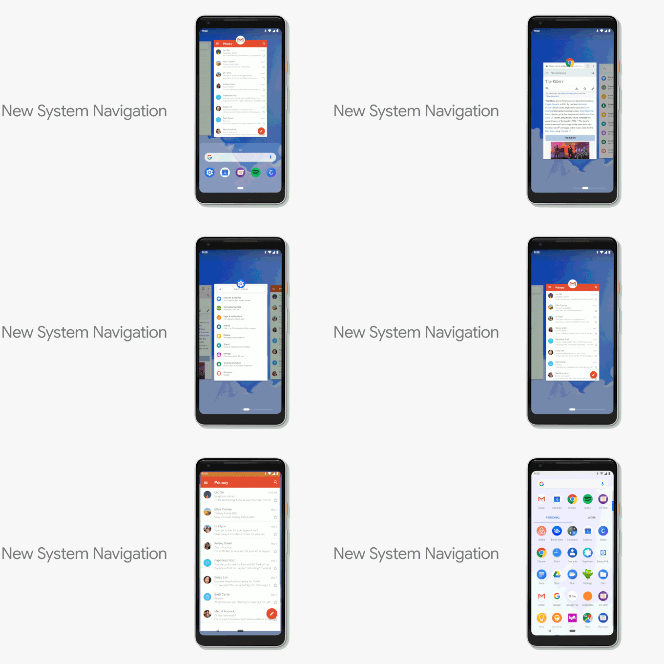
Most other core functionalities have been left unchanged. For example, you still access the Google Assistant by long-pressing your home button or the tic-tac pill if you've opted for the gesture-based interface. However, the latter gravely changes another core Android functionality: accessing the split-screen multitasking feature is a bit trickier than it used to be. Once you swipe up your home screen to access your recent apps, you have to tap the app's icon on the top and select "Split screen" in the options overflow menu that pops up. In its current state, this feature feels a bit convoluted and not intuitive at all, but we have high hopes that future Android 9 Pie releases will iron things out.
Needless to say, these gestures take some getting used to. We were hoping that Google would improve them from the first betas, but it hasn't changed them much and this new type of navigation definitely feels less intuitive than the gestures that we have seen implemented by other companies.
Status bar clock shenanigans
A more visible clock
Another minor but nonetheless-startling change is... the clock position in the status bar. For times immemorial, stock Android has had this essential element positioned in the top right corner of the screen, but Android Pie hints that this age is drawing to an end: the clock is now across the street and rests on the top left part of the screen. It really felt confusing the first few times, but in the end of the day, one should easily adapt to the change. It's obvious Google did that for the sake of equilibrium between the two sides of the display when a display notch is present, as the left one would traditionally remain unpopulated once the user clears all pending notifications.
Granted, many aftermarket Android skins have traditionally had status bar clocks positioned to the left or even in the center, but it's the first time stock Android scores such a change. Currently, there's no toggle that allows you to choose whether your clock should be positioned, though it will be good if Google eventually allows users to choose where this one should be positioned and doesn't force this change to just about anyone.
Granted, many aftermarket Android skins have traditionally had status bar clocks positioned to the left or even in the center, but it's the first time stock Android scores such a change. Currently, there's no toggle that allows you to choose whether your clock should be positioned, though it will be good if Google eventually allows users to choose where this one should be positioned and doesn't force this change to just about anyone.

Android 9 Pie clock (left) vs Android Oreo clock (right) on the Pixel 2 XL
Quick Settings redesigned again
Material Design 2.0 is fun and quirky
It's been a while since Google overhauled the Quick Settings tiles, but Android 9 Pie seems to be on track to introduce a rather major revamp to this essential interface component. The tiles now feature circular teal-colored settings icons. The pending notifications are also now separated from the quick settings by a gap that's several pixels wide. We are still on the fence if we like it or not but we wouldn't want to grow attached to it since it might go the way of the dodo pretty soon.
Colorful settings menu
More colors, much easier to navigate!
Android 9 Pie settings menu (left) vs Android Oreo settings menu (right)
The notch is now a feature
Like it or not...
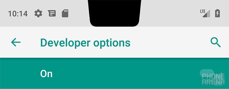
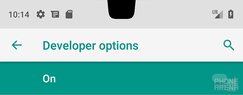
As we previously suspected, Google will natively support devices with a display notch starting with Android 9 Pie. Much to the delight of developers, the first preview introduces s few notch overlays that showcase how the software will adapt around the notch. This option can be enabled from either the display submenu or the developer options (though it can only be disabled from the latter) and allows willing parties to employ an Essential Phone-like notch, a much wider iPhone X-like one, and finally, a middle-ground between the two.
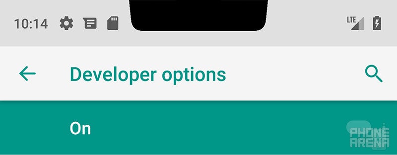
Android 9 Pie wide notch
Now, you might wonder how notification icons accommodate with the notch in the way. Simple, once you have more than three different notifications present, you will only see the icon of the latest one followed by dots representing all the other notifications that will show up once you expand the notifications bar.
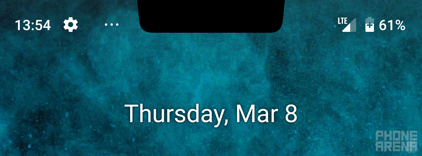
Android 9 Pie handling more than 4 notifications at the same time with the widest notch overlay enabled
New volume panels
It's much easier to single-handedly switch to vibrate or silent modes
And in case you're wondering, yes, it also comes in black when you put on a dark wallpaper. Nifty!
The volume panels have received some much-needed love
Display rotation, reimagined
Simple idea brings big improvements
A new and wildly useful feature would be the new smart rotation mode. If you disable auto-rotation of the display from settings, everytime you physically turn your device to the side, a rotate icon will appear in your navigation bar. If you tap it, the screen will rotate. If not, it will disappear in a couple of seconds. This will come in mildly useful when you desire to lock your device in a certain orientation mode and is a great and actually useful addition to Android. However, if you enable auto-rotation, your device will act just like any other Android phone ever - turn it and it will promptly adapt to the change.
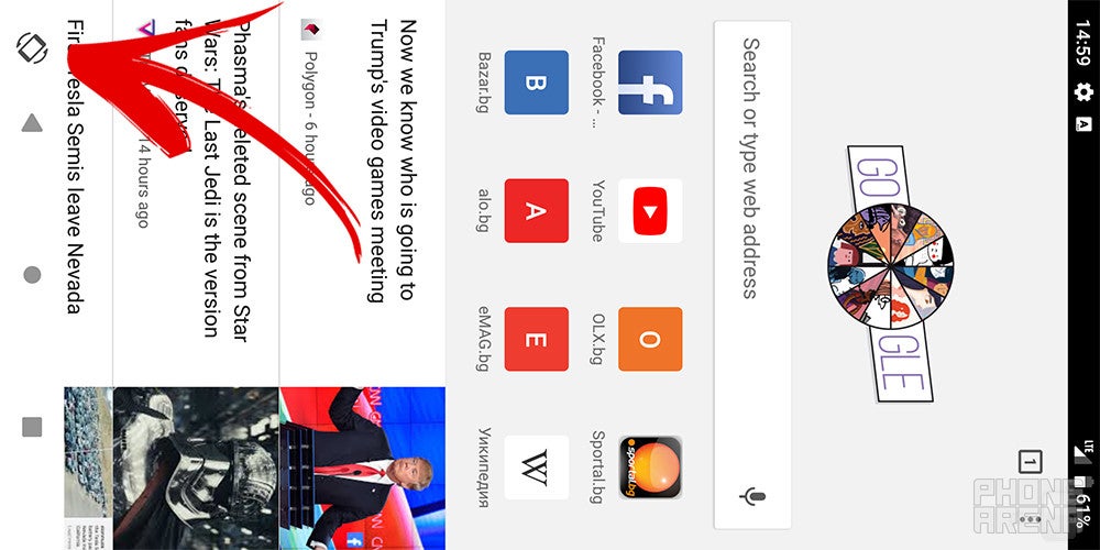
Tapping this button automatically rotates the screen even if auto-rotation is disabled
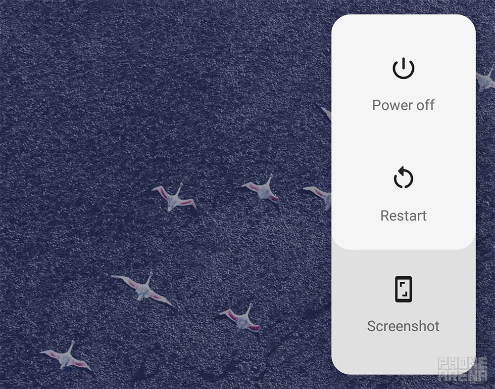
Enhanced screenshot controls
Finally, you can annotate your screenshots
Message threads in notifications
Threads are a good thing
You will be able to keep up with message threads straight from the notification shade
Easter egg
Psychadelic!

Every time you lock and unlock your device, a new color scheme will get applied to the easter egg, making up for a trippy feeling. We made a small GIF to illustrate almost all the color themes, check it out to the right!
While we don't say it reminds us of colorful popsicles, we do admit it is the software embodiment of having an acid trip in a confectionery.
Release date
We keep talking about future developer previews like we have any idea when these are going to be released, and we totally do. Here's a rough breakdown of the history of Android P previews and the final Android 9 Pie version:
- Preview 1 (initial release, alpha)
- Preview 2 (incremental update, beta)
- Preview 3 (final APIs and official SDK, Play publishing, beta)
- Preview 4 (release candidate for testing)
- Preview 5 (release candidate for final testing)
- Final release to AOSP and ecosystem
And here's when these will be released. As you can see, the final release of Android 9 Pie arrived on time in August.

Final words
At this point, Android 9 Pie is a quality-of-life update that introduces small but welcome changes to the operating system. It also brings a first look at Material Design 2.0, a new, fun and quirky styling that you can see in the settings and we love it. Important new features like the gesture navigation, however, don't feel so well thought out and are not as intuitive as on other phones.
Android 9 Pie also brings a lot of little things that improve the overall experience and we do appreciate Google paying attention to those small details that can make a big difference.
Some of the best Android Pie features like Slices and Dashboard are not yet available, and we will only be able to judge them once they are launched in the coming months.

Follow us on Google News








Things that are NOT allowed:
To help keep our community safe and free from spam, we apply temporary limits to newly created accounts: