An iPhone X-style notch and gestures on Android? Some shrug, but more gasp (poll results)

Android P folds the iPhone X notch and gestures, do you like where Google is heading?
As long as the features make sense, who cares
47.28%
I don't like it, Google and Android makers should keep it original
52.72%
With the P20 family of Huawei, we have the first major Android handsets that have reworked the interface to fit a notch in, and even add an iPhone X-esque home indicator in the nav bar settings. Huawei is not even the major offender here, as plenty of Android makers before it announced phones with notches, and Google itself lended support for it in the next version.
This is why we asked you last week whether you approve of this follow-the-trend mentality that Google seems to be introducing with Android P. Well, it turned out that a full 47% of our respondents don't really care, as long as the notch and gestures help screen-to-body ratio and navigation. A bit more numerous is the tribe that thinks Android makers, and Google itself, should be more original when it comes to setting trends no, rather than following them.
Google recently cut out an image from its developers blog, as it was showing the overhauled navigation paradigm of the upcoming Android P update before it had become official. The shots depicted a new navigation strip that had only two virtual buttons - an elliptical home bar, and a back key - with recent app duties allegedly taken over by a swipe-up gesture.
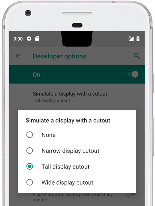
Still, if the home key becomes a mere gesture indicator like it was depicted by Google, while swiping up and holding would bring recent apps, the copycat journey would be complete. Adding insult to injury, Android P is already introducing official screen cutout support, aka the notch, as you can see from Google's official developer blog imaging on the right.
Follow us on Google News




Things that are NOT allowed:
To help keep our community safe and free from spam, we apply temporary limits to newly created accounts: