Android Lollipop vs Firefox OS vs Ubuntu Touch - interface comparison
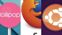
We love doing user interface comparisons here at PhoneArena. It's a perfect format to illustrate the evolution of an interface (like TouchWiz) over the years, the changes between major Android releases, or the differences between operating systems. But why do we care so much about interfaces at all? It's because the interface stands between you and your smartphone. It can make it or break it. A poorly optimized interface can make the most powerful hardware gasp for breath, turning your experience into wrestling your smartphone for control. And an ugly skin can make even the prettiest device unappealing. Simply put, interface matters!
Today, we're turning our attention from the Android flavor of the week to two OS underdogs that are slowly, yet ambitiously nurtured to challenge its dominance. We're talking about Firefox OS and Ubuntu Touch. The former is a lightweight operating system made to run on entry-level devices and designed with first-time Internet users in mind. The latter is an elaborate piece of work that stands strong in design, but odd in usability - outside of developer circles, it is yet to prove itself as a reliable daily driver for the masses. Heck, in Ubuntu, you can't even make screenshots without a PhD in Computer Science! We actually had to photograph our testbunny Nexus 4 in a dark room and crop the images, which is something we haven't done since the era of feature phones ended.
Now, we invite you to breeze through the slideshows and appreciate how different the three operating systems look and feel compared to stock Android 5.0.1 Lollipop. No, we won't trade the Google-y operating system we know and love for Firefox or Ubuntu yet. But we're all for the fresh perspectives and diversity Firefox OS and Ubuntu Touch's creators are bringing to the smartphones that we've gotten so used to.





Things that are NOT allowed: