Android L vs iOS 8: first look
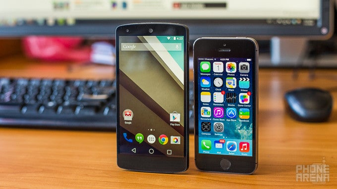
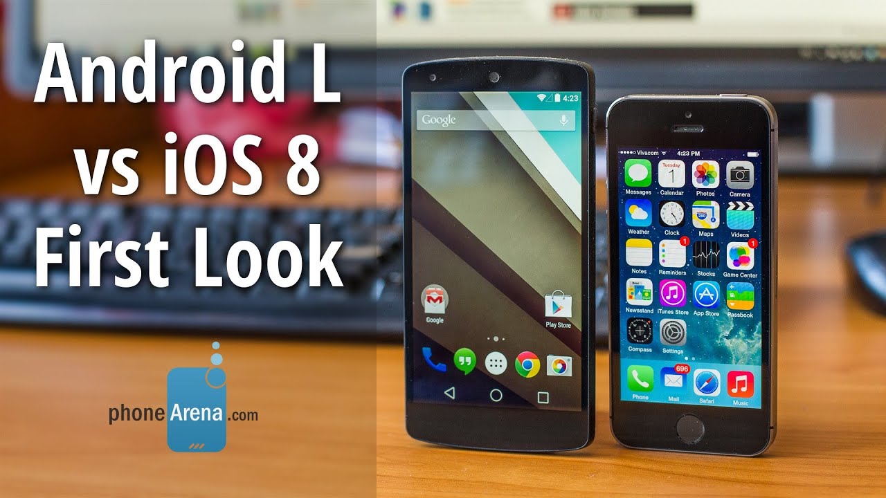
The releases of iOS 8 and Android L in the fall isn't likely to change anything, and the iOS vs Android flame wars will surely go on. This, however, won't stop us from comparing the two platforms side by side and from commenting on their traits and peculiarities. To do that, we have the iOS 8 beta running on our iPhone 5s and the Android L preview release installed on our Nexus 5.
Lock and home screens
Our first stop is the Android L lock screen, which has undergone some notable changes. First and foremost, notifications are now displayed at a glance, right in the middle of the screen, as opposed to before, when we had to pull down the notification panel in order to read them. That's a welcome feature, albeit seemingly inspired from the way iOS handles lock screen notifications. On Android L, tapping twice on a notification launches the respective app and a swipe to the side dismisses it. On iOS 8, a swipe can be used to reply to an email or mark it as read. Both solutions work just fine.
Some might like that a notification causes the screen of an iOS device to light up for several seconds, thus letting the user read it instantly. This won't happen on Android L, but instead, a phone or tablet's RGB notification light will go off, if available.
The Android L lock screen has one thing that iOS lacks – a shortcut to the Phone application. This lets the user dial a contact's number in as little steps as possible. What's present on both platforms' lock screens, however, is a camera shortcut.
Now would be a good time to mention that in Android L, support for lock screen widgets has been abandoned. We're kind of left with mixed feelings about this as there were some great ones out there. But on the other hand, lock screen widgets weren't very intuitive to set up and use. Perhaps Google wanted to reduce the lock screen clutter, or to simply free up room for the new Phone shortcut. Ironically, iOS 8 will support third-party widgets in the notification panel, and these will be accessible from the lock screen by pulling the said panel down.
Once on the Android L home screen, we see that everything is as it was in KitKat, pretty much. We got our screens for app shortcuts, folders, and widgets, our app drawer, and Google Now is at a swipe's distance. The iOS 8 home screen hasn't changed either and is as minimalist and intuitive to navigate as before. As they say, if it isn't broken, don't fix it. Naturally, Android L will appeal to those who enjoy personalizing their device, while iOS 8's personalization features are limited for simplicity's sake.
Notification panel, quick controls, multitasking
The overhauled notification panel is one of the significant improvements brought by Android L. We love how important notifications are now pushed up to the top of the list, while non-important ones are pushed down – email alerts appear at the top, for example, while app installation notifications are given low priority. Apple's approach to notifications in iOS 8 is a bit different. Pulling down the panel from the top displays the Today tab, which lists the user's daily schedule and the weather forecast, whatever widgets have been activated, and other bits of information. Notifications are in their separate tab, grouped by application, and the order in which these are listed can be changed from the settings menu.
Android L includes a redesigned Quick Controls menu, which is placed in the pull-down panel, as before. However, Google has chosen to abandon the two-finger swipe-down gesture for accessing the controls easily, which is odd. Anyway, the new panel is not only better looking. It is more functional with the added display brightness slider and, finally, a toggle for locking the screen's orientation. The iOS Control Center is no less awesome. Accessible from any screen, it lets us easily set the screen brightness, toggle Wi-Fi on or off, control music playback, and more. On the downside, one has to be careful not to pull it up by accident, while scrolling down a web page, for example.
With Android L comes a redesigned interface for our recent apps. On one hand, it definitely looks better than before as it now presents recent apps as a stack of cards, not sorted in a boring column as before. But on the other hand, switching to a particular recent app can be a bit cumbersome as no more than 3 cards can be displayed at a time, meaning that we're required to do more scrolling than usual. The recent apps list in iOS 8 is a great one and we like it better. It is simple, yet functional, with apps listed chronologically along with their respective icons on a separate row. What's more, the menu contains a list of our most frequently used contacts, which can be extremely handy.
Keyboard, Dialer, Contacts
The redesigned keyboard included with Android L (and available as a stand-alone app, by the way) is fast and accurate. Visually, it meets the principles set by Google's newly introduced Material Design. Yet from a functional perspective, the L keyboard doesn't seem to be much different from the stock Android keyboard that we know already. As before, it supports word prediction, auto-correct, and gesture typing à la Swype. Emoticons are also present. With iOS 8, Apple is adding intelligent word predictions to its stock keyboard. These follow an algorithm that takes into account the conversation's context and learns from it to provide better predictions. But in case for some reason you aren't happy with Apple's solution, third-party keyboards for iOS 8 are coming with the platform's release.
The Phone app in Android L has a fresh new design, and it looks like things have changed for the better. Starred contacts are organized in a more compact list, and their placement closer to the screen's bottom edge makes them easier to reach with a single thumb. The contact dialed last and the search bar are on top. As before, searching from the Phone app yields not only results from our contacts, but from nearby businesses, restaurants, and hotels as well. This works the other way around, and if you're getting a call from a business that's in Google's directory, their name will be displayed on your screen. Neat! The iOS 8 Phone application hasn't really changed much from before. It is still the minimalist, black-and-white list of contacts, favorites, and recently contacted numbers. Sure, it gets the job done, but lacks in character. Yet points go to Apple for enabling us to block calls and texts from certain contacts in iOS.
Contacts in iOS 8 are displayed in a single alphabetical list. Perhaps it would have been nicer if a picture was shown next to their name, but our guess is that Apple didn't want to include the option as many of those contacts would't have one assigned anyway. Profile pictures are displayed for contacts on the Favorites list, however. On Android, the contacts list has been made more compact, with smaller profile pictures and less empty space between names.
Search, voice commands
Android 4.4 made it possible to initiate hands-free searches and commands with the "OK, Google" voice trigger, which worked from any home screen. Now, thanks to an update for Google's Search app, we're able to use the same voice command to search from any screen, even from the lock screen. Actually, this update should land on Android phones before Android L is out, and those who don't want the "OK, Google" command to be on at all times are free to turn it off. Similarly, Siri in iOS 8 has gained the ability to listen for voice triggers. "Hey, Siri" is the command she (or he) responds to, but there's a catch. You see, the hands-free commands in iOS 8 work only when the device is plugged into a power source. Otherwise, "Hey, Siri" won't do anything unless the Siri interface is open on the iPhone or iPad. The next iPhone iteration might enable the trigger to work at any time, but that's just a guess.
But our guess is that you'll be typing in whatever it is you're searching for most of the time. On Android L, the Google search bar is placed permanently on the top of any home screen, just like before. While it does occupy precious screen space, it lets us search the internet, find a contact, or search for an app installed on the device. Spotlight search in iOS 8, which is accessible with a swipe down gesture in the middle of any home screen, is no less versatile. In fact, it can be used to search the internet, the user's inbox, contacts, installed apps list, and will also display results from news outlets, from Wikipedia, and the iTunes store.
Cameras, photo gallery
Android L uses Google Camera as its default camera application. Yup, the same app that you can download from the Play Store. Overall, it is a great app that shines with its ease of use. Photography buffs won't find manual exposure, ISO, and shutter speed controls, but ordinary folks should be satisfied with the built-in camera modes. These include Lens Blur, Photo Sphere, HDR, and Panorama. You can read our Google Camera review for more details. On iOS 8 we find a camera application that also has a few tricks up its sleeve. iOS users now have the option to shoot time-lapse videos and the freedom to control focus and exposure independently. Plus, a self timer has been included. Compared to Google Camera, the iOS 8 application is about as easy to get the hang of.
Photos in Android L are viewed from the Photos application. They are organized in two separate tabs – one containing all images and another labeled "Highlights". As the name implies, the latter organizes select images in albums and arranges them by date. The Photos application can automatically back up your photo library so that your photos are never lost. As for its editing tools, there's a lot at our disposal – from basic Crop and Rotate to image filters, frames, and effects. Best of all, you don't need any image editing skills in order to use the app's tools effectively. When it comes to features, the Photos app in iOS 8 has almost as much to offer. Images can be easily sorted by time and date taken for easier management and backed up to the cloud for safe storing. We don't get quite as many image editing options as we do with Android's Photos app, but whatever iOS 8 offers is simple and intuitive to use.
Expectations
Android L and iOS 8 – coming this fall
Android L brings along more than just a visual redesign. We really dig the new Quick Controls menu, the improved Phone app and how notifications are now being sorted by priority. Also, it is nice to see that Android has learned a few tricks from iOS, and the way lock screen notifications are handled is a good example of that. Similarly, iOS has assimilated some ideas from Android, such as the options for having third-party widgets and on-screen keyboards – nothing wrong with that, if you ask us.
So all in all, both OS releases are expected to be of huge benefit to users with all the features and improvements that they'll bring. Whichever camp's side you're on, with Android L or iOS 8, you'll have even more reasons to stick with your platform of choice.



Things that are NOT allowed: